THE BRAND
Biasca is a new bitter soda made from plants found in the Swiss Alps and juicy citrus fruit. The brand’s main goal is to be a representation of all that Switzerland has to offer, from its simplicity to the intricate luxury it’s known for. Inspiration was found in the typical tourist ads from the 20th century and the Swiss design culture.
Resolutely different, mixing natural and classy minimalism, Biasca is ready to be shared during a relaxing afternoon or afterwork on a lakeside with you.


THE CONCEPT
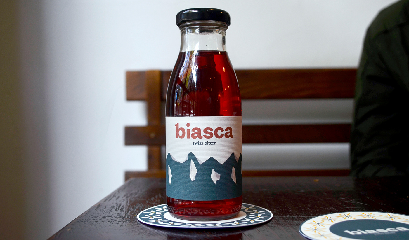
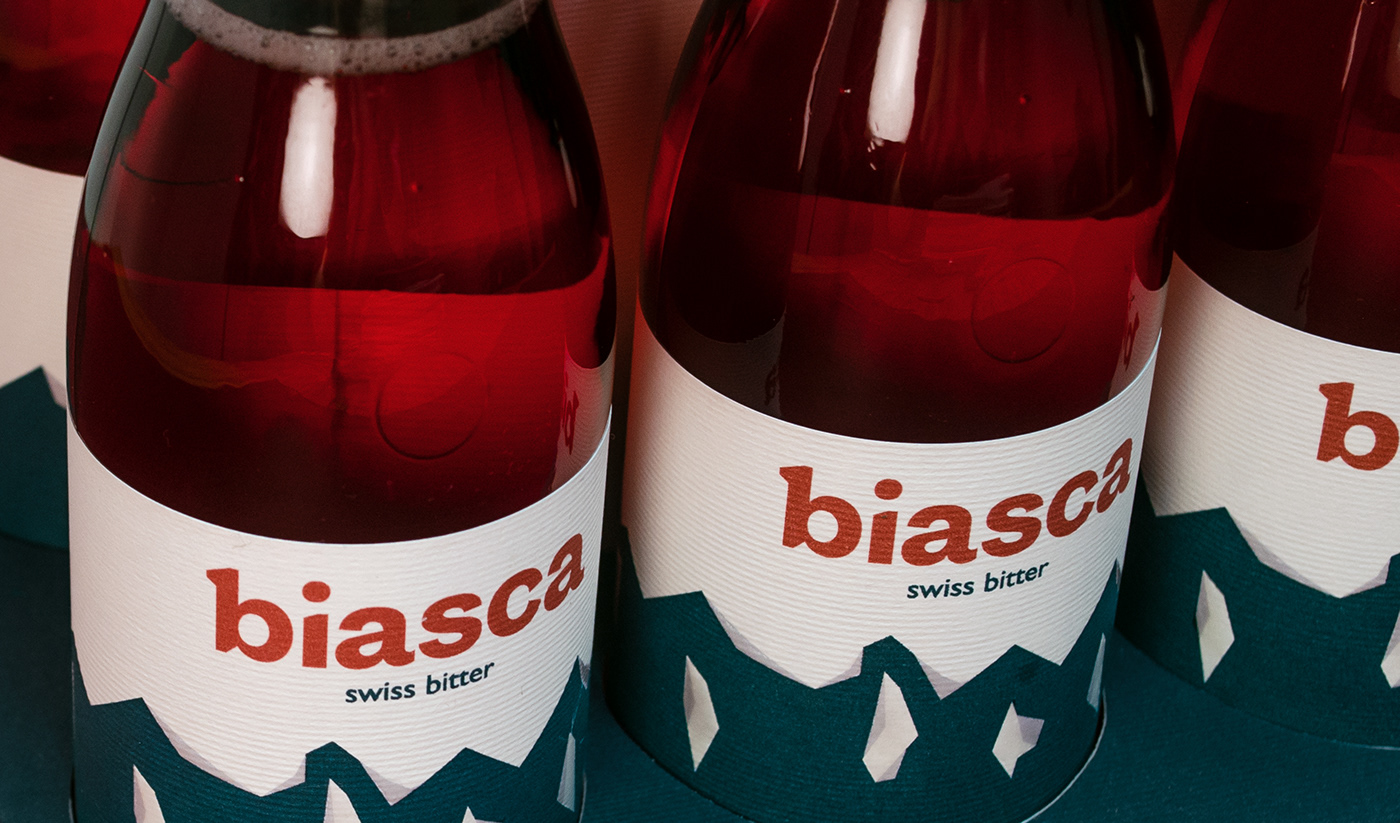
The bottle and packaging are key elements of the identity of Biasca. The unique bottle shape is reminiscent of an old little milk container which makes it stand out from other brands. The packaging enhances this imagery by mimicking an old milk basket and thereby helping the bottle and label design to stand out.
The logo was designed to be simple and its typography to be bold and rough as the mountains yet discrete like the Swiss lifestyle.
Bitter labels are usually characterized by gold elements and foil and often have a vintage design. I therefore decided to go in a totally opposite direction and choose a minimalist illustration depicting mountains, printed on a naturally textured paper. To add a little touch of fanciness and contrast to the texture, a spot gloss finished was added to the snow part.