


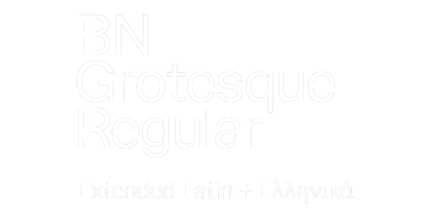
BN Grotesque
typeface design 2019
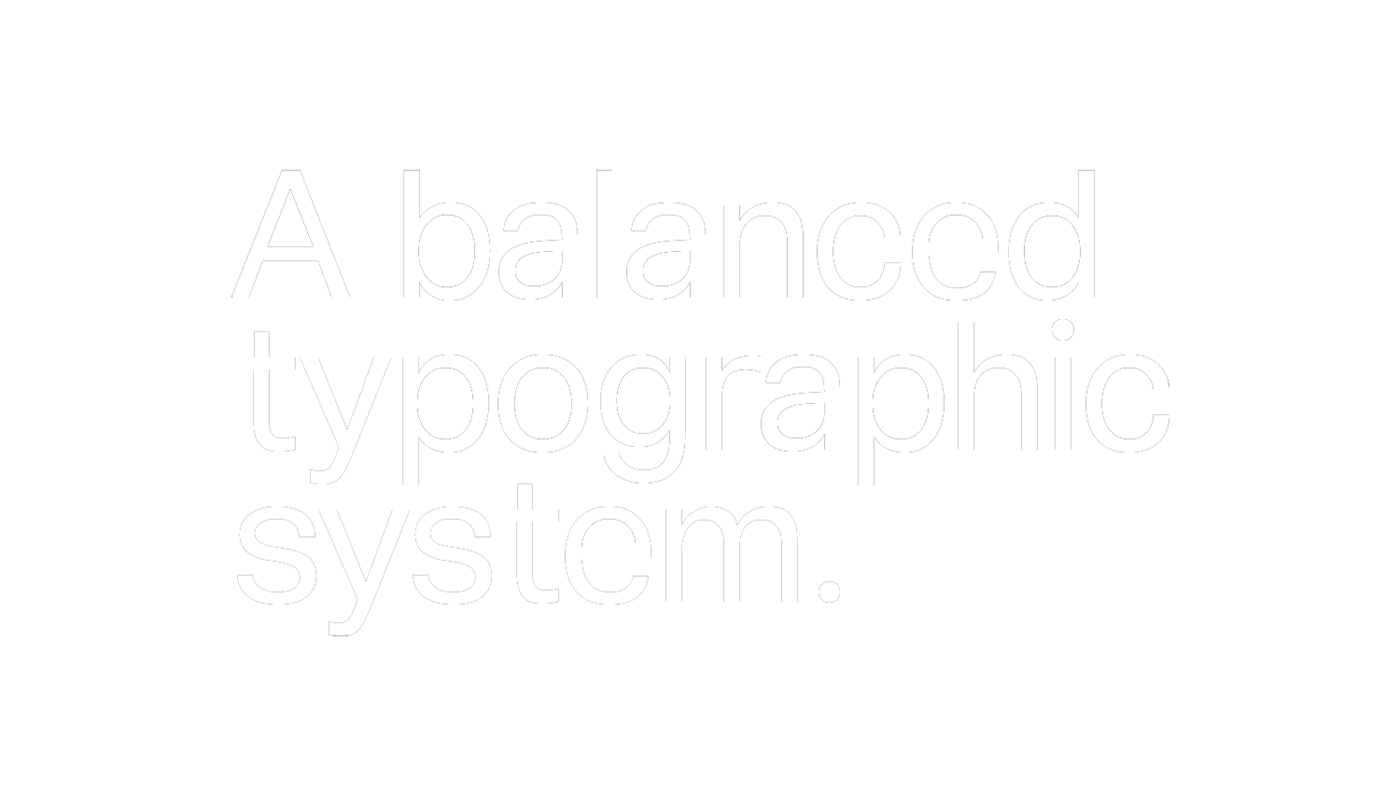
BN Grotesque is our internal typeface designed to directly, clearly and truthfully deliver the message. Our design approach is based on balancing Neo-Grotesque typeface heritage, humanistic sans-serif features and several design choices that we’ve made both for Latin and Greek character sets.
Our goal was to create an optimal harmonious and a visually euphonic outcome at any text size. In that notion, we implemented a precise geometric design, optical corrections, new approaches like the widening of -t and -r, particular numbers, a stable set of capital letters, an overhaul in specific Greek characters perception and many other choices that finally define our typographic project.
BN Grotesque is a result of research, hard and systematic work, constant evaluation and many specific typographic decisions based on how the typeface performs in words and meanings both in several languages including Greek.
In that context, we perceive the BNG development as a reference point for the agency’s identity. Τhe typeface was designed in bold and regular weights.


created by
brand.new


