tip-tip™ (WIP)
_
Doesn’t matter if you didn’t drink wine or you didn’t have dessert, because when dinning out with friends, the bill is always split equally. tip-tip™ is a small and simple calculator that allows you to easily calculate the tip and split the final bill.
Project Type: Application Redesign and development
Production year: 2013
Client: deskfolio.com
Platform: iOS (iPhone/iPod)
Current version: 1.3.0
Requirements: iOS 7
More info: tip-tip website (old website)
In order to match the new standars and guidelines from the latest iOS (version 7), a new update was release for the tip calculator app. The redesign focused on different stages of the actual build that should be addressed and changed:
1. Tipography
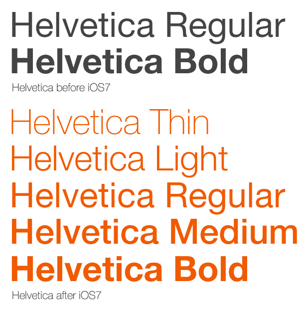
The new version of the operating system, introduced Helvetica in a whole new variety of font weigths, that were useful during the redesign process in order to create different visual hierachies that were less evident and hard to achive with the traditional regular and bold combination that was the only possibility available before using the system font. The light weights, combined with the sharpness and clarity brought by the introduction of the retina display, also helped in the goal of achiving a more simpler, crisper and cleaner look-and-feel.

2. Images and Metaphors
Away from the too obvious skeuomorphism(*), the new update offers a much simplified and almost imageless UI. Every single control was reduced to its basic shape and rendered without gradients or any other kind of effect besides a plain and solid fill of color. The result is a wider and less cluttered interface, that focus only on what's important: the content and the interaction with it.
Away from the too obvious skeuomorphism(*), the new update offers a much simplified and almost imageless UI. Every single control was reduced to its basic shape and rendered without gradients or any other kind of effect besides a plain and solid fill of color. The result is a wider and less cluttered interface, that focus only on what's important: the content and the interaction with it.

(*) Skeuomorphism refers to a design principle in which design cues are taken from the physical world. This term is most frequently applied to user interfaces (UIs), where much of the design has traditionally aimed to recall the real world - such as the use of folder and files images for computer filing systems, or a letter symbol for email - probably to make computers feel more familiar to users.
3. Grid and Layout
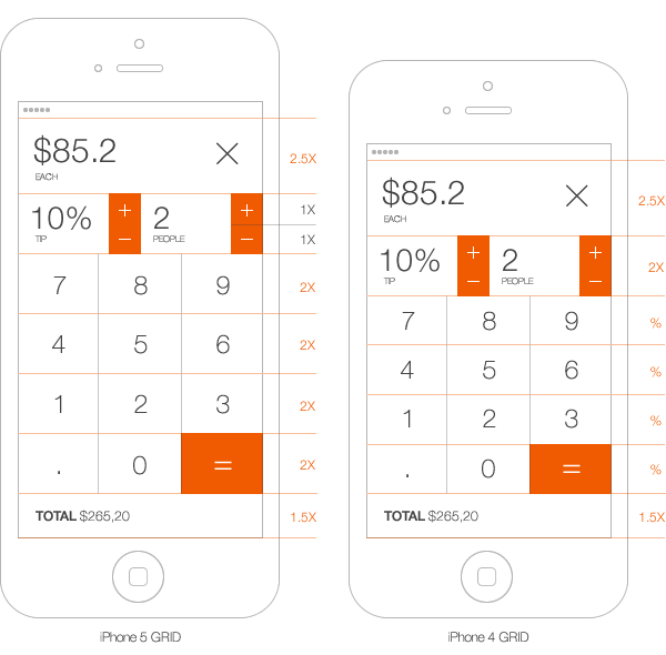
The app was also modified and updated to fit on both the iPhone 4 and iPhone 5 screens (which was a pending and requested feature from its users). Using the autolayout feature introduce in iOS6, a vertical grid was created that would only shrink or expand the calculator buttons accordinly, in order to make room for the new portion of the UI, while the rest of the controls would remain unvariable.
The app was also modified and updated to fit on both the iPhone 4 and iPhone 5 screens (which was a pending and requested feature from its users). Using the autolayout feature introduce in iOS6, a vertical grid was created that would only shrink or expand the calculator buttons accordinly, in order to make room for the new portion of the UI, while the rest of the controls would remain unvariable.


3. Animations and Transitions
Static images were not the only elements to revise and update. Animations and transitions such as the peel-off effect used to present the detailed bill view, were also replaced by a new animations. In this case, the calculator buttons are smoothly pushed along with the stepper controls all the way down to the bottom, in order to reveal more information (bill details). The pseudo-3D flip transition effect was also replaced by a simple push animation from the bottom to the top of the screen, fading the main calculator view upon the Z axis, creating the illustion that is making room for the Settings and Preferences pane.
Static images were not the only elements to revise and update. Animations and transitions such as the peel-off effect used to present the detailed bill view, were also replaced by a new animations. In this case, the calculator buttons are smoothly pushed along with the stepper controls all the way down to the bottom, in order to reveal more information (bill details). The pseudo-3D flip transition effect was also replaced by a simple push animation from the bottom to the top of the screen, fading the main calculator view upon the Z axis, creating the illustion that is making room for the Settings and Preferences pane.
4. Settings View
Another radical change on the mayor update for the app, was the migration of its preferences from the native Settings App, to within tip-tip™. In order to make things easier, faster and more accesible to the user, the list view of preferences and options was moved and grouped along with the information and copyright view, now without the needing of switching between apps.
Another radical change on the mayor update for the app, was the migration of its preferences from the native Settings App, to within tip-tip™. In order to make things easier, faster and more accesible to the user, the list view of preferences and options was moved and grouped along with the information and copyright view, now without the needing of switching between apps.

5. Functionality
Another user requested feature, was the possibility to have the detailed view updated instantly while making changes on the tip and/or people steppers. Previously, the peel-off transition effect presented data in a very elegant and convenient way, but the user needed to constantly change views in order to see the changes reflected. The use of the expanded bill view, now let the user still keep changing amounts and percentages while the information keeps updating and visible at all time, without any extra steps.
Another user requested feature, was the possibility to have the detailed view updated instantly while making changes on the tip and/or people steppers. Previously, the peel-off transition effect presented data in a very elegant and convenient way, but the user needed to constantly change views in order to see the changes reflected. The use of the expanded bill view, now let the user still keep changing amounts and percentages while the information keeps updating and visible at all time, without any extra steps.

6. Gestures
With the new realease, several new gesture were introduced besides the already available long-press gesture for the "minus" buttons, that decreases the stepper values to its minimum (0 for tip, and 1 for people). The steppers for Tip and People controls also gained new swipe gestures (up/down) that can replace the tap functionality of its add/remove buttons.
With the new realease, several new gesture were introduced besides the already available long-press gesture for the "minus" buttons, that decreases the stepper values to its minimum (0 for tip, and 1 for people). The steppers for Tip and People controls also gained new swipe gestures (up/down) that can replace the tap functionality of its add/remove buttons.
