


Taking a health food label
From anonymous to synonymous
Through conscious design.
From anonymous to synonymous
Through conscious design.

How we helped a health food label gain a recognisable voice and stand out from the clutter.
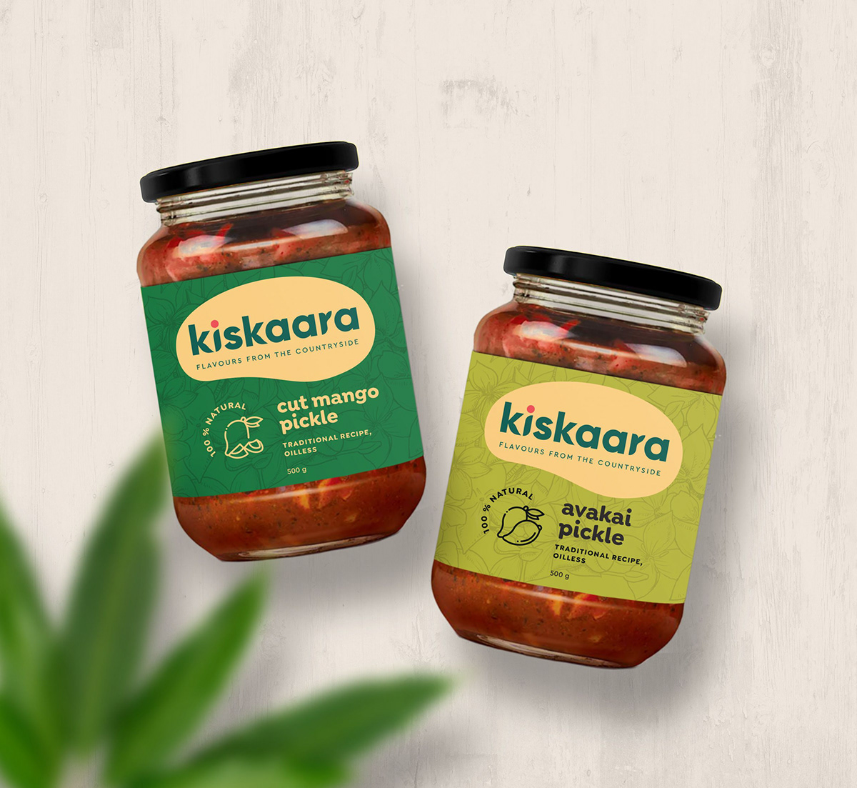
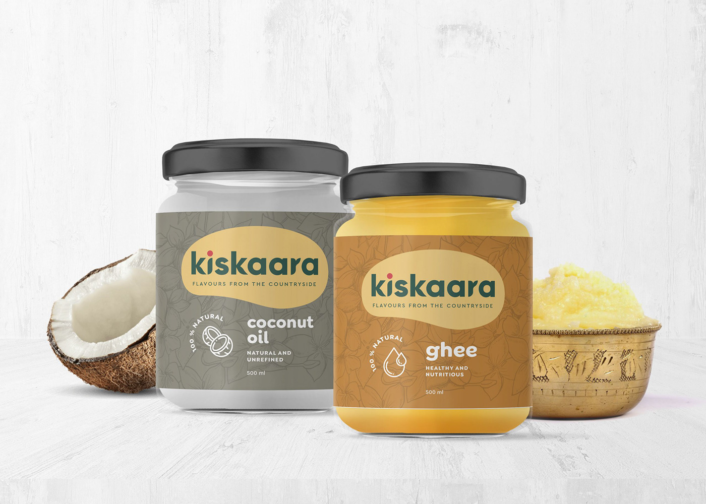
Kiskaara (the Kannada word for “flower”) wanted to be synonymous with safe and healthy food. Their valiant attempt was to separate man from his favourite peri-peri flavoured snack and turn towards healthier, nutritious alternatives. The brand boasted an impressive menu ranging from lifestyle snacks to essential food products such as honey, ghee, pickles and flour.

The leaf: Out of the book and onto the logo
The Kiskaara logo gained shape with a leaf-like illustration that acts as a container for the brand name. Leaves are synonymous with fertility, growth and revival. Kiskaara wants to revive the snacks segment with their healthier alternatives. It all connects.

The leaf is at the core of every design we had in place for Kiskaara. Such an alignment helps ground the brand’s passion for better products and a better world. The simplicity that’s present in the logo is as ample a metaphor to the simple lives of the brand’s key source – the farmers and the reminders of simpler times that these snacks are expected to conjure up in the customer’s minds.
Having set the mood for the brand and roped in leaves and farmers as key inspiration, we chose a dense, leafy green and a rustic yellow as brand colours. The two colours in co-ordination with a contrasting touch of pink were thereby determined to be present on the logo and other essential brand collaterals.
Snack brands have access to a bevy of fonts, some curly, some straight and some outrageously stencilled. The copy that a man reads before he’s about to go on a gastronomic adventure matters but, the font it’s written in matters even more.
For Kiskaara, we tapped into a softer, curved sans serif font, one that’s both playful (like a curly font) and also sensitive (like the straighter ones). Kiskaara’s new font brought to the table dynamic organic shapes and rectangles with curved edges; everything we needed to create a rustic look.
The Bangalore-based homegrown label also taps into the local farming community and has envisioned a farm-to-table movement to present products that are "untouched" by the harmful chemicals and preservatives that commercially packaged foods generally contain.
When Sukkrish Aadds came onboard, we had many questions to answer. The most prominent one being, “how can Kiskaara be different from the other brands that are dominating the health food segment?" To find the answer, we went to work.


Illustrating simpler times
Kiskaara was in need of an imagery that would stir up nostalgia in the minds of the users. We decided to create an illustration that could sum up the simple life, one that would go on all branding collaterals.
Beige was chosen as the primary background colour. We admire beige for its neutral, calm and yet dependable personality. Here’s a colour that brings the warmth of brown and the crispness of white. As a secondary colour, we looked at a rebellious shade of pink which drew a stunning contrast to the neutral beige. It all connects.
The style of illustration too matters. Modern illustration types may not induce the nostalgia we were looking for and so we went with a hand-crafted sketch. As part of our illustrations, we created a number of flowers which we’d dub the Kiskaara Flowers that were painted with a contrasting shade of pink.
These flowers appear in a majority of the designs we created for the brand and helped create a strong visual recall. By associating these illustrated flowers with the brand, we were able to put the brand in the same realm as organic and safe food, just as nature intended.

A garden of collaterals
Apart from the logo, we handled Kiskaara’s packaging, signboards, direct message creatives and business stationery. Apart from some pre-made illustrations, we created additional custom illustrations that highlight the brand’s personality.


The farmer, the flowers and the leaf are a part of every bottle and pouch we designed as these elements connect with the very core of Kiskaara.


From anonymous to synonymous
Bringing natural colours such green and yellow and inspired colours such as beige and pink together adds an effective sense of wonderment to the brand. The result is strikingly immediate in colour and is followed with fine illustrative detail.
We believe that for a brand that planted its roots in fertile soil, Kiskaara inches closer to full harvest and with the armada of creatives and collaterals by its side, the brand is ripe and ready for more awareness.
Creative Head: Shreesh Shankar
Studio: Sukkrish Aadds


