Logo
The brief for Pan was challenging as the key elementts were nurture. The concept that evolved was that of a cottage tucked away in the hills that produced its homegrown vegetables and fruits which are fresh and nurtured with personal care.
The brief was further complex as, as per the Vastu Shastra, the logo color was restricted a shade between violet and burgundy. And also the chimney needed to be at a certain position (As opposed to orignally designed to be aligned with the shaft of the letter 'n')
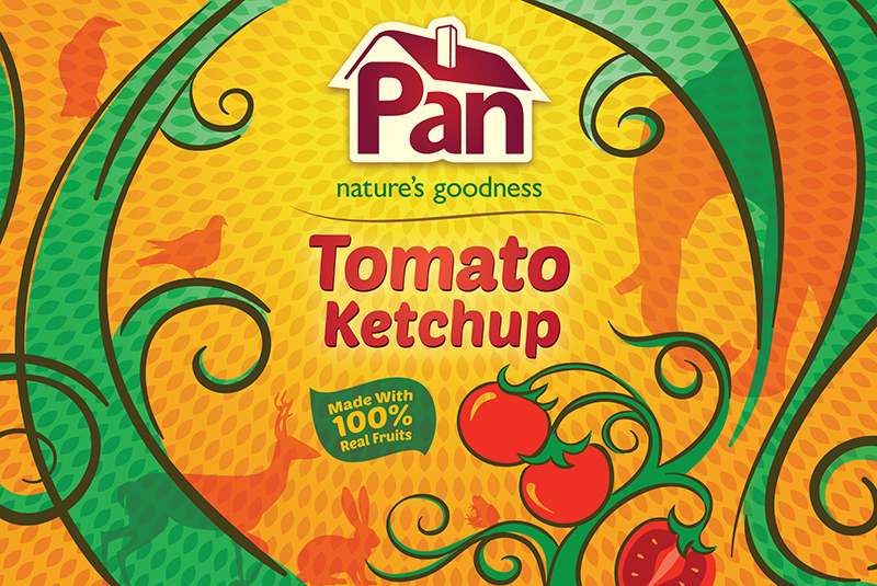
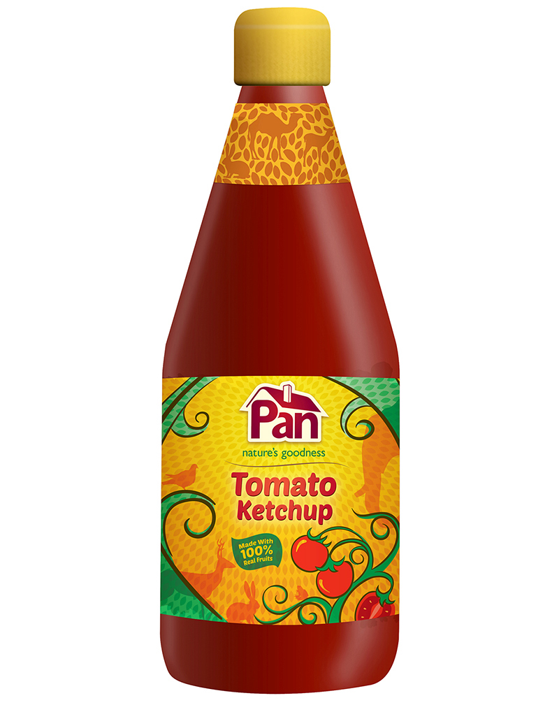
Ketchups
This concept takes inspiration from The Panchatantra, a literary work which is part of the Indian heritage. Panchatantra essentially means ve ways of how human life interacts with the world around them. These fables were conceived to impart the vast wisdom of worldly ways, to teach children in a simple visually imaginative manner; in order to prepare them for their life ahead. Also, the Panchatantra is symbolic of how Indian culture has always been deeply rooted to nature and environment (for instance how every animal represents various facets of human character)
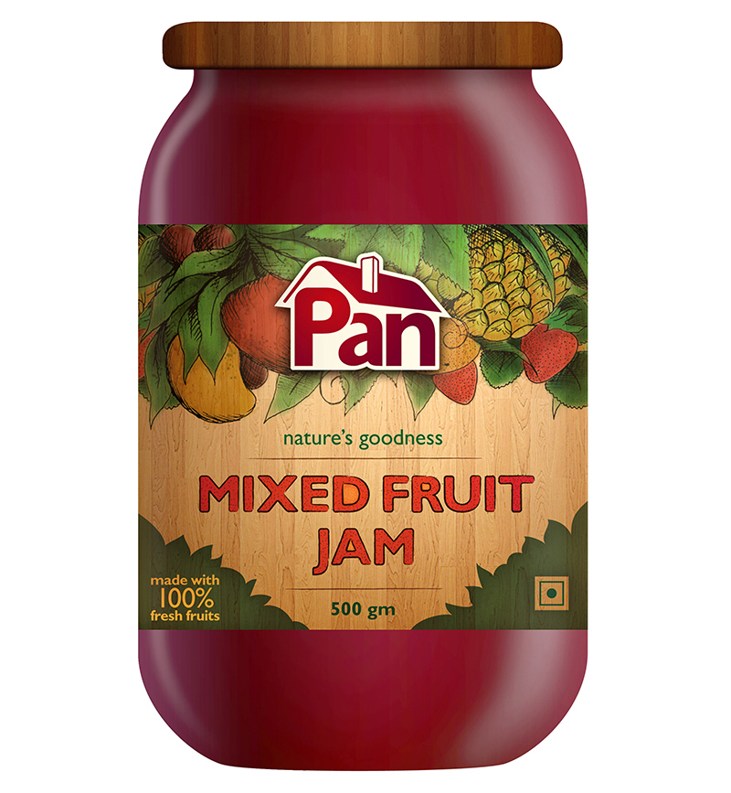
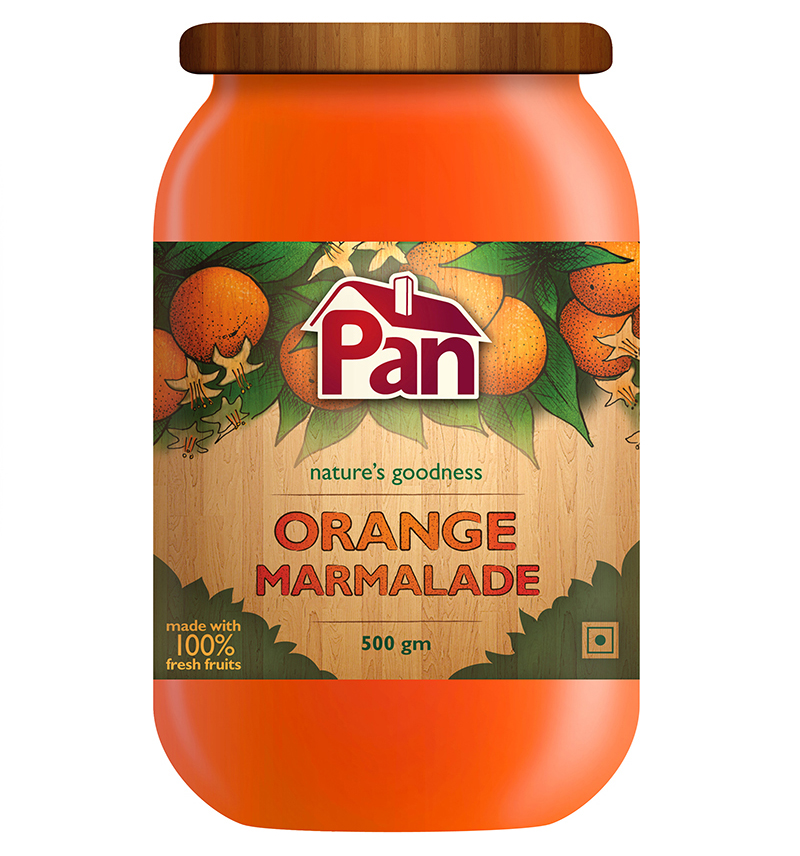
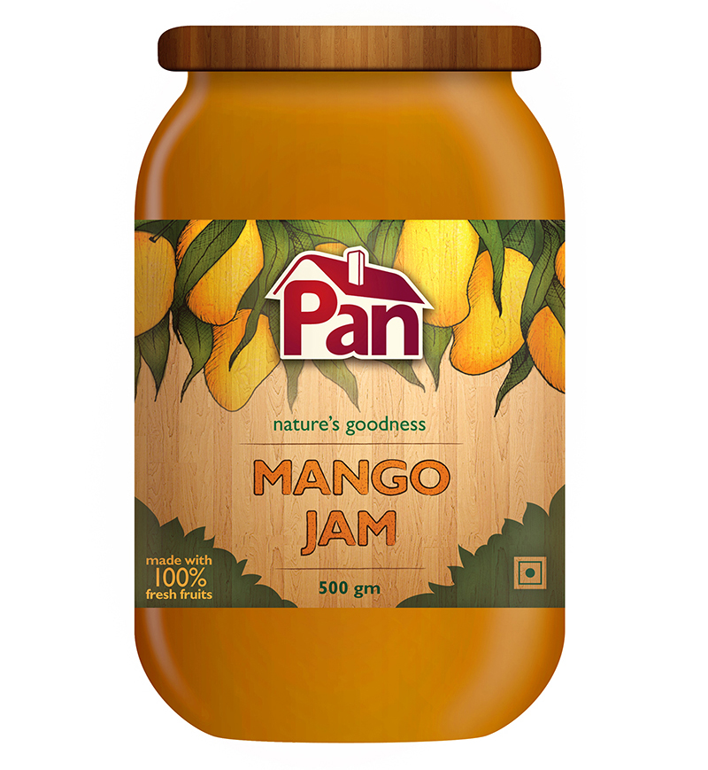
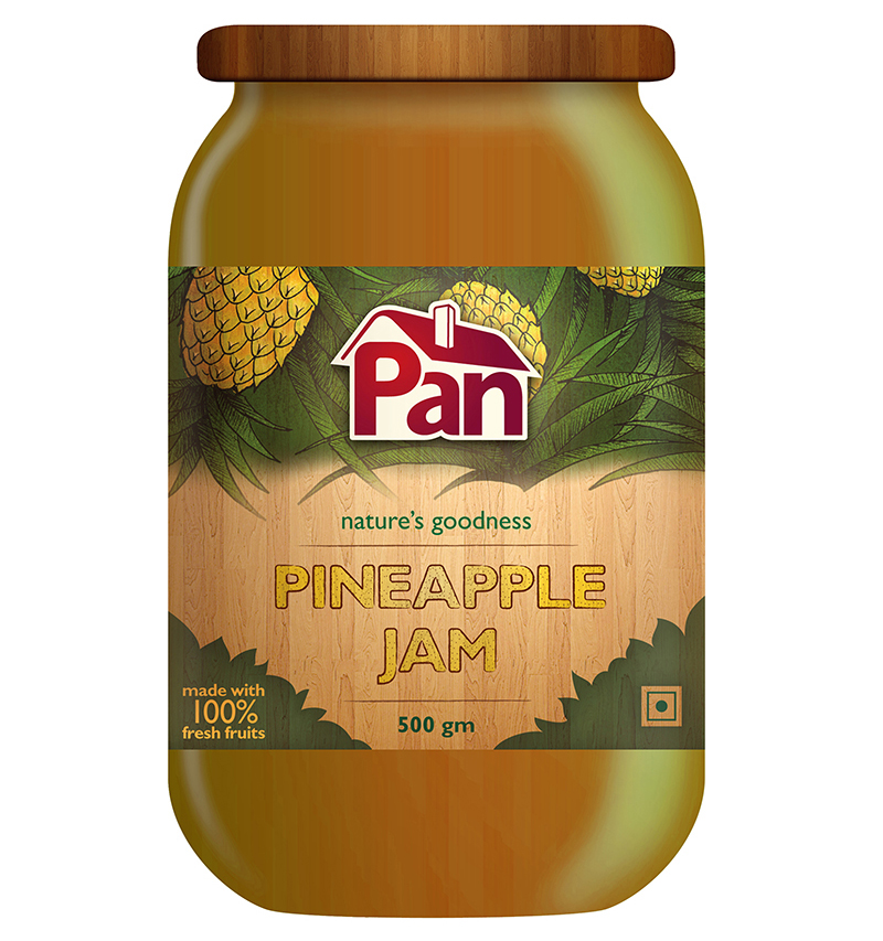
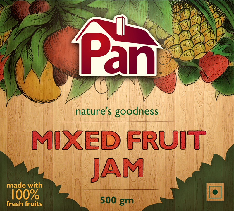
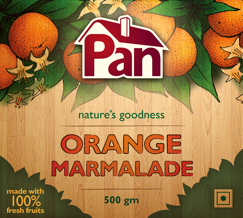
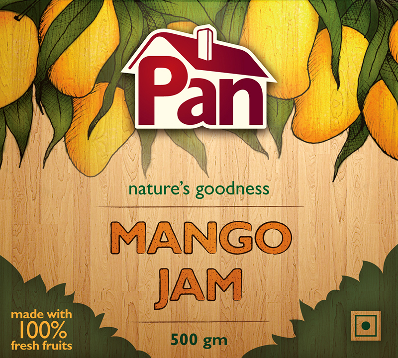
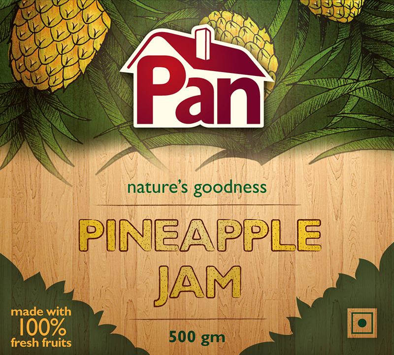
Jams
The design for the labels of the Jam range were created as an extension of the cottage concept. Taking a wooden theme and highly customized and illustrated design denoted special attention and care that is given to Pan Products. The Illustrations were manually illustrated and digitally repainted. The typography was modified from Gill Sans to match the mood of the design.