Chin Sin Huan
Branding/Illustration/Art Direction
2018
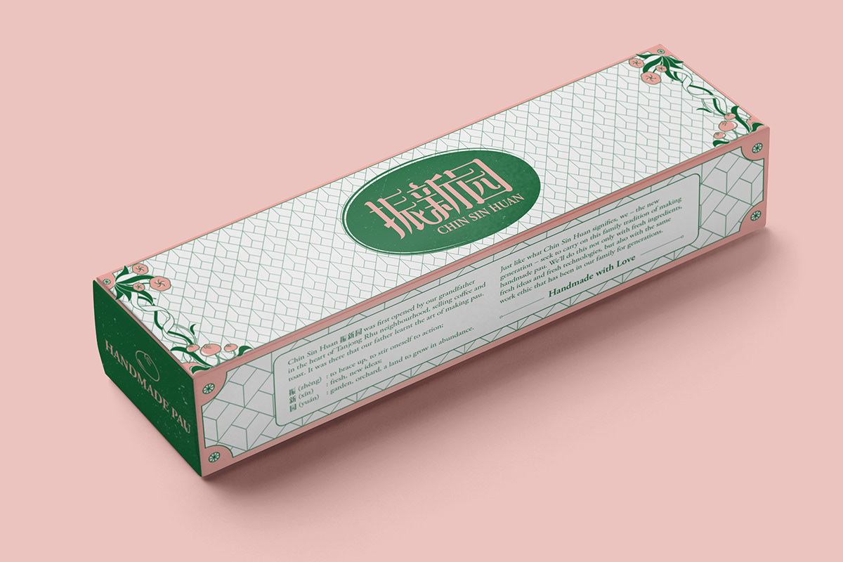
A branding project for Chin Sin Huan “振新园”, an eatery selling handmade paus with a recipe that passed down from generations since the 1960s.
飲水思源 is a chinese idiom that means to feel gratitude for our blessings, to remind us to show respect to the source of our happiness and success. As a brand name that has lived through generations, Chin Sin Huan is recognised for its original taste because of the recipe that has been passed down since the 1930s. Inspired by 海派; which refers to Shanghai’s East-meets-West culture that is popular in the 1930s, the goal is to give Chin Sin Huan a new modern take that would attract the new generation, while not forgetting where its roots came from.
The strokes of the 3 words “振新园” are interconnected showing a sense of teamwork and unity. The logo is framed by an oval shape with a stamp-inspired texture, emphasizing on its handmade quality.


Photos by Black Mongrels/ Studio W Photography

