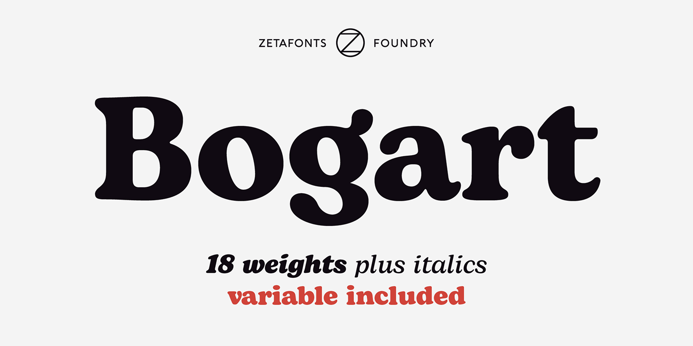
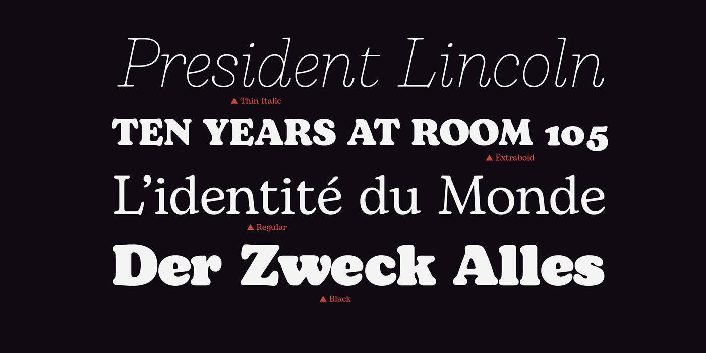
Bogart has been designed in 2020 by Francesco Canovaro as a personal homage to the iconic look of low-contrast oldstyle fat faces, like Cooper Black (Oswald Bruce Cooper, 1922) and Goudy Heavy Face (Frederic W. Goudy and Sol Hess, 1925-1932). Originating from the modern old style of Bookman, these muddy, goopy shapes found their pop culture iconic status thanks to rub-on transfers and phototypesetting systems in the 1960s and 1970s. Positively bursting with hippie energy and exuberant vitality, they often included an extensive repertoire of swash characters, bridging the space between lettering and typography.
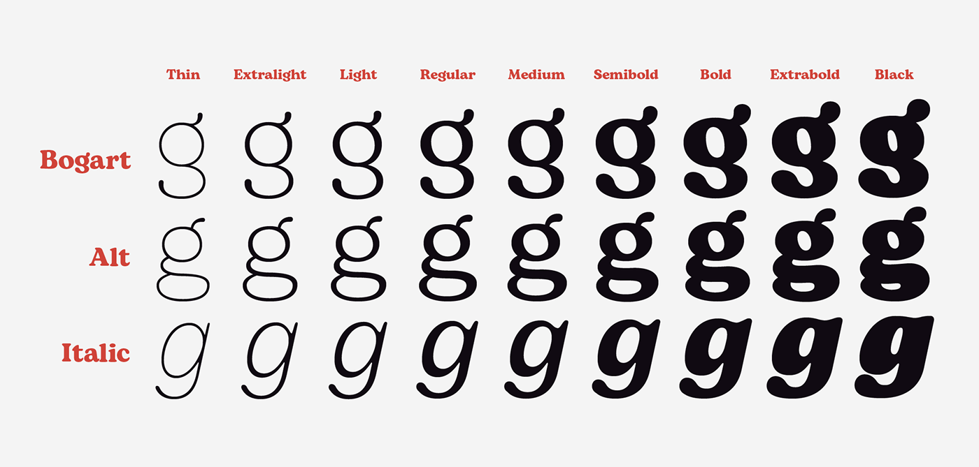
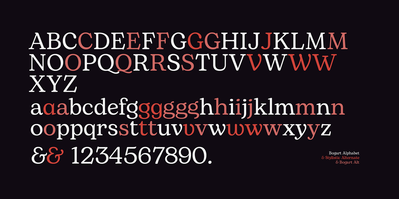
In researching these shapes, Canovaro decided to include also the influence of another idiosyncratic american old style typeface, Windsor, quoting its sloping shapes and quirky solutions, and expanding the weight range of Bogart to include a selection of display light weights where the muddy shapes of the heavy weights distill into elegant teardrop terminals. To add flexibility for editorial usage, a text-oriented Bogart Alternate set of nine weights was added to the family keeping the design more similar to its modern old style model and allowing for a heavy readable mid-weight range.
Because "typefaces are never so good that they can't be made better".
Discover Bogart at 80% discount on myfonts:


Discover the font and download the trial version for free on