

The Whispering Sea
2020
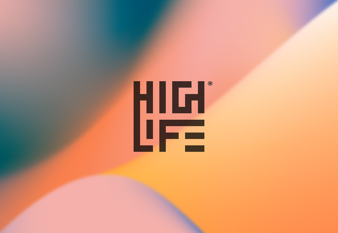
Highlife / It's a way of life
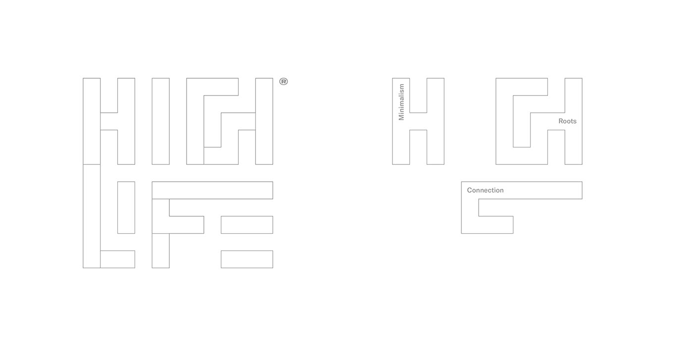
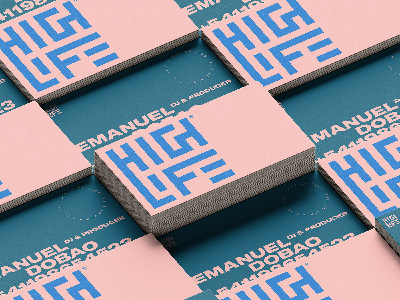
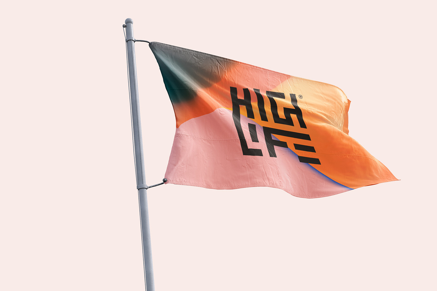
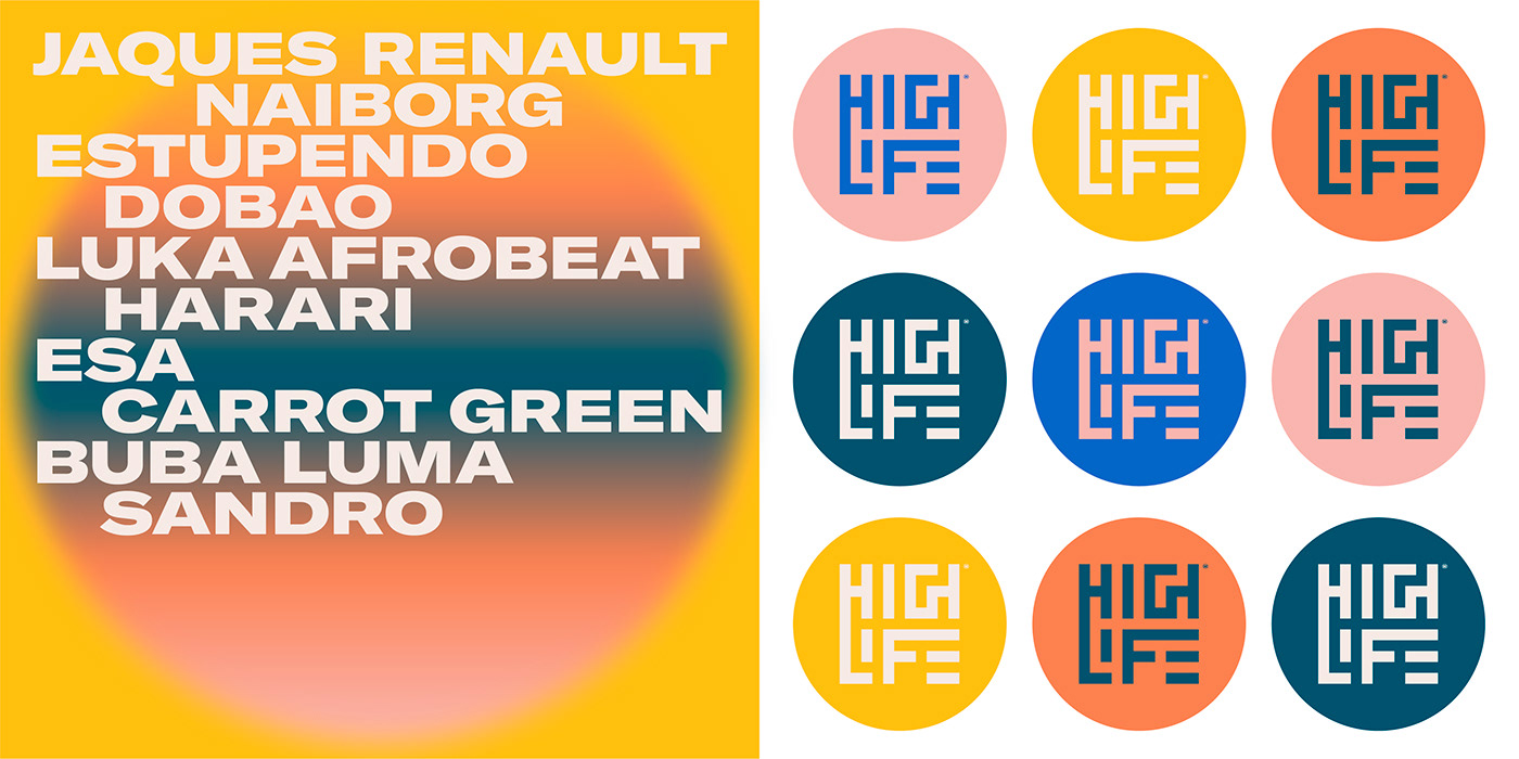
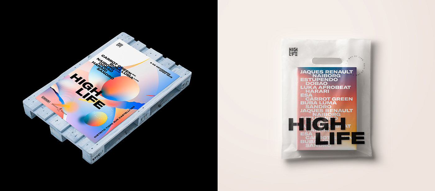
A logo is proposed with the name of the festival (High Life) which, due to its strength and solidity, also functions as an Isotype. Its composition allows it to function dynamically, in different directions and configurations, it also presents the possibility of being animated in the future.
The tradition of African ancestral art was taken as a reminiscence for the morphology of the sign, going back to the roots, but with a modern, minimalist and dynamic structure of signs.

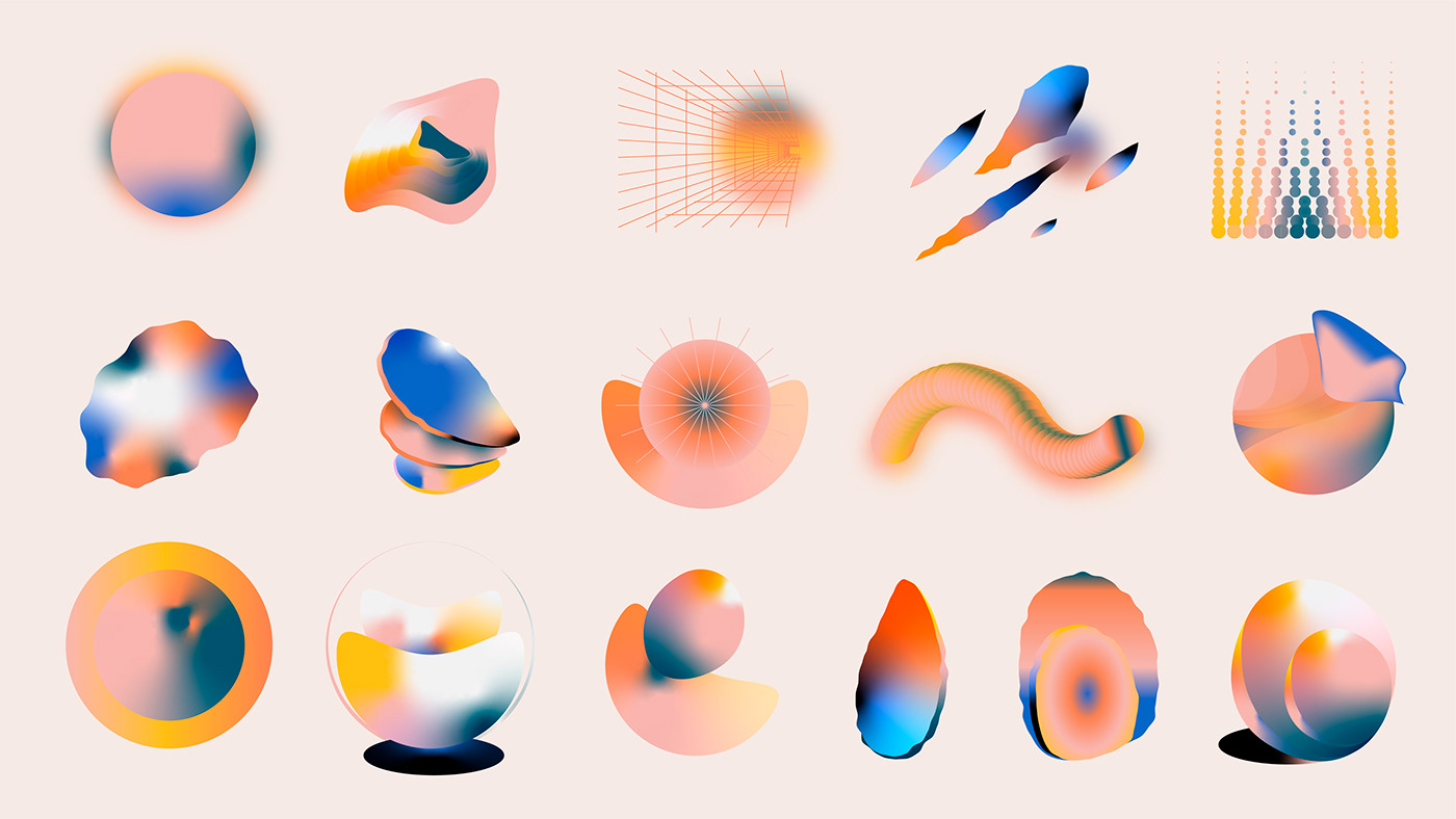
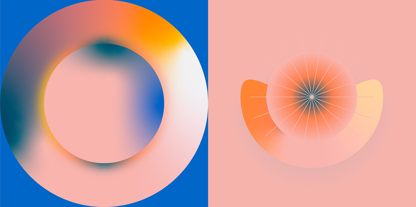
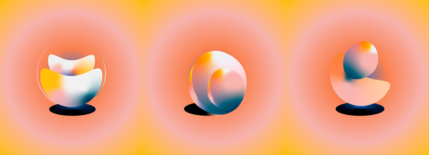
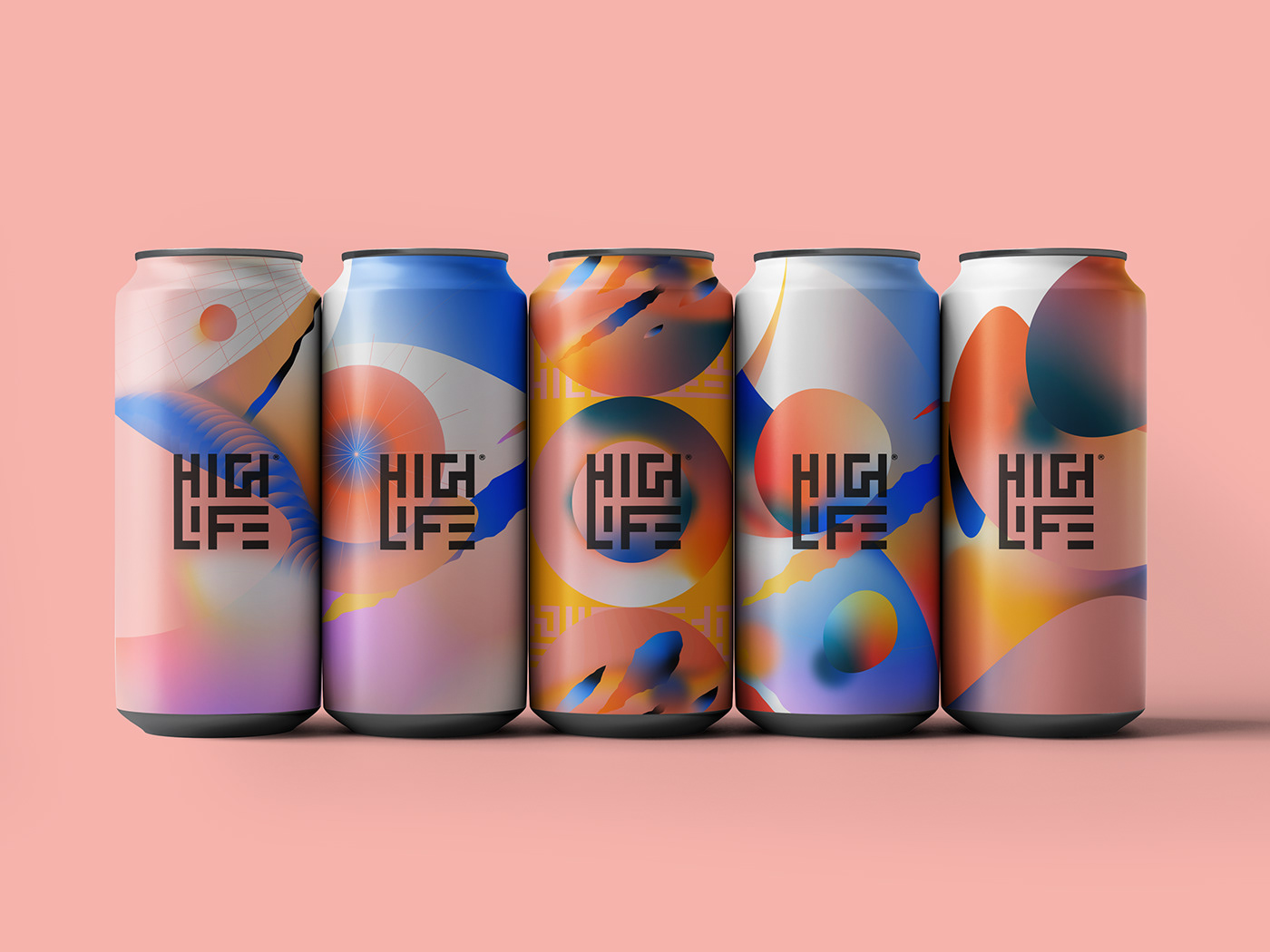
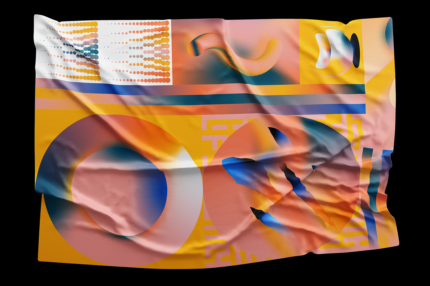
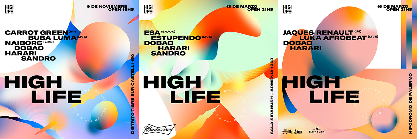
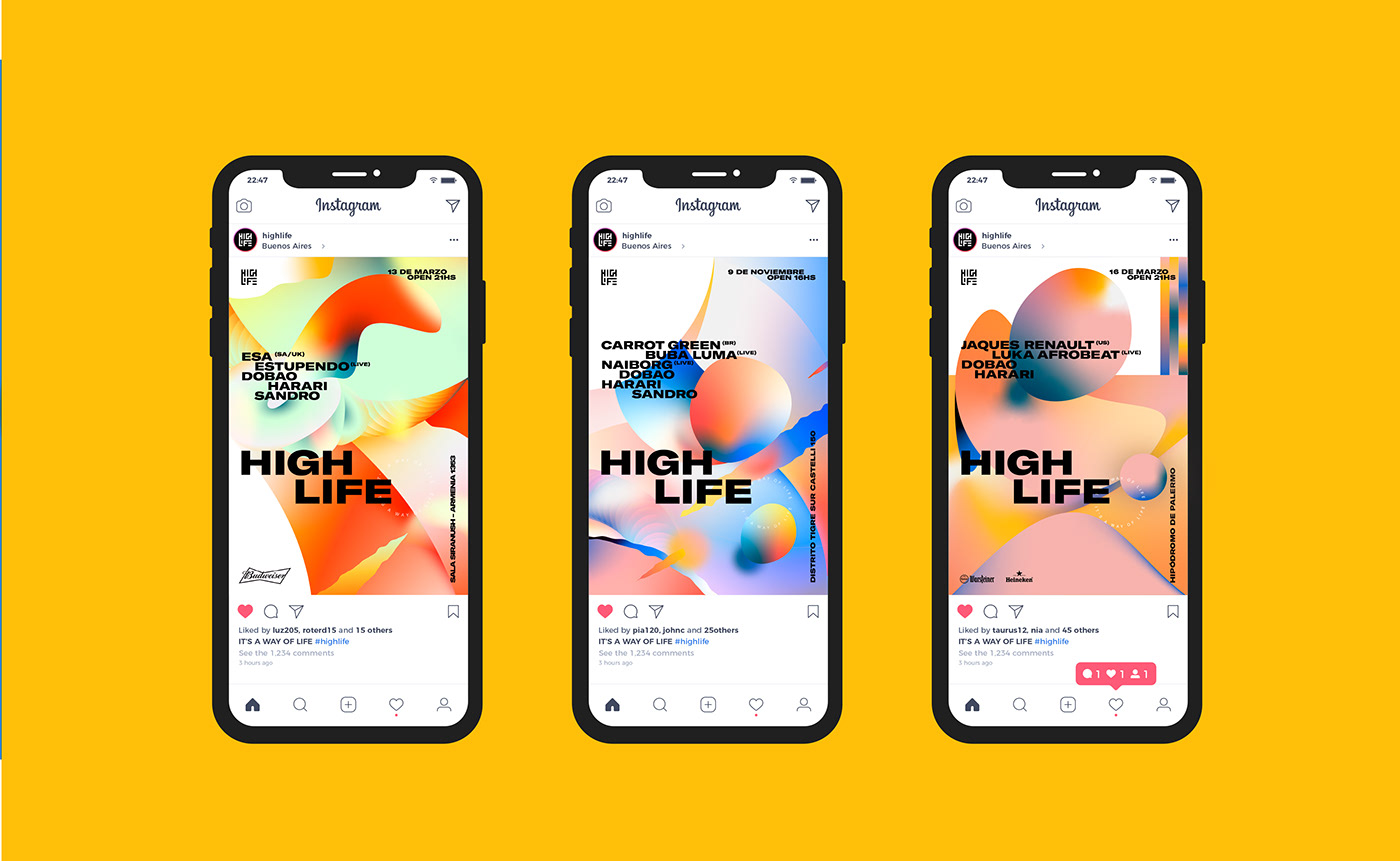
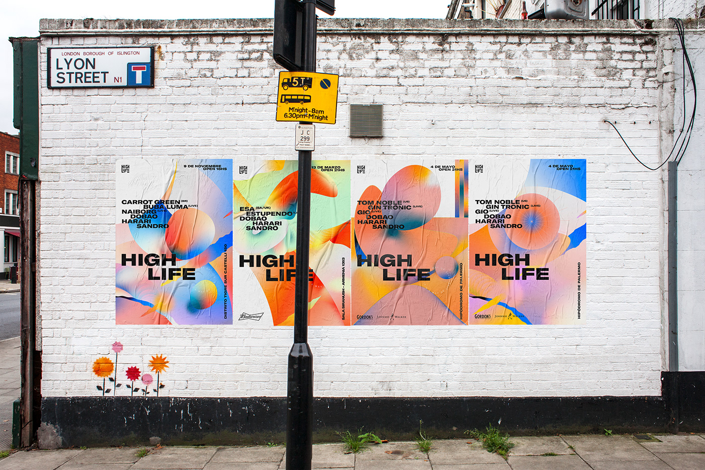
We generate different assets and visual elements to be able to combine and compose new graphic pieces either by superimposing elements, doing zoom-in zoom-out, or using these as a background, among other visual operations.
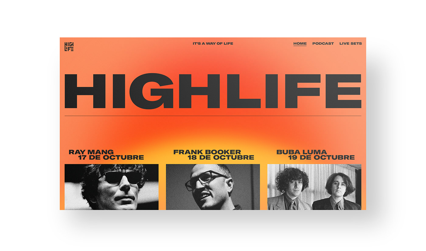
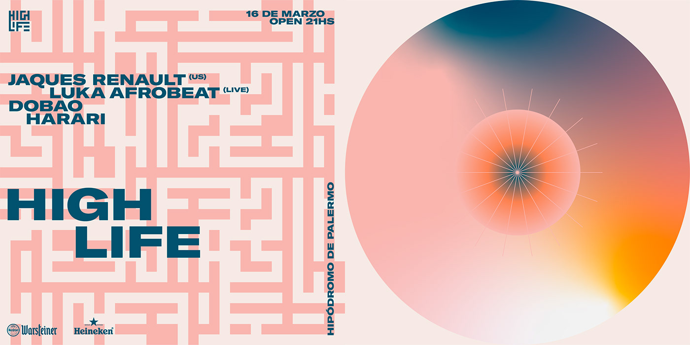
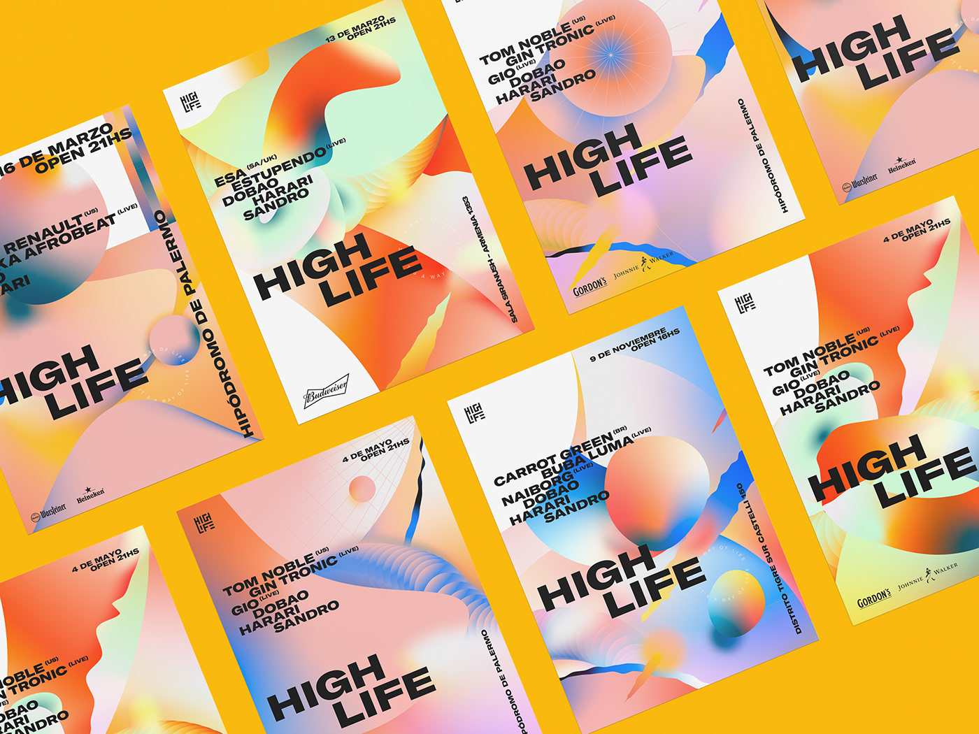
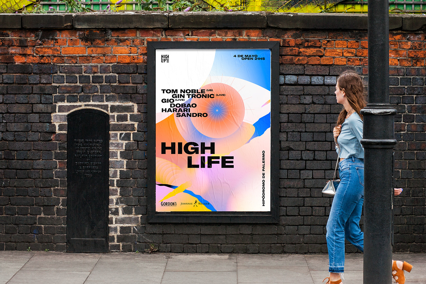
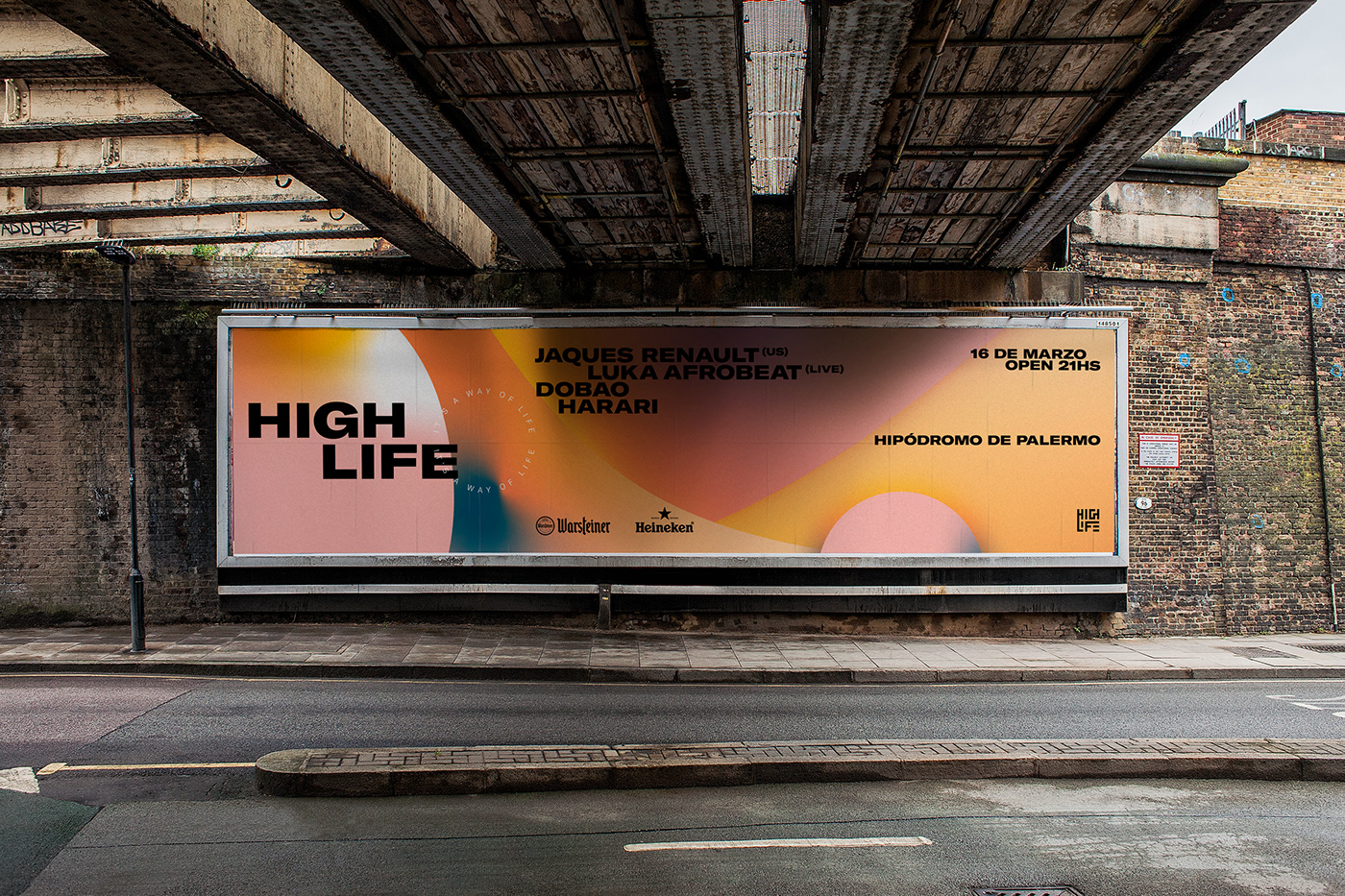
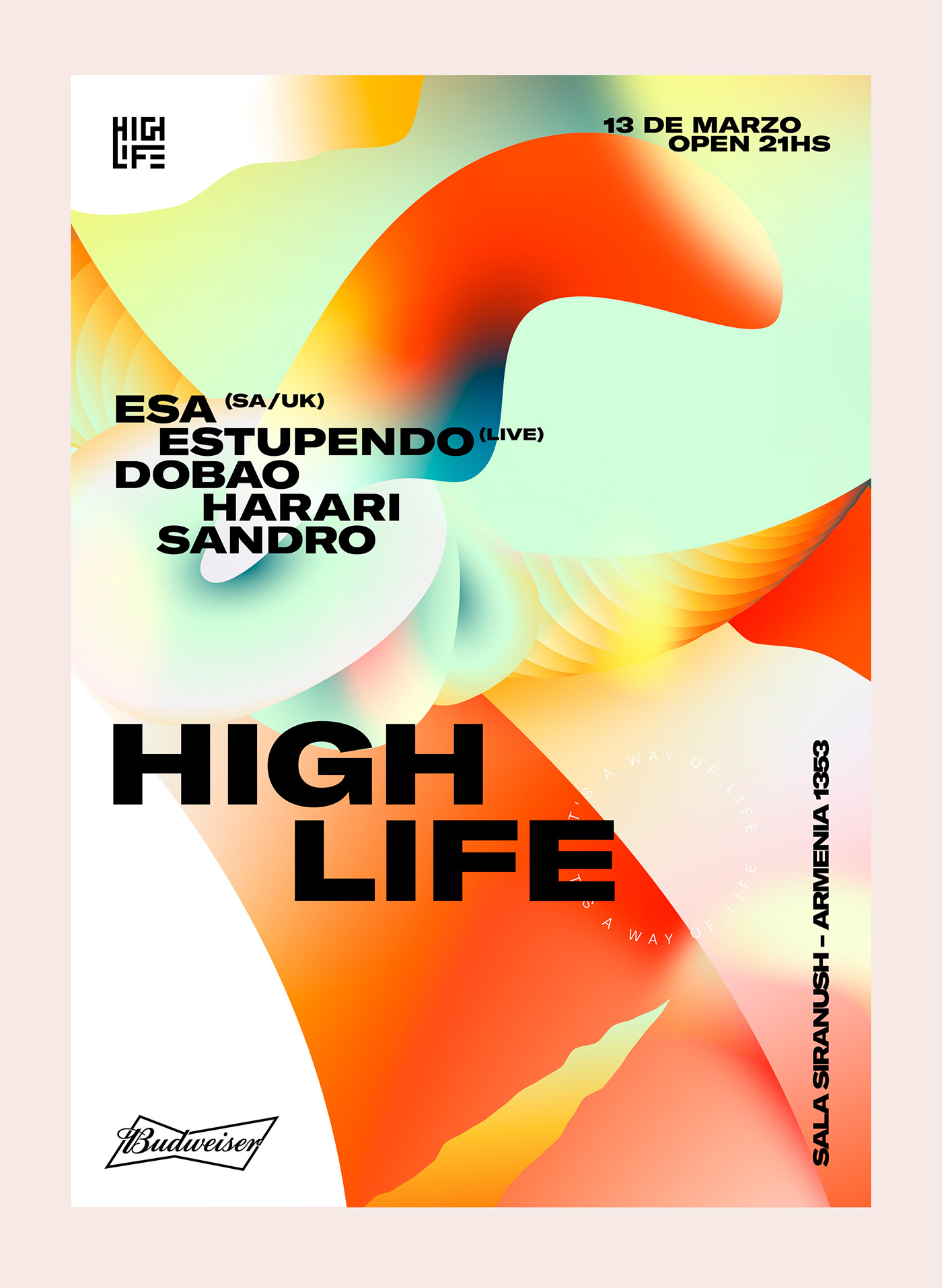
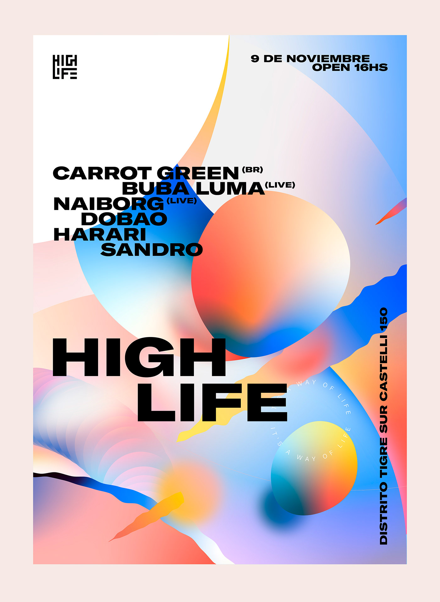
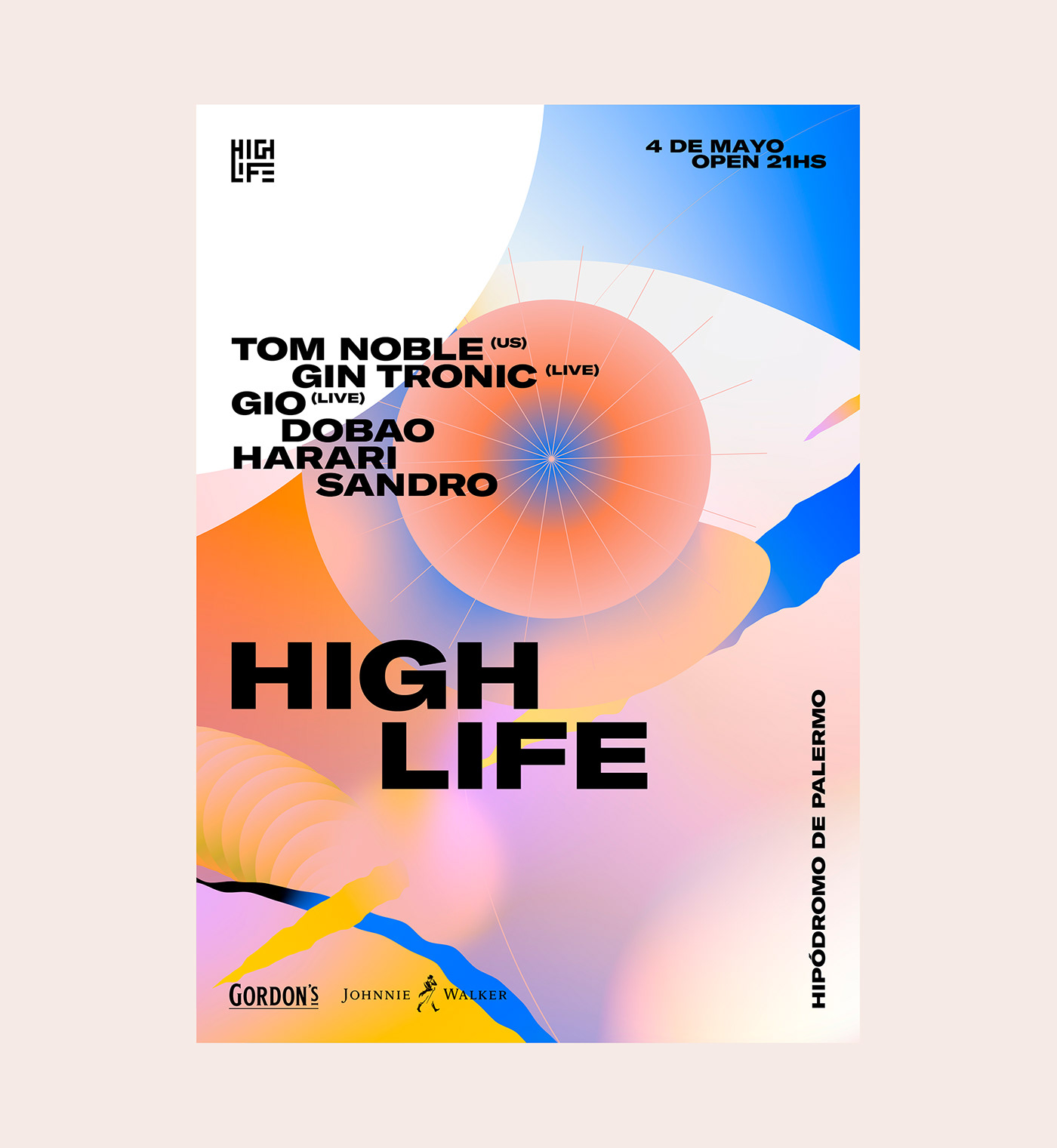
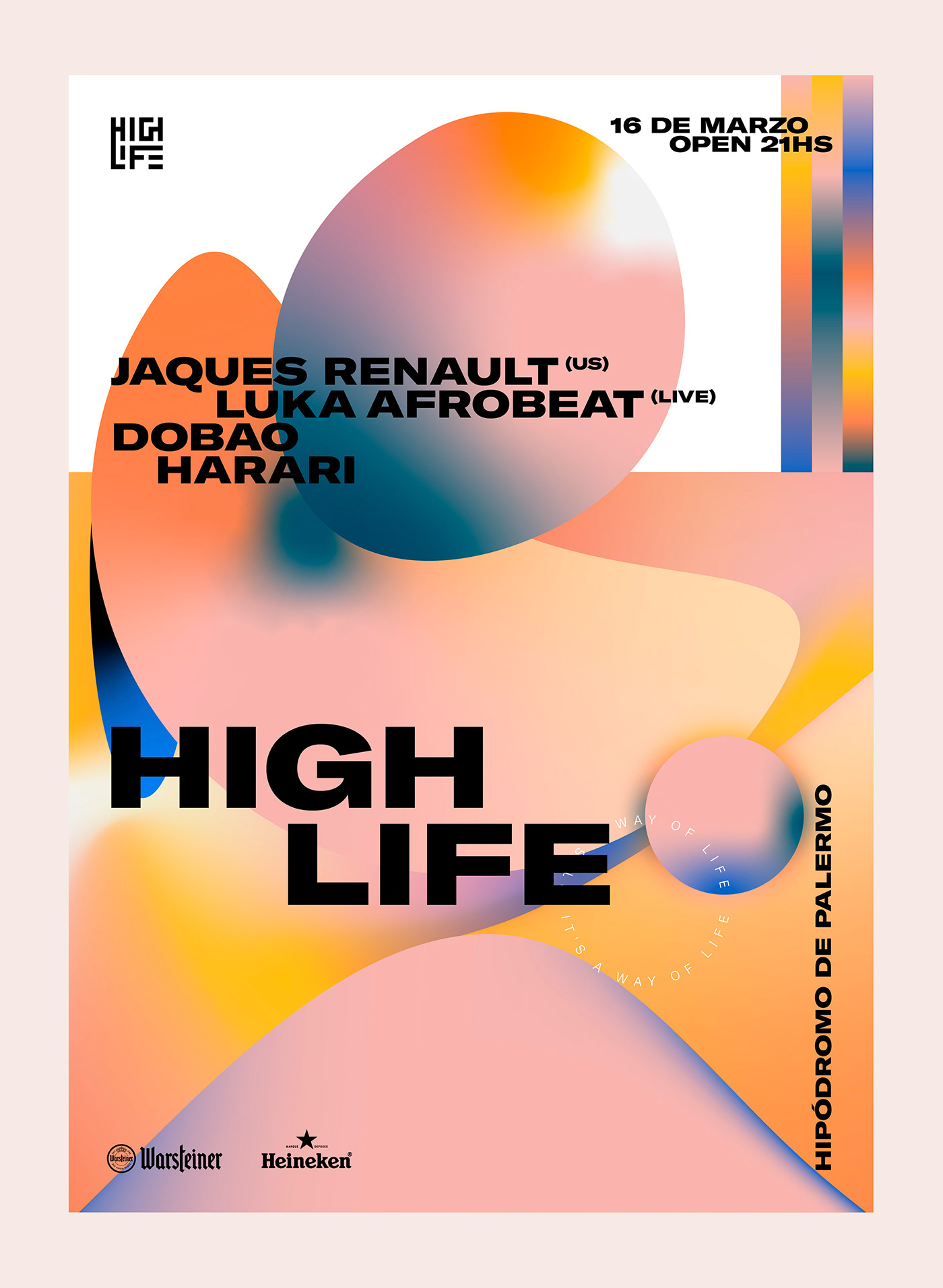
Based on the museum concept, we develop different layout proposals. These function as containers for the visual landscapes that are the central figure of each piece. The minimalism of the typographic layout allows the visual compositions to show off and maintain the legibility of the important data of each piece. Frames and margins are also found in the layout, these were referenced in the structures proposed by the layouts of catalogs and art books, which take care of the work at the time of its manipulation.
Based on the museum concept, we develop different layout proposals. These function as containers for the visual landscapes that are the central figure of each piece. The minimalism of the typographic layout allows the visual compositions to show off and maintain the legibility of the important data of each piece. Frames and margins are also found in the layout, these were referenced in the structures proposed by the layouts of catalogs and art books, which take care of the work at the time of its manipulation.


Client: Highlife
Partners: Emanuel Dobao, Tomas Palazzo, Ariel Harari, Sergio Guevara
Partners: Emanuel Dobao, Tomas Palazzo, Ariel Harari, Sergio Guevara
Director & Lead Designer: Angello Torres
Designers: Lucas Rodriguez, Pamela Blanco
Animator: Charly Dhave, Fifi Lachimia
Designers: Lucas Rodriguez, Pamela Blanco
Animator: Charly Dhave, Fifi Lachimia


