


About the project
The history of Lipetsk ice cream begins in the distant 1962. Lipetsk ice cream was loved by residents of many cities of the former USSR, it was considered one of the highest quality and delicious.
Today the refrigeration plant occupies a leading position in the Central Black Earth Region, its products are widely distributed in more than 40 regions of Russia and beyond.
A task
Paying attention to the stagnation of sales dynamics, the company's management decided to redesign the product, setting us the task of creating a unique brand image that allows us to differentiate ourselves from competitors and convey the advantages and values of the brand to the consumer through visualization on the packaging, thereby strengthening trust in the brand.
Decision
The main message in brand communications is appeal to the heritage, traditions and quality standards of GOST.
GOST remains a significant reason for trust to this day, but along with the withdrawal of counterfeit products from store shelves, faith in GOST as a quality mark in certain product categories is also disappearing.
Therefore, in order to endow the old set of letters with a meaning that over time has ceased to be transparent and understandable for the buyer, it was necessary to reveal the history of this standard in our ice cream.
Lipetskoe GOST is ice cream, which is created according to original recipes, unchanged since 1962 from high-quality raw materials by the caring hands of people working at the Lipetsk refrigeration plant.
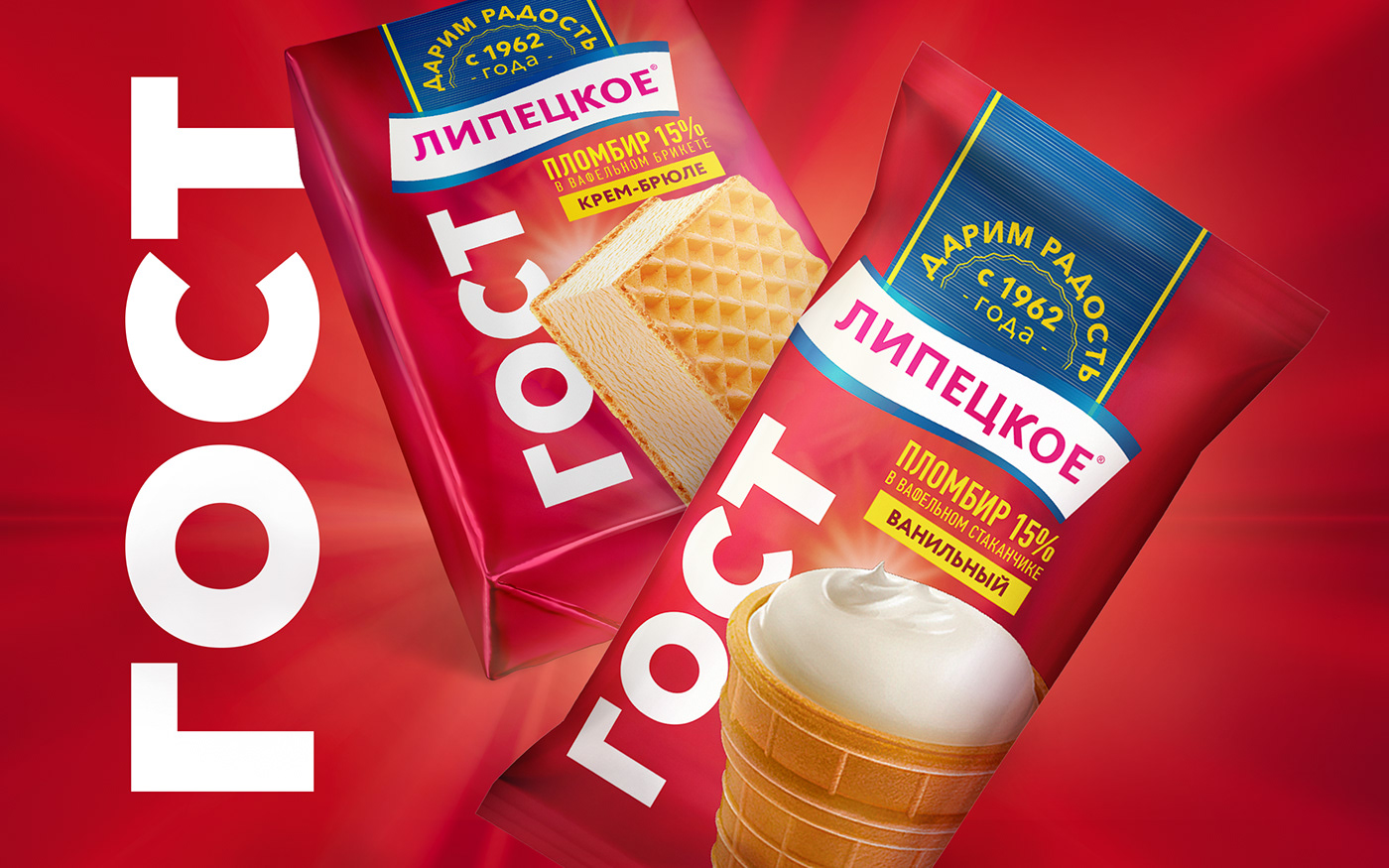
Among the RTB products, we highlighted the following: the history of the manufacturer since 1962, adherence to original recipes that have not changed over the years and a suitable assortment, which most associate with the past era (cups, briquettes, popsicles)
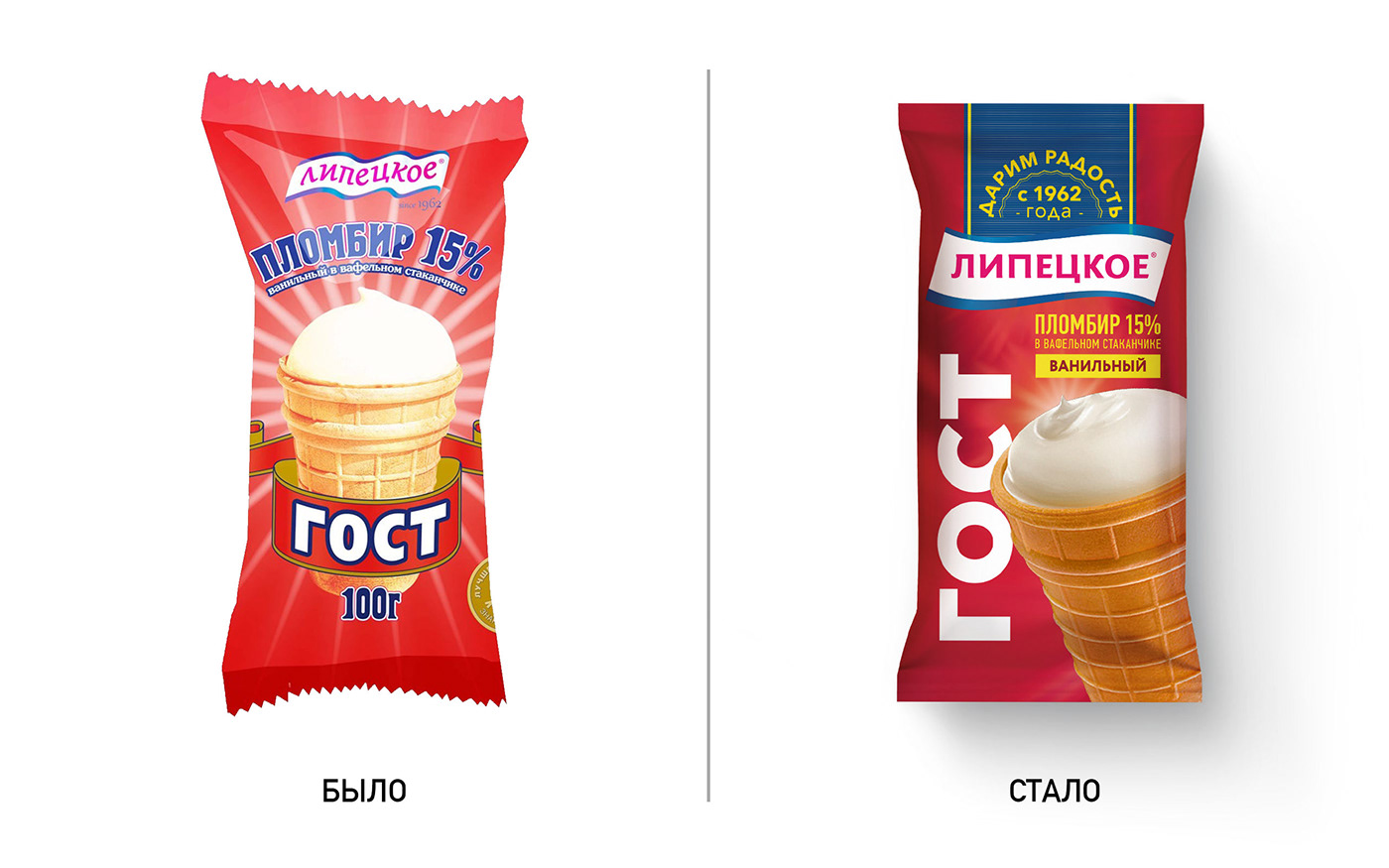
The old design used rather crude fonts and graphics. By itself, the GOST inscription was not a driver for the purchase. The product was perceived as cheap and "old" and had a weak connection with the manufacturer's brand.
Using our author's technique "3 layers of efficiency" we worked and strengthened each layer in the design.
Visual layer
We have strengthened the manufacturer's area: not just GOST, but LIPETSKOE> GOST> 1962. They emphasized that this is an "ice cream with history", which has preserved the original recipes and is made from quality raw materials. Highlighted the manufacturer's brand identity. The contrasting colors of the packaging increased the visibility of the product on the shelf.
Context layer
It became informative: it is immediately clear what kind of product is inside, its taste, fat content, that is, all the properties of the product are revealed.
Conversion layer
Emotional slogan - we give joy since 1962, at the same time evokes warm feelings and convinces the buyer that he has a quality product in front of him, enhances trust.
The result is a traditional yet stylish design that emphasizes production traditions without giving the impression of old "retro" ice cream.


