

Skin Retreat is a Helsinki based skin and spa salon. Skin Retreat focuses on effective skin care without compromising on the comfort of the treatment. Our task was to connect a retreat-like mood into the brand.
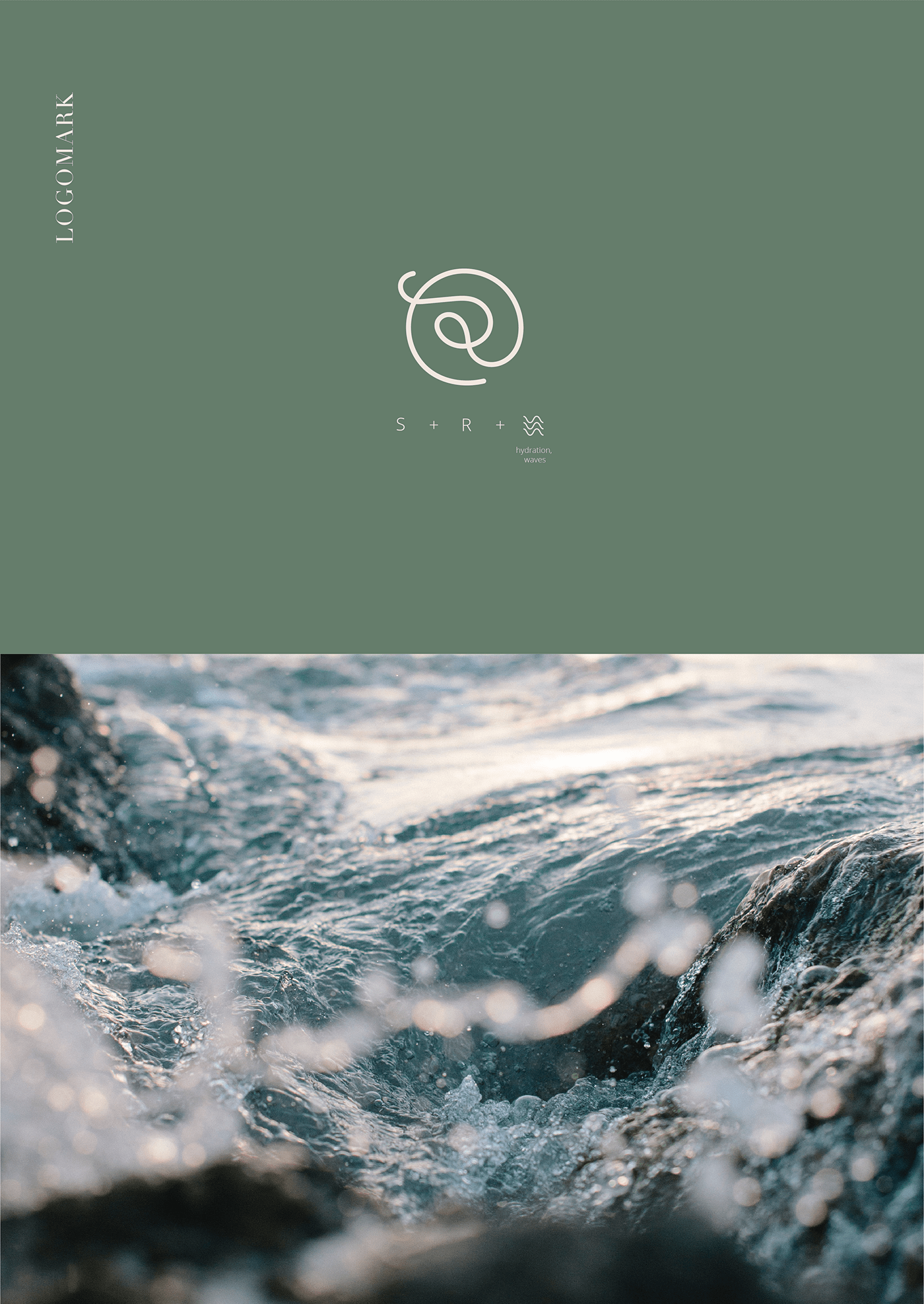
The logo is a fusion of letters and a spiral, which represents hydration, waves and energy. Logotype is a combination of two fonts, makes it readable and doesn't require space between two words.


The color palette was inspired by elements like water, skin and nature. Therefore, it is neutral and balanced but the highlight colors make it unique.
Typography is classic though minimal including a serif and sans serif fonts.


Thank you for watching and your appreciation!
Photos: Unsplash

