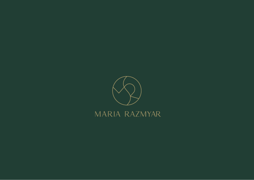
Maria is a physical wellness professional and coach with a degree in Chinese Medicine and Acupuncture.
The aim was to combine her main focus in one simple and minimal symbol.
The aim was to combine her main focus in one simple and minimal symbol.

The logotype is a customized font from and original Selna font. Selna is elegant and modern serif font. However, we transformed it into a sans sefir get the balance with the logo symbol. Original Selna font is used for example, in subheadigs.


The symbol represents several things. Firstly, there are the initials of the person herself. Secondly, there is representation of movement or an active body, spine which keeps us standing. And thirdly, there is the balance. Balance between and mind, yin-yang. Strong body is merely a strong mind.
All of this is smoothly combined and transformed into a fluid symbol.
All of this is smoothly combined and transformed into a fluid symbol.


Thank you for viewing, and leave a thumb up!
