Tealer
Tealer is a brand created by me and Julián Muñoz for the second semester of their Master in Graphic Design. The general concept of this tea brand is creating an international eco-responsible, urban, young and dynamic brand and shop. In order to escape the traditional approach to tea, we established a new code, and a new way of thinking a brand, bringing it closer to the consumer and his daily routines and escapes.
Naming
Tea + Dealer = Tealer
With this naming we tried to achieve a modern, urban name.
Easy to remember and to associate with our image goal.
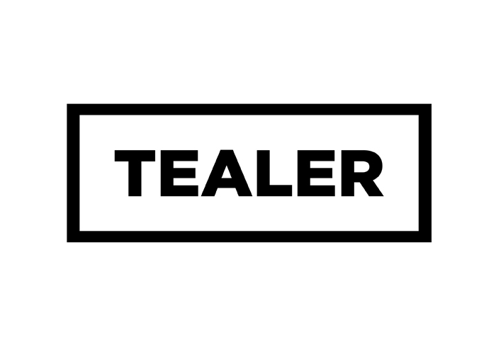
Logotype
Typography — Gotham
We used Gotham for the logo and for all the applications in order to create
a narrative that was bold, clean, simple and recognizable at the same time.
We have two versions for the logo, the general one and the second one it's used in the respective country using the same code that Airports use for cities. Ex: AMS - Amsterdam


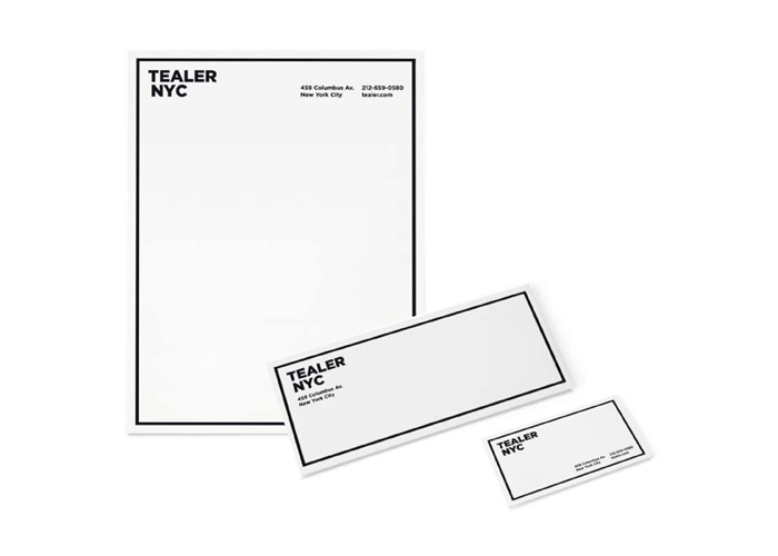
Visual System
Along with the logo and inspirared by these big cities we use a frame that changes in every application.
Creating a easily recognizable system. The color and the gradients are also part of this system. In the stationary the gradients are made manually by offset printing and this allow us to use a lot of different colors (split fountain technique) and gradients with little budget. The publication made for this project can be seen here.


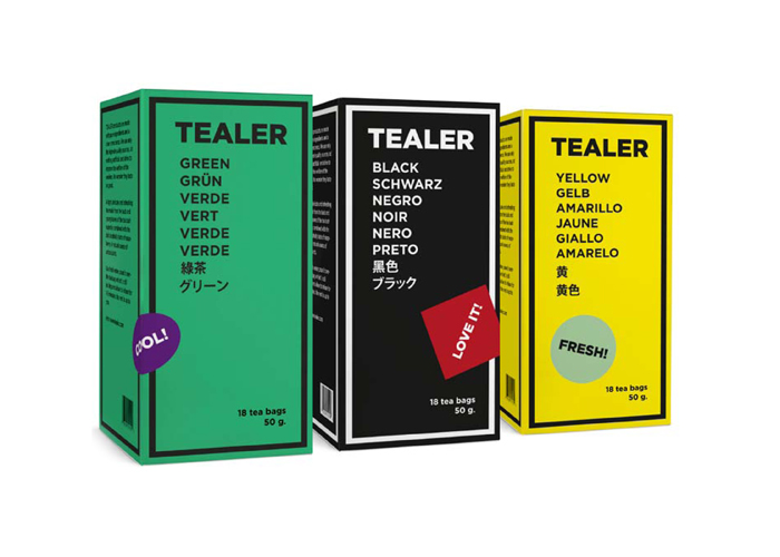
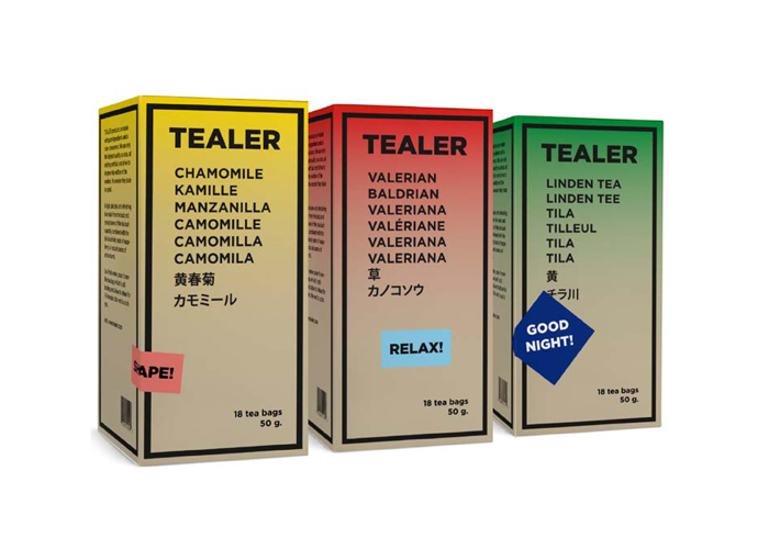
Packaging
Here the colors have an extra purpose because they help the client to recognize the three different tea collections. The traditional teas, the traditional infusions and our own mixtures.
Also we have a collection of stickers that the staff use to personalize the packs in which store. These stickers are like little clues that help the client to know what kind of tea are they buying.
Also we have a collection of stickers that the staff use to personalize the packs in which store. These stickers are like little clues that help the client to know what kind of tea are they buying.

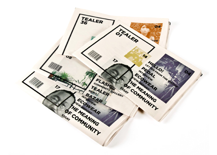
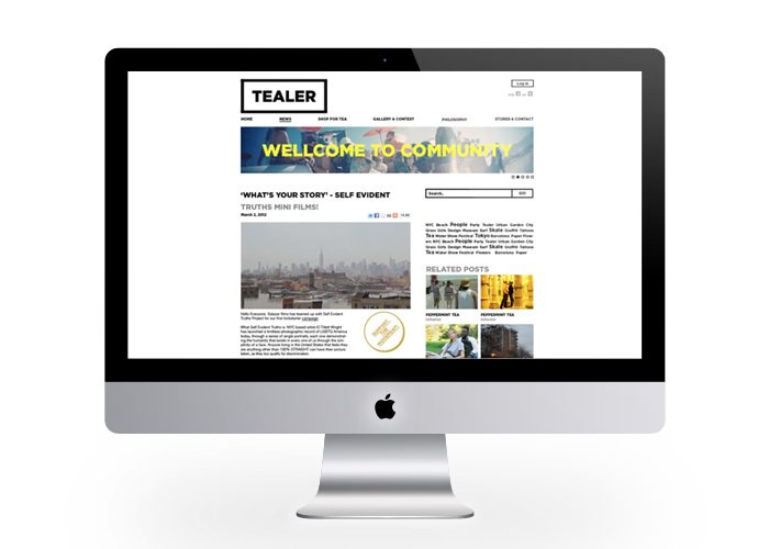
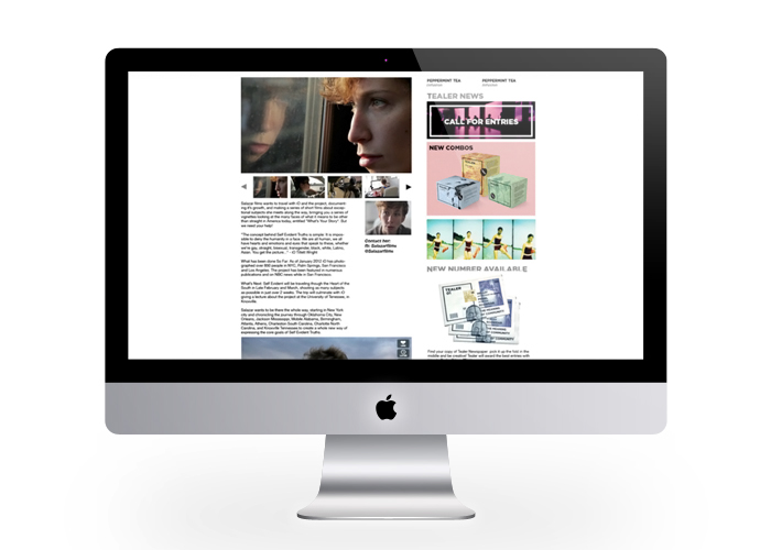
Website
The most meaningful purpose of the website besides its function as a store is the connection with the printed publication because it allows the community to participate in a dialogue that is consistent with the philosophy of the brand and be a part of the printed publication. We promoted this with contests and a photo gallery.


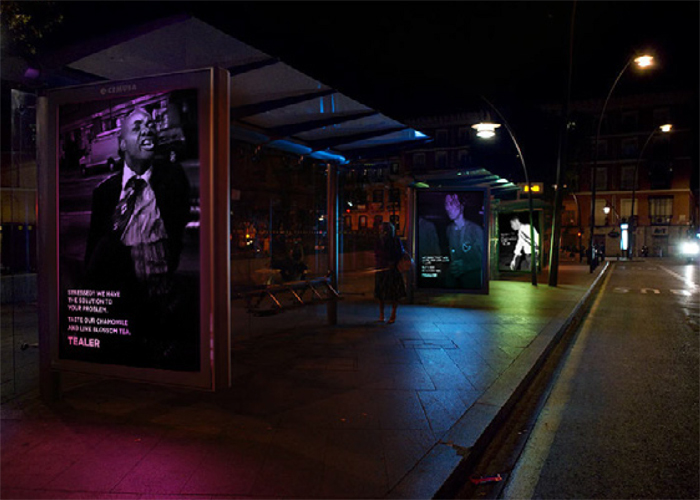
Campaign
Our idea is based in the split fountain technique and how could we translate that to an advertising space in a city and also we really wanted to portrait real people in the ads. So we picked Charlie Kirk's portraits of anonymous people printed the copy in an especial ink that reacts to a certain light and illuminated the photos with two lights of different colors that when lighted would revealed a hidden message. So by day you would see a beautiful photograph with only the logo signature and by night the photo illuminated with the message.