

Miscellaneous Art
Various, Largely Unrelated Pieces - Professional and Personal
Various, Largely Unrelated Pieces - Professional and Personal
There's no particular theme to this selection. Most of these are various illustrations and such I've done in the course of working in the Auto Krafters, Inc. Catalog Production department. Others are personal projects pursued as either a creative outlet or just for laughs.
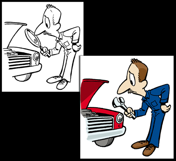
Clip Art Guy
The line drawing above left is something I drew on a whim to accompany a column filler in one of the company's auto parts catalogs. Years later, I was called upon to digitally alter it slightly and colorize it for use in one of the company's weekly email campaigns. The result is above right.
The line drawing above left is something I drew on a whim to accompany a column filler in one of the company's auto parts catalogs. Years later, I was called upon to digitally alter it slightly and colorize it for use in one of the company's weekly email campaigns. The result is above right.

Ford Baby Redux
I was asked to draw a cute Baby New Year for the first email campaign of the new year, but since I work for a Ford parts warehouse, I thought I'd make it more Ford-specific. Thus: the Ford Baby. Later in the year, Ford Baby was revamped for a Father's Day email.
Please note: I do not endorse or encourage underage child labor. This is just a humorous illustration. No actual babies were harmed in the making of this illustration.

Fathers Then and Now – Auto Krafters Company Blog Spot Illustration
I wasasked to draw something funny that was both automotive-relatedand appropriate for a Father's Day blog posting. I hope this succeededon all counts.
Drawn with a graphics tablet.
I wasasked to draw something funny that was both automotive-relatedand appropriate for a Father's Day blog posting. I hope this succeededon all counts.
Drawn with a graphics tablet.

Harried Mother – Auto Krafters Company Blog Spot Illustration
As with the Father's Day cartoon, I was also asked to draw something fun to accompany the Mother's Day blog post.
Partly drawn with graphics tablet, partly scanned drawing.
As with the Father's Day cartoon, I was also asked to draw something fun to accompany the Mother's Day blog post.
Partly drawn with graphics tablet, partly scanned drawing.

Artwork for Auto Krafters Company Mug
Shortly after moving into the new building, I was asked to photograph it and adapt the photograph for use on mugs for the employees. Here is the result.
Shortly after moving into the new building, I was asked to photograph it and adapt the photograph for use on mugs for the employees. Here is the result.

Artwork for Auto Krafters Cruise-in Trophies
This is the only design I was asked to create for the trophies for the car shows the company would periodically hold. I'm rather pleased with the way it turned out. Since there were several different trophy categories, the design was used several times over. Nice exposure.
This is the only design I was asked to create for the trophies for the car shows the company would periodically hold. I'm rather pleased with the way it turned out. Since there were several different trophy categories, the design was used several times over. Nice exposure.

Unused Finca Santa Marta Logo
I was approached to help create a logo for Finca Santa Marta, an organic farm in Panama. The clients had already decided on the typography; they just wanted a graphic to accompany it. Since the farm's slogan is "Healthy Food for Panama," I used Panama's national flag for inspiration and incorporated elements the clients desired. In the end, the client rejected this design and chose instead to use a graphic of their own design.
I was approached to help create a logo for Finca Santa Marta, an organic farm in Panama. The clients had already decided on the typography; they just wanted a graphic to accompany it. Since the farm's slogan is "Healthy Food for Panama," I used Panama's national flag for inspiration and incorporated elements the clients desired. In the end, the client rejected this design and chose instead to use a graphic of their own design.

Table Signs for Asbury UMC Missions Fair, October 2001
This began as a sign for a single table, but grew to become the sign for ALL tables at this fair.
The Asbury United Methodist Church Missions Fair is an event highlighting the achievements of and recruitment for UMC missionary work. I was enlisted to help create a display for the "United Methodist Women" table, which, obviously, focused on the field work of the church's women missionaries. Leaping at the opportunity to create the sign for table, I designed a couple of background image concepts (1 and 2) using autumnal colors and a bit of Illustrator path interaction I was fond of playing with at the time. The title of the table's theme could then be laid over it.
As things moved along, and the chosen theme of this table shifted and wavered, I realized a less theme-specific background was in order. After reworking the text and fading out the design to create a watermark effect (3), the final version (4) was met so favorably that it was adopted for use on ALL the tables' signs. Sort of. Sadly, the Illustrator file I created was used merely as a template for an aped version someone else attempted to create using Microsoft Word, and those were the signs seen at the fair.
Having a more mature design sense now, I would give greater consideration to the interplay of shapes if I were creating this sign today. Still, I like the overall concept behind it.

Inappropriate Design: Where's My Cow?
Terry Pratchett fans will either laugh at this or just scratch their heads.
This is just a typography experiment using a font I don't typically get to use. It's a faux-retro-Euro-propaganda-style bit of nonsense. "Who Watches the Watchmen?" That's a slogan. "Where's My Cow?" In German? That's just ridiculous. I guess I was a bit giddy that day.


