PONCIN METAL BRANDING
- - - - - - - - - - -
Our fast paced world requires us to work, build, create and deliver always faster.
But to what risk? The loss of agility and precision. In today's constantly evolving world,
these two elements are however at the core of Poncin Metal’s strategy
and its indisputable competitive advantages.
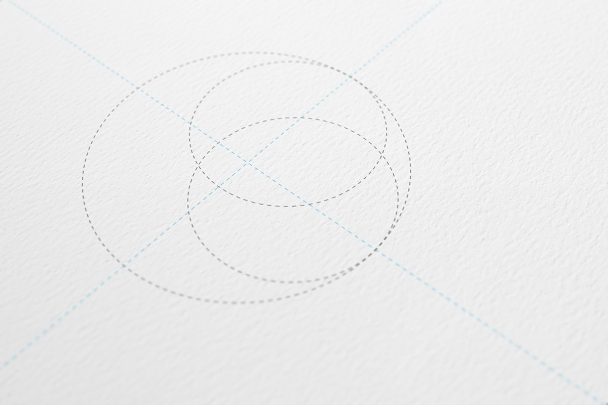
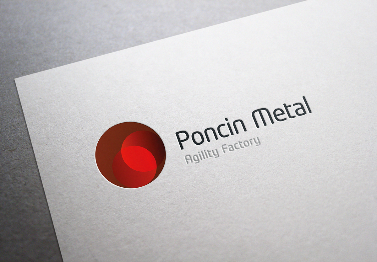
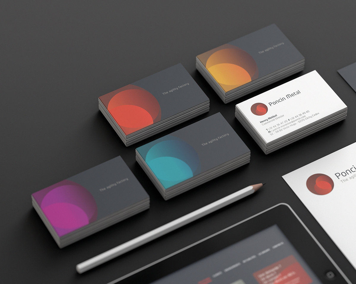
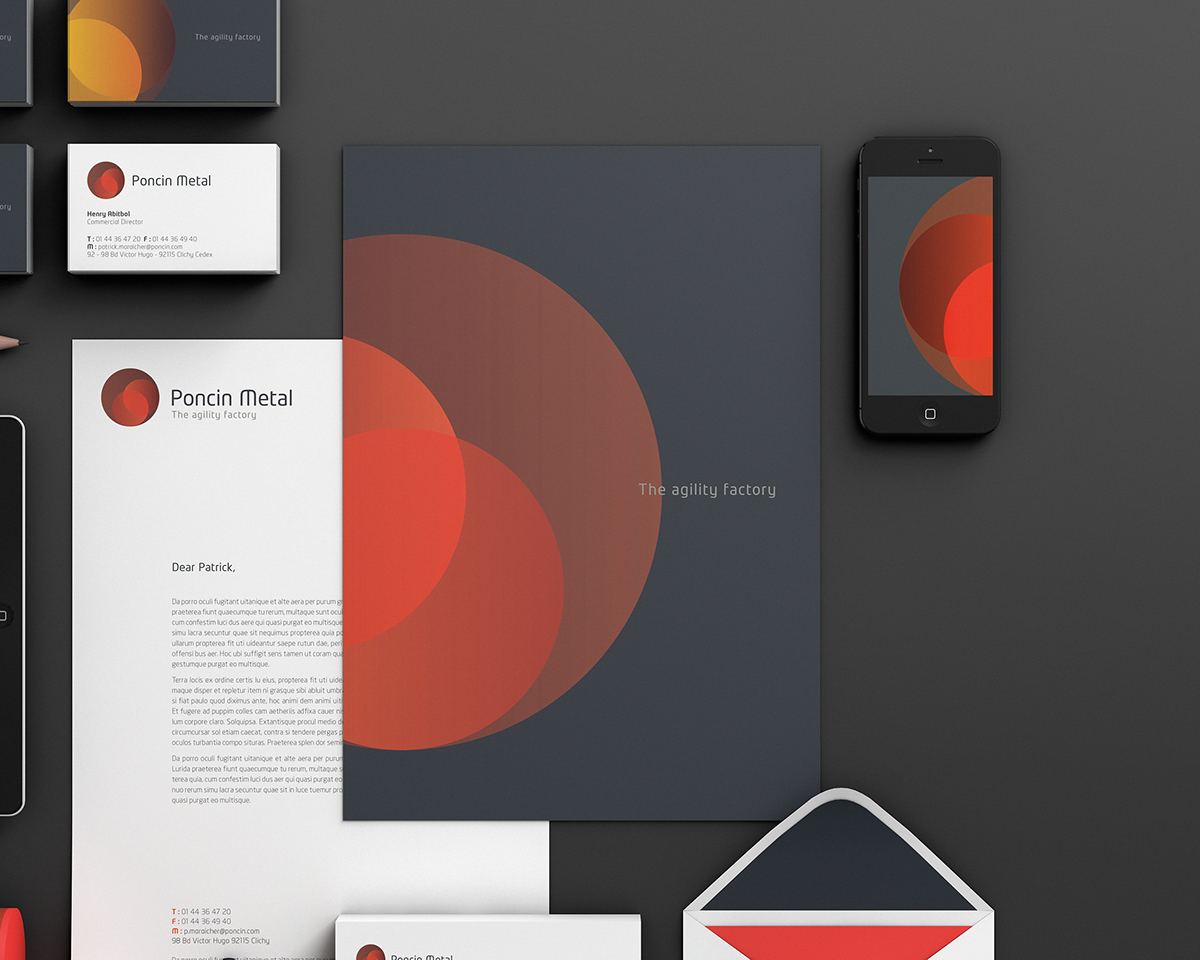
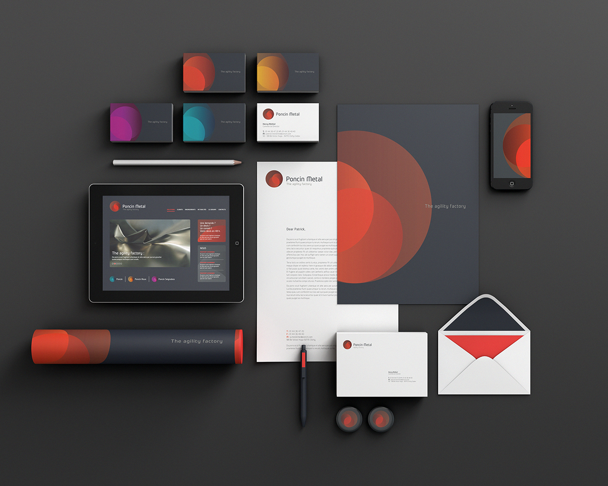
The circle, depicted in the logo, symbolises all the fundamental aspects of the company’s expertise.
By turning on itself, it represents the ABC'S of positive movement:
agility, balance, coordination and speed.
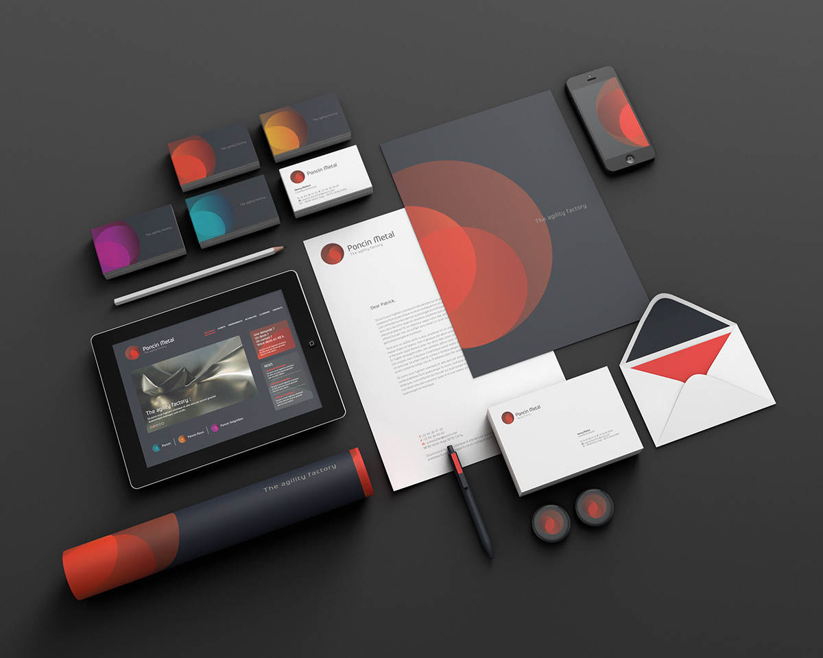
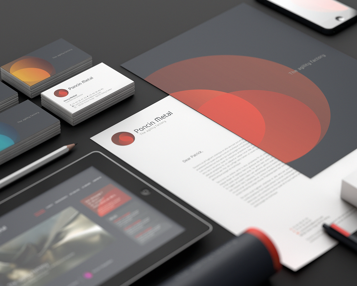
The anthracite grey background, a wink to the steel industry, offers stability
and lays the foundations of Poncin Metals’ future developments.
The use of different colour codes enables a 360° overview of all its activities:
red for the Group and orange, blue, purple for the subsidiaries.
- - - - - - - - - - -