

How much warmer is your city?
BBC News
BBC News

BBC News
Visual Journalism Team
Visual Journalism Team
DESIGN
Prina Shah and Irene de la Torre Arenas
Prina Shah and Irene de la Torre Arenas
DEVELOPMENT
Alexander Ivanov and Becky Rush
Alexander Ivanov and Becky Rush
DATA JOURNALISM
Nassos Stylianou, Clara Guibourg and Paul Rincon
Help with the methodology and data analysis was provided by Zeke Hausfather at Carbon Brief, Karsten Haustein and Friederike Otto at the University of Oxford Environmental Change Institute.
Nassos Stylianou, Clara Guibourg and Paul Rincon
Help with the methodology and data analysis was provided by Zeke Hausfather at Carbon Brief, Karsten Haustein and Friederike Otto at the University of Oxford Environmental Change Institute.
How much warmer is your city? is a project that explains to the general public how much the temperatures have risen since 1880, and how much they could increase in the next 80 years. The article uses data visualisations to explain these changes and it is divided into three parts: the past, the present, and the future.
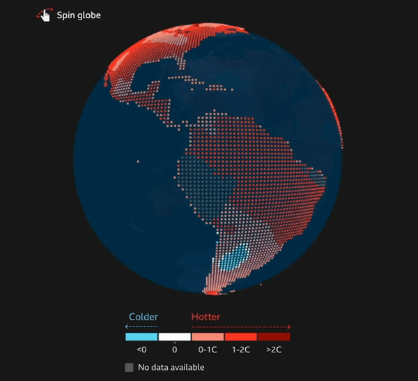
Spiny globe
The first part is focused on how much the temperatures have already changed worldwide. To do so, a spiny globe shows the temperature variation in the last 10 years compared with 1880-1900. The second segment explains how much temperatures have varied in specific cities, and how much they will change in the future. A search lookup controlled through scrolly-telling techniques explains the different projections for a city.
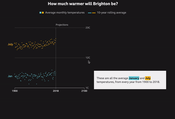
Chart that animates as the user scrolls
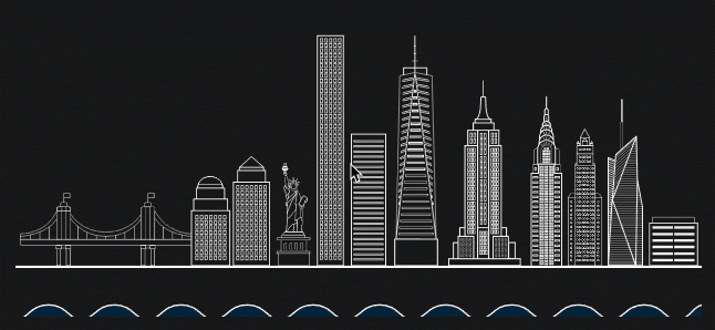
The last part finishes addressing possible outcomes of climate change. Three case studies explain known effects for the rise in temperatures: Jakarta sinking, floods in New York, and the Arctic melting.
You can learn more about how the project was done here


