Chapter TwentyTwo Branding Design
第二十二章品牌設計
Design Agency : StudioPros.work
Creative Director : Yi-Hsuan Li 李宜軒
Art direciton : Yi-Hsuan Li 李宜軒
Visual design : Yi-Hsuan Li 李宜軒 / Kai-Hsiang Ho / Jan-Yi Lee
Visual design : Yi-Hsuan Li 李宜軒 / Kai-Hsiang Ho / Jan-Yi Lee
Design Concept : Kai-Hsiang Ho
Logo Animation Direction | Group.G 谷汩文化
Logo Animator | Chi-Hao Chu 朱啟豪
Photographer : Shengyuan Hsu(Link)
Printer: Wei-Yang Printing Enterprise Co.,LTD
Date : March. 2020
Logo Animator | Chi-Hao Chu 朱啟豪
Photographer : Shengyuan Hsu(Link)
Printer: Wei-Yang Printing Enterprise Co.,LTD
Date : March. 2020
-
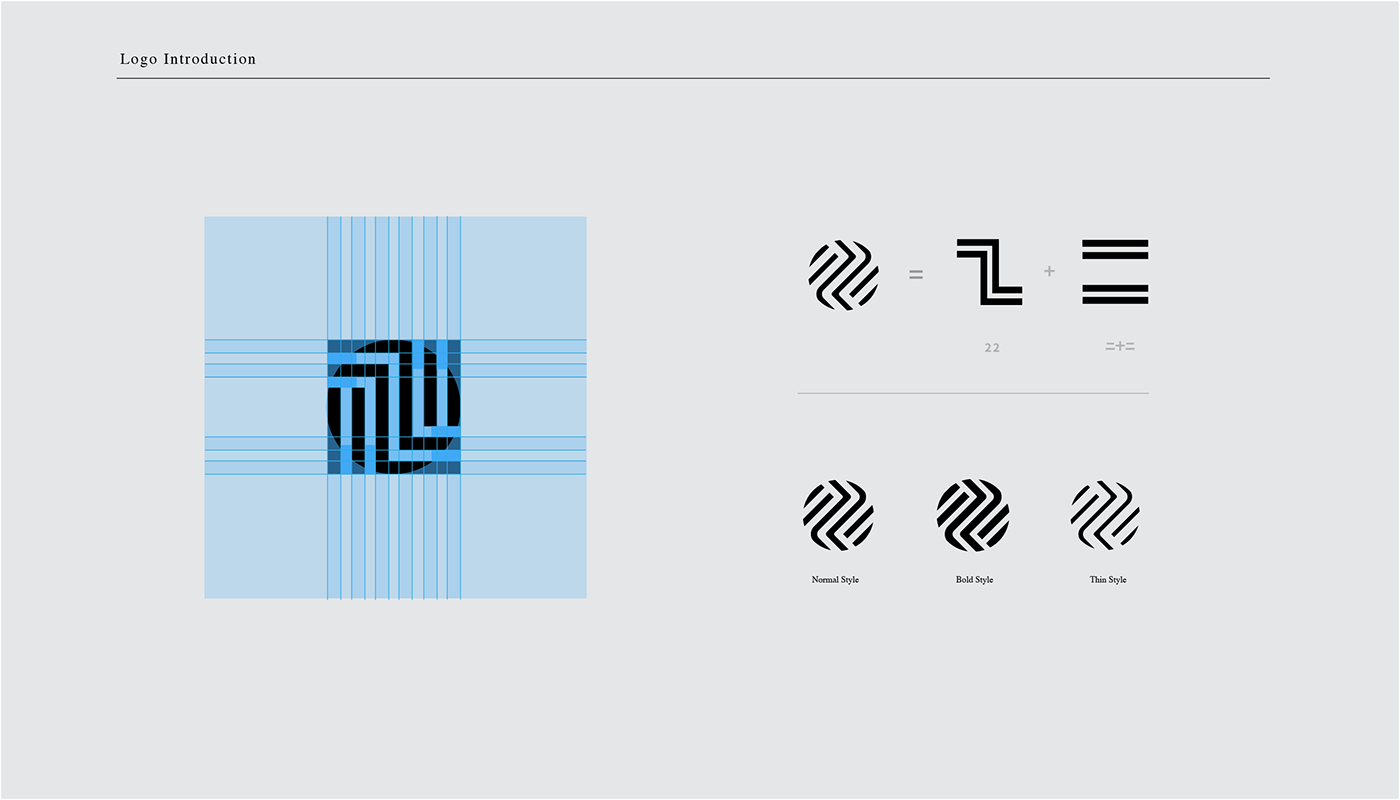
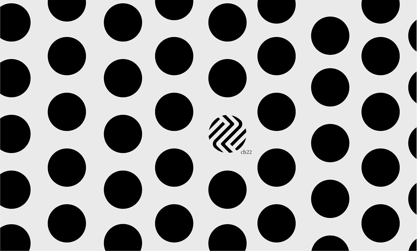
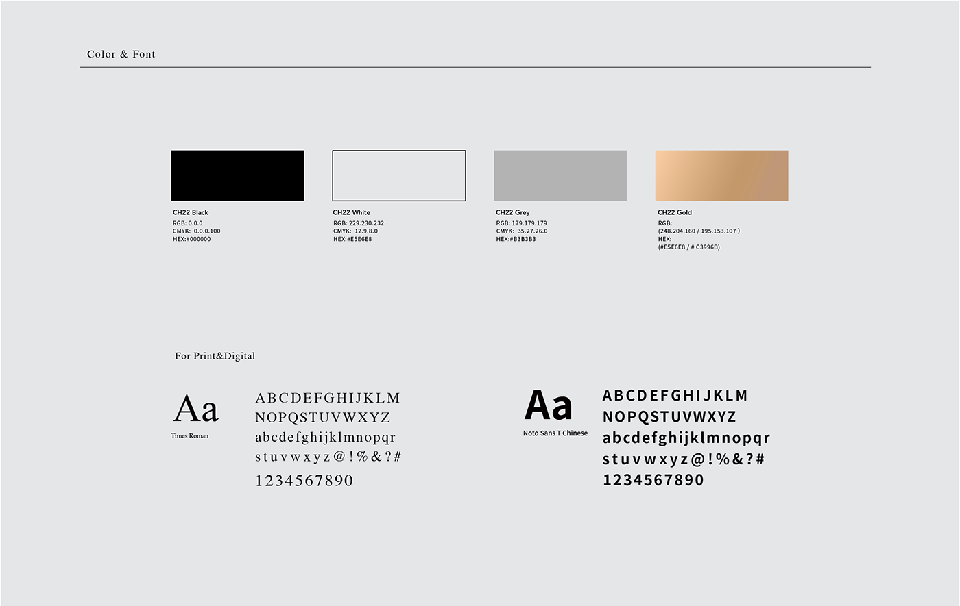
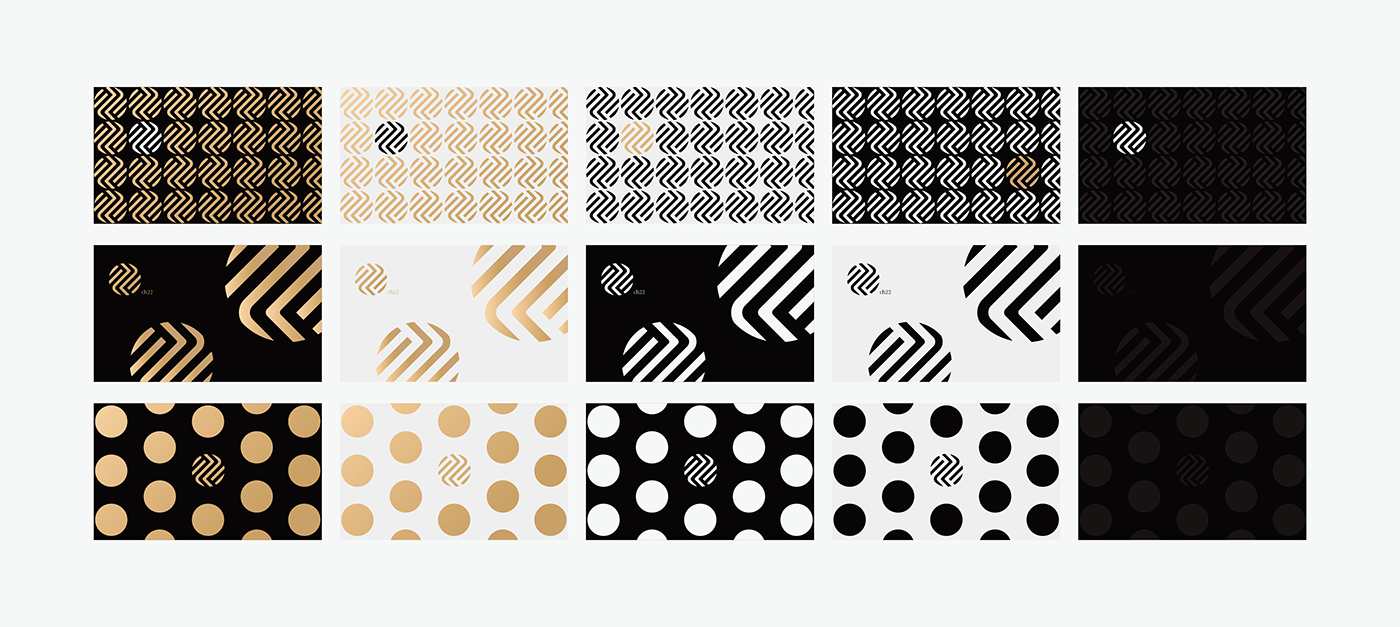
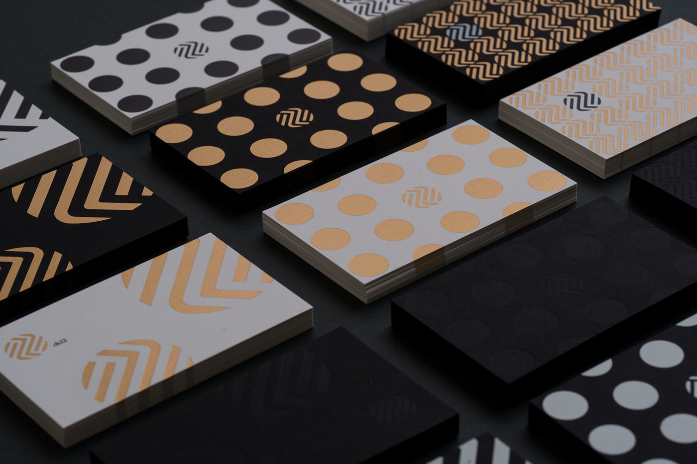
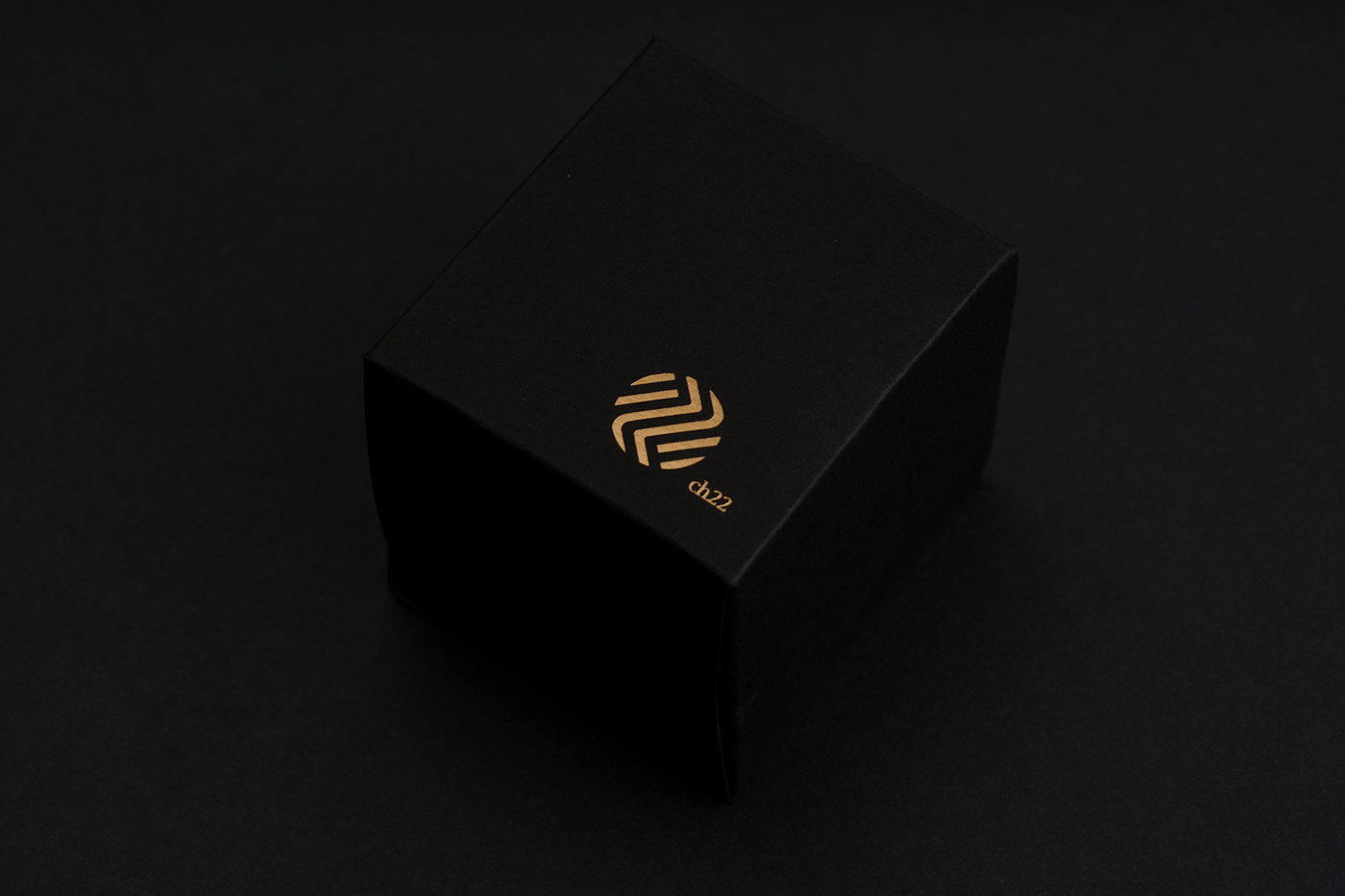
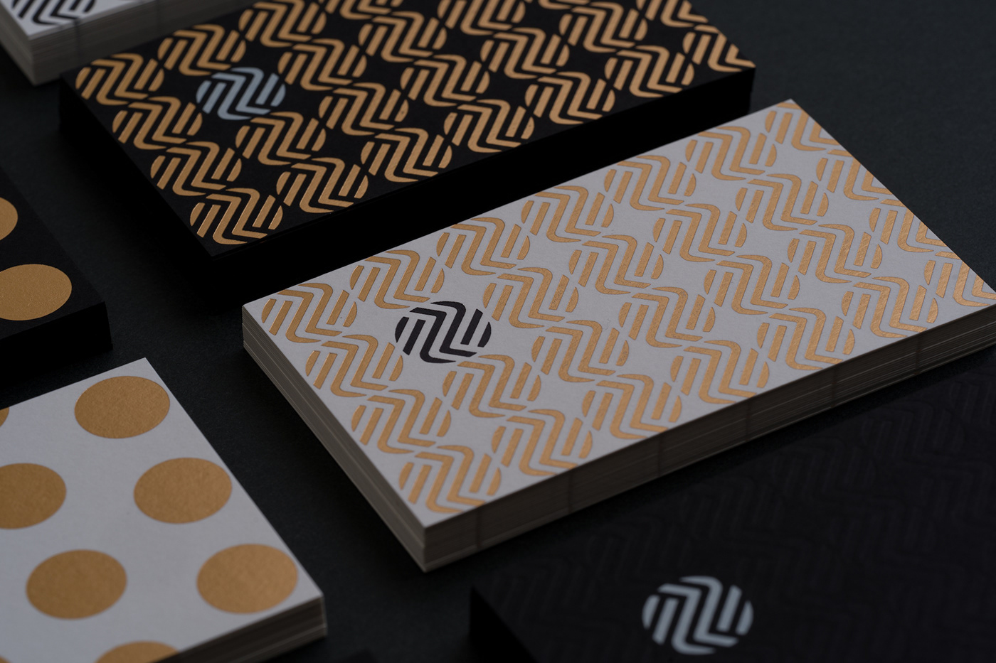
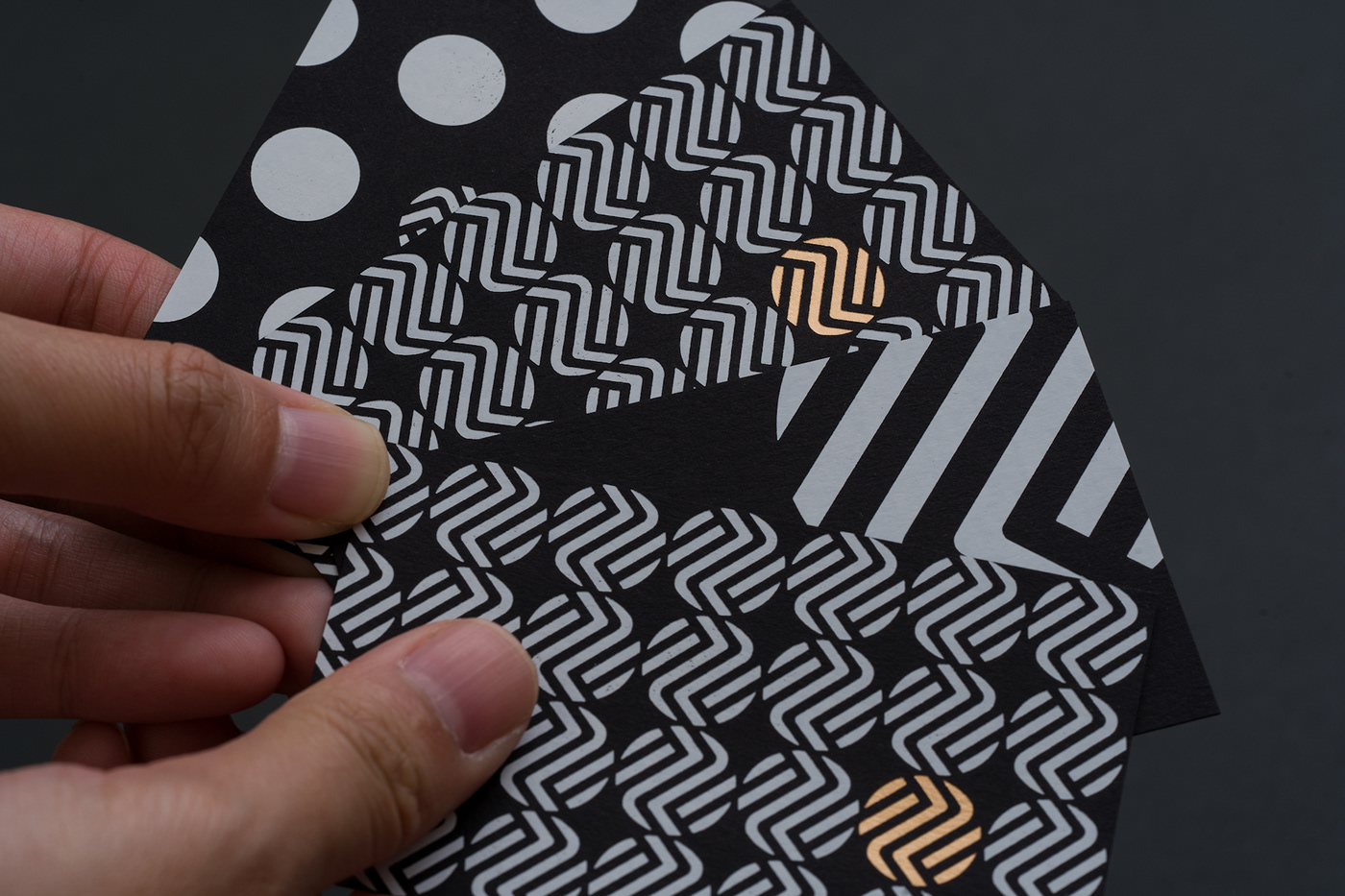
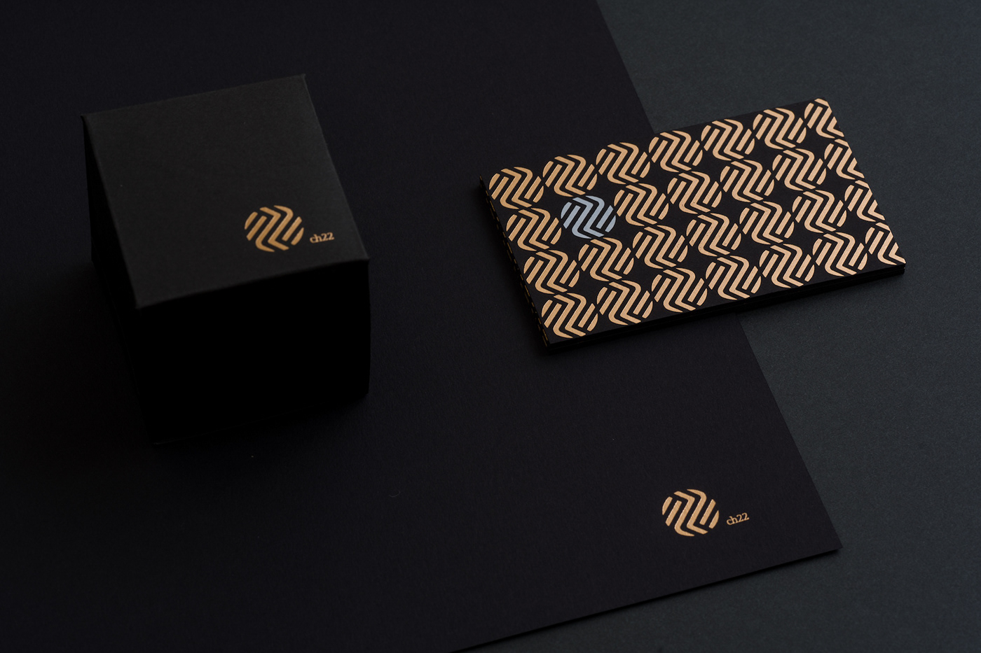
Named as a reference to Chapter 22 of Tao Te Ching by Lao Tzu, Ch22 infuses the deep meaning of verses from the classic into the brand concepts, which shows its initial visions of regaining simplicity and seeking the nature of everything. The logo looks like a seal and is composed of many iconic signs inspired by I-Ching hexagrams, an Arabic numeral 22, and two Chinese characters “Er” (two). These elements are put together in a circle to make the design look like a Chinese knotting and develop a delicate, elegant Oriental art style. The seal-like logo appears on every product like ancient painting stamps, decorating these products in a more Oriental fashion.The predominant hues of the brand are black, white, and gold, taken from the colors of ink and paper. The logo, embellished with gold-colored decors, presents a graceful, sublime aesthetic.
Ch22以老子道德經第二十二章為名,將經文意涵融入品牌內,呈現品牌回歸樸質、找回事物的本質的初衷。Logo如一章印,細節啟發於易經符號,融合了阿拉伯數字的「22」與中文字的「二 二」,兩者整合於一圓框內,如同中國結的繩結圖騰,呈現細緻優雅的東方風格。章印感的Logo就如印於每個產品上,如同古時的的畫印,更體現東方藝術的風格。品牌色調以黑白、金為主色,色調取自於墨色與紙色,金色為點綴色裝飾在畫面裡,讓整體視覺優雅大器。