


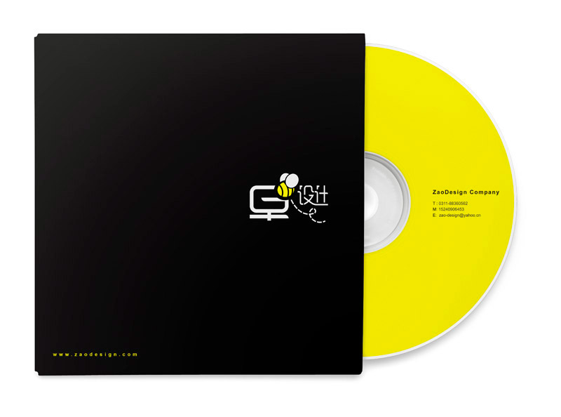

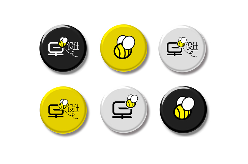


This is a simple but never boring idea . A bee flying among the Chinese characters "Early design ", implies the deeply inspirational epigram "Hard work is the key to success. ". Compared with others, one must pay more efforts to obtain a greater harvest. The icon uses the carefully designed Chinese characters "Early design " as the main body to represent the industrious and loveable bee, making clear our philosophy of schooling: "being ahead of others". The overall visual feeling is more cordial and more interesting. The bee is the symbol of our design concept. The bee's general shape is round and cute and it is relatively more acceptable to the target population--junior and senior middle school students. Adhering to the conviction " being earlier " our education and our hard working staff surely will get remarkable success.

