Racibórz is a medium-sized town situated on the Oder River in Silesian Voivodeship
in southern Poland. It is also the seat of the Racibórz County. Together with Opole city,
Racibórz is the historical capital of Upper Silesia.
Racibórz is the historical capital of Upper Silesia.
It’ lovely to live in Racibórz!
Racibórz is a medium-sized town with a population of approximately 55,000 inhabitants. We call ourselves a local community which is in love with Racibórz. We like our brewery
in Racibórz and we become involved in helping animals in a local shelter. We very often spend time together listening to music at the “Intro Festival” or we ride bicycles together. As people who live and work in Racibórz we want our town to develop together with us.
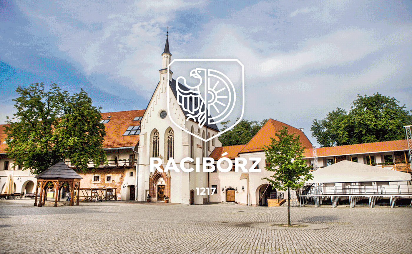
We are proud of our history and tradition. Many valuable monuments have been preserved to this day, including the castle chapel of Saint Thomas of Canterbury, known as the pearl of Silesian Gothic. The Piast’s Castle is one of the most valuable medieval castles in the whole voivodeship. There is also a mummy in our museum! The former inhabitant of Thebes is over 2800 years old! It was brought to Racibórz by the rich banker Anzelm von Rotschild.
We are proud of our history and tradition. Many valuable monuments have been preserved to this day, including the castle chapel of Saint Thomas of Canterbury, known as the pearl of Silesian Gothic. The Piast’s Castle is one of the most valuable medieval castles in the whole voivodeship. There is also a mummy in our museum! The former inhabitant of Thebes is over 2800 years old! It was brought to Racibórz by the rich banker Anzelm von Rotschild.

New concept of visual identity
The town of Racibórz is a beautiful place with rich history and tradition. However,
The town of Racibórz is a beautiful place with rich history and tradition. However,
it has not had its characteristic concept of visual identification yet. Thanks to its creation,
it will be possible to make the inhabitants of Racibórz identify themselves even more with the town. Moreover, people from other regions of Poland will recognise Racibórz as
a modern, trustworthy and attractive business partner.
The need to create a clear visual identity has become a priority in our town.
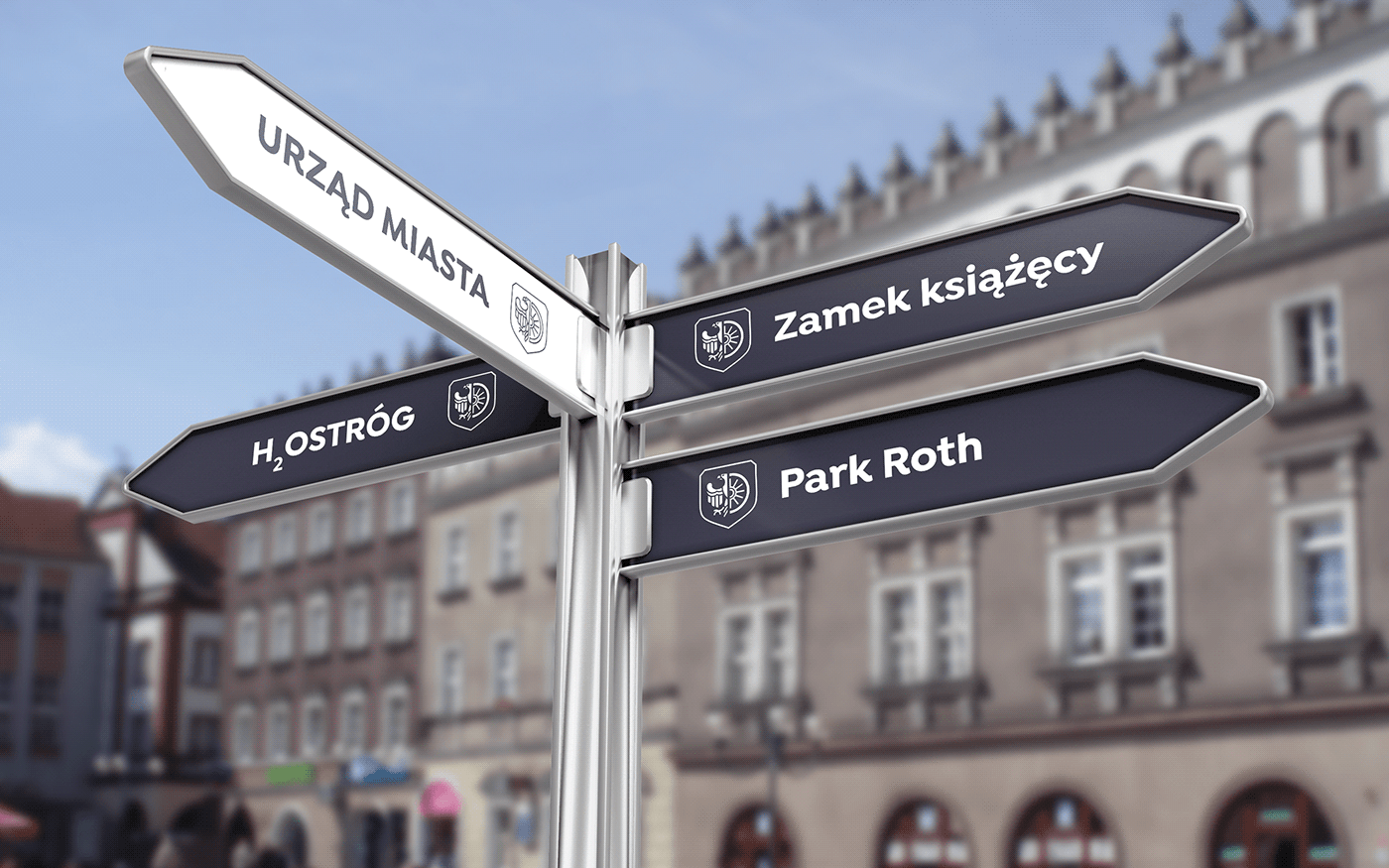
The implemented graphic solutions
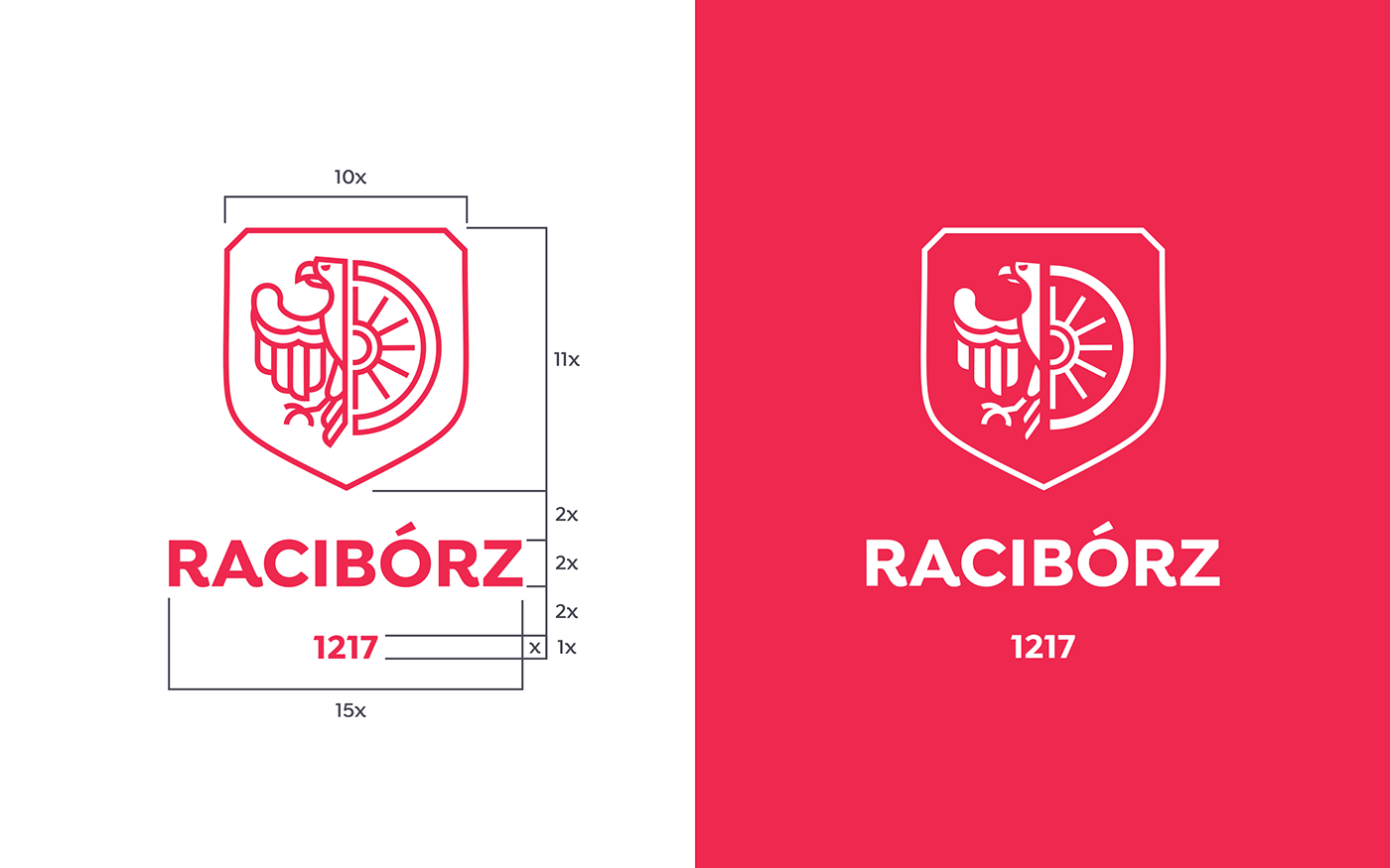
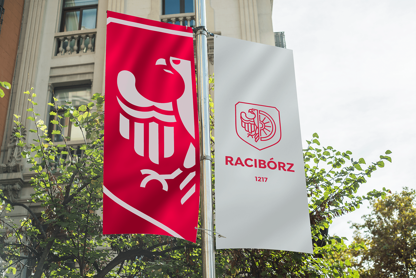
In the concept I have prepared I decided to focus on visual clarity. It’s worth remembering
that the starting point of communication is a modern logo. Let’s take a closer look at the coat of arms of my city. The new coat of arms of Racibórz depicts half an eagle and half
a wagon wheel on a white background. It looks clearer, more expressive and it fits into
the developing town of Racibórz. The enriched red colour emphasizes the individual character of this project. However, the main colour is a modern graphite colour!
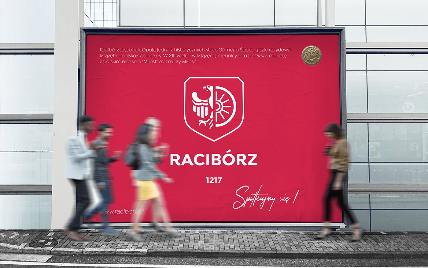
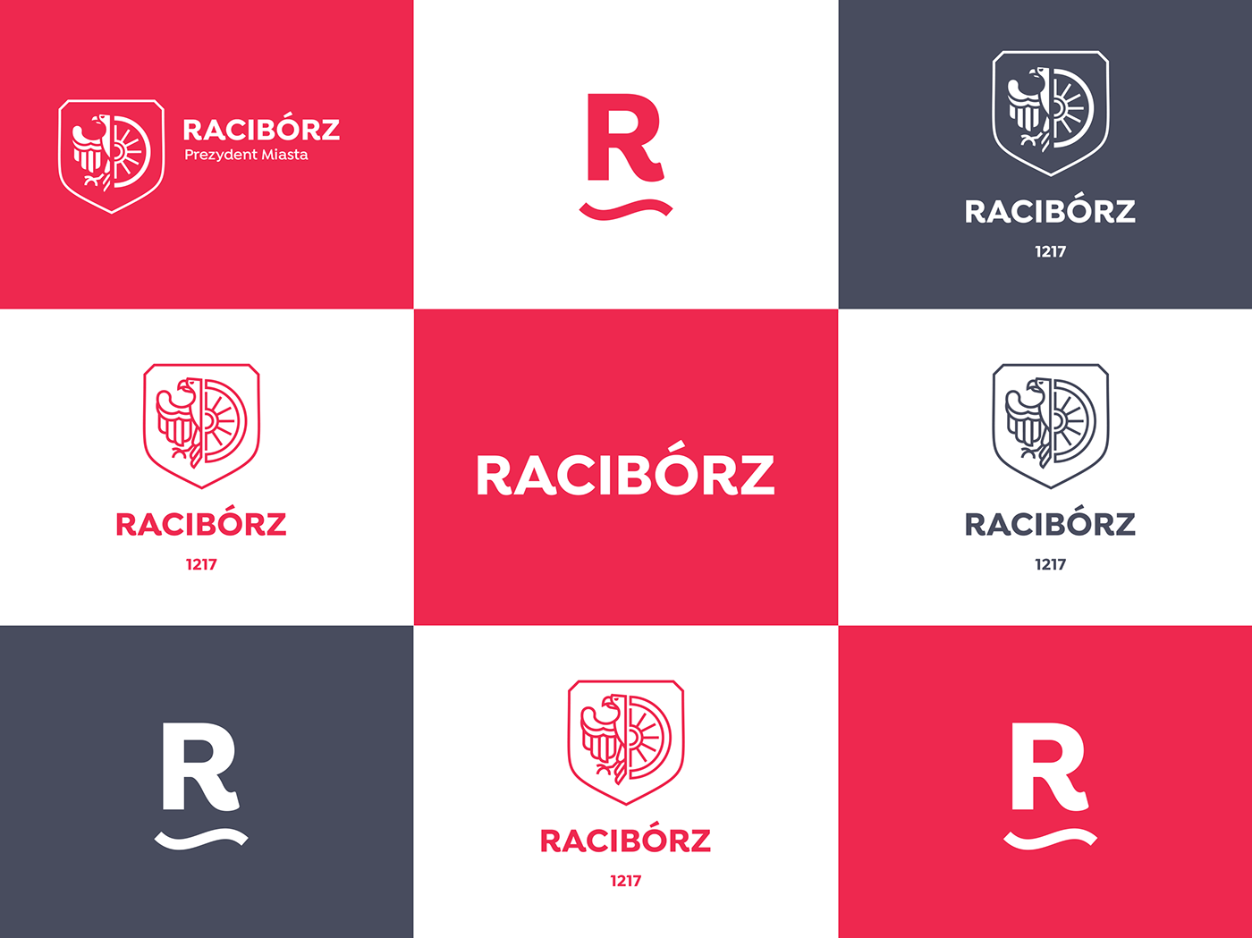
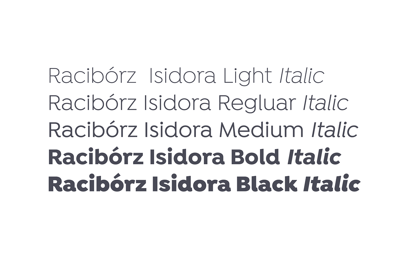

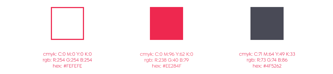
In the project it is used Isidora font in different cuts in red and raspberry colour which ideally matches the prepared concept of visual identification. It is a clear, modern
and legible font which can be used both in formal communication and on promotional materials. All signs and symbols in white colour look perfect on a red and modern graphite background!

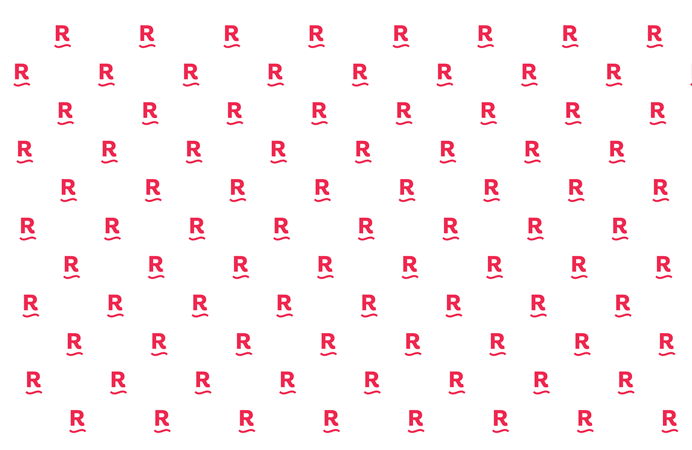
Furthermore, an additional logo was prepared in a form of the letter ‘R’. It refers to the first
letter of Racibórz and to the shape of a wave which is a reference to the Oder River.
letter of Racibórz and to the shape of a wave which is a reference to the Oder River.
This will make the use of the logo more versatile.


I believe that such a coherent visual identity, which includes the logo in several versions with diverse colours and matching font, will support the process of building a strong sense of community among the inhabitants of Racibórz. It is a beautiful town. The economy has been doing well and it has become a thriving town. My concept of visual identification
is only to emphasize these advantages.
----------------------------------------------------------------------------------------------------


foto: facebook.com/MiastoRaciborz


