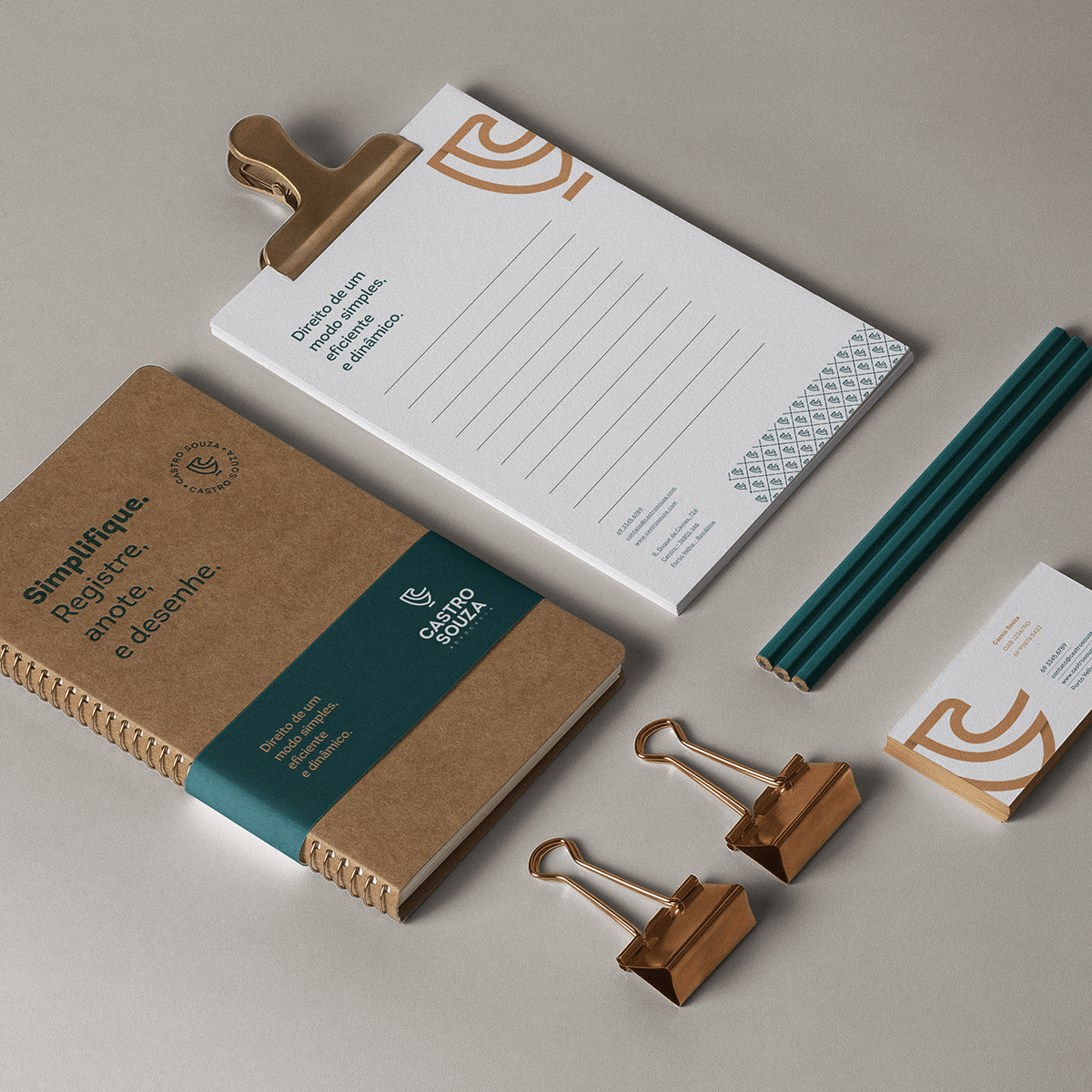
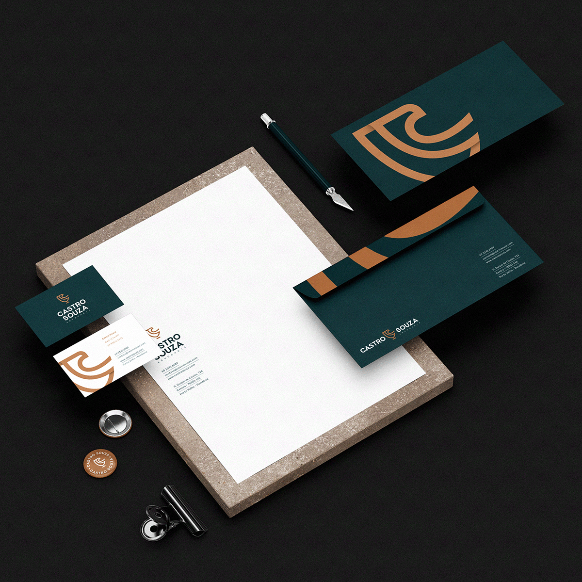
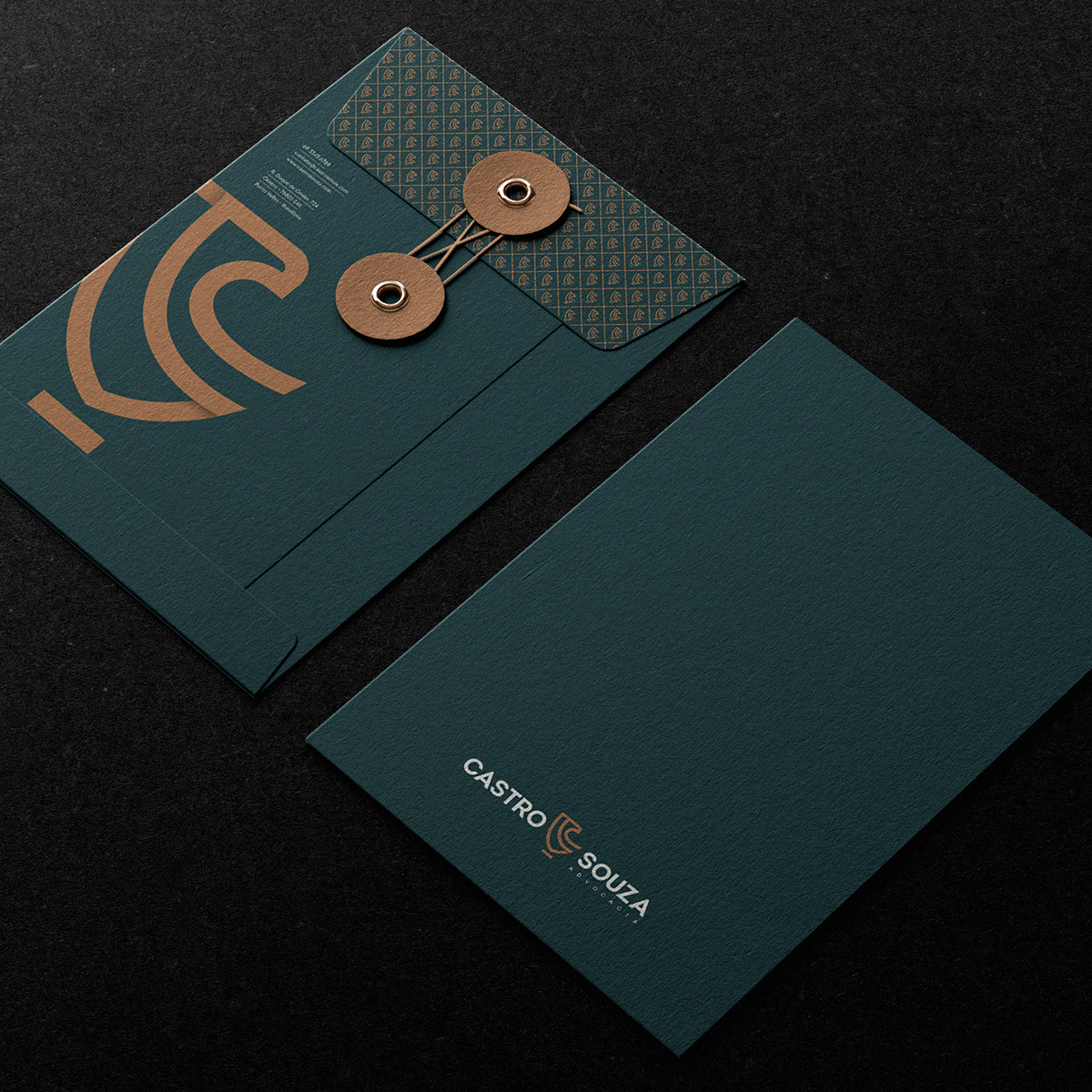
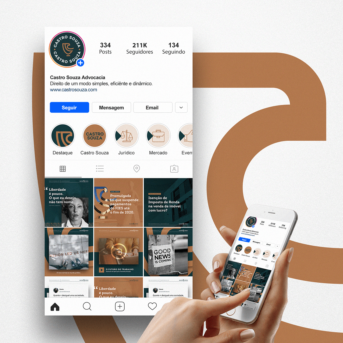
Castro Souza é um escritório de advocacia de Porto Velho, Rondônia.
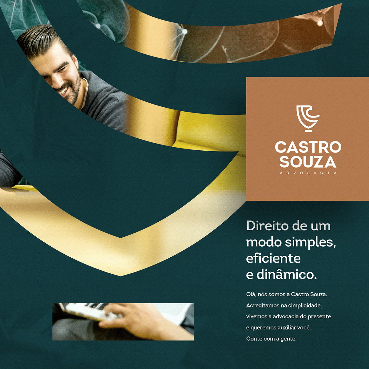
Uma empresa que nasceu com o propósito claro e definido: prestar serviço jurídico de modo simples, eficiente e dinâmico. A marca foi construída respeitando esses valores e enaltecendo toda experiência que o escritório carrega, potencializando os atributos de respeito, autoridade e classe.
Metodologia
Todo o trabalho seguiu uma metodologia própria e do Design Thinking. Uma imersão completa no negócio, na categoria e no cenário de futuro do ambiente de advocacia. E além disso, entender a fundo as necessidades do público-alvo.
Castro Souza is a law firm in Porto Velho, Rondônia.
A company that was born with a clear and defined purpose: to provide legal services in a simple, efficient and dynamic way. The brand was built respecting these values and extolling all the experience that the firm carries, enhancing the attributes of respect, authority and class.
Methodology
All the work followed its own methodology and Design Thinking. A complete immersion in the business, the category and the future scenario of the advocacy environment. In addition, to understand in depth the needs of the target audience.

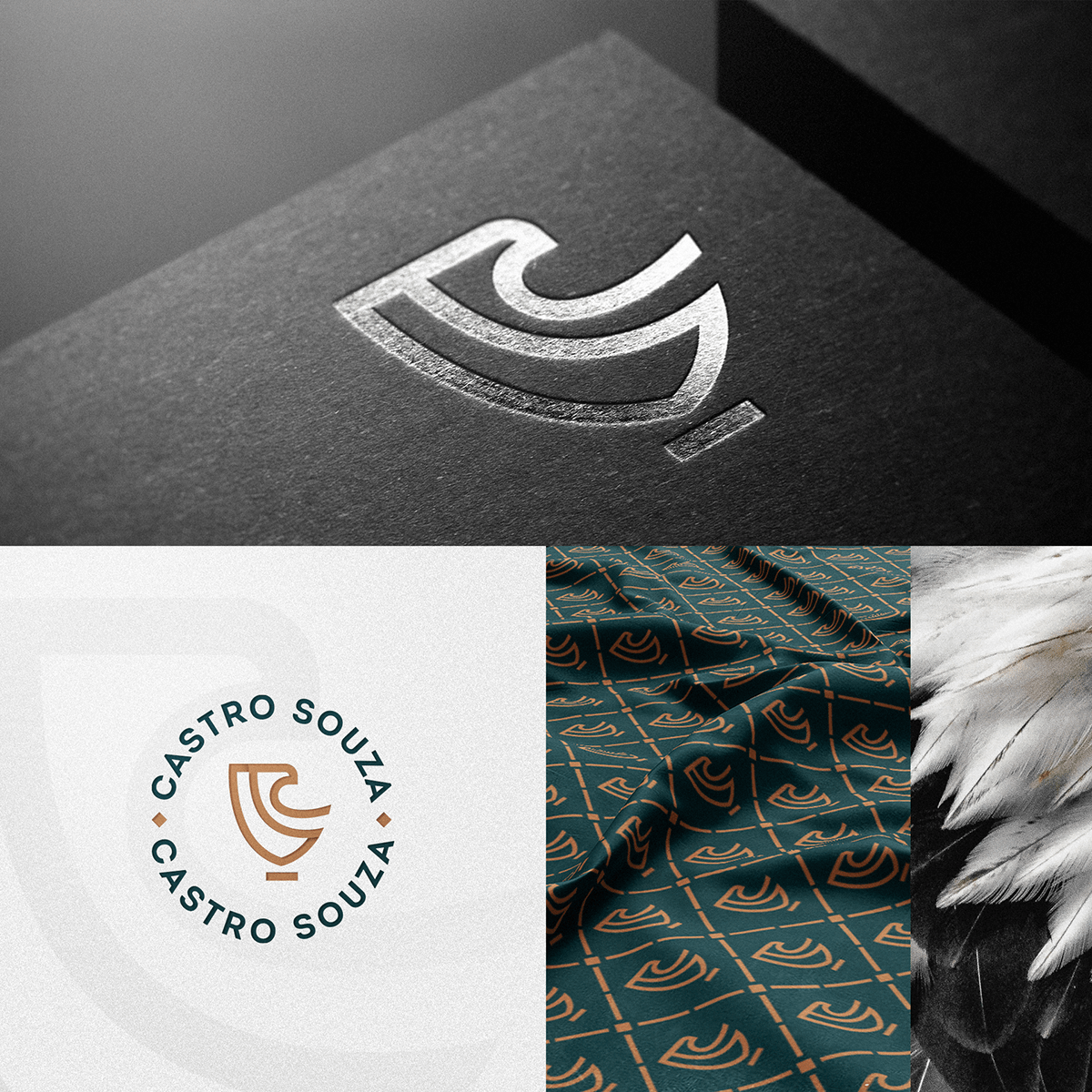
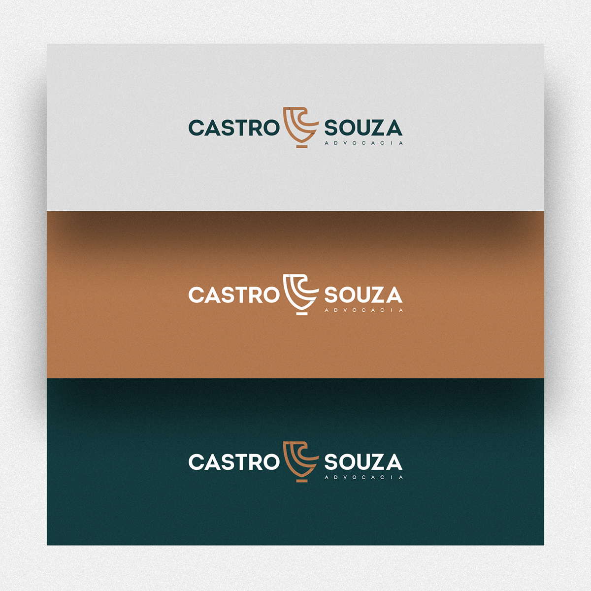
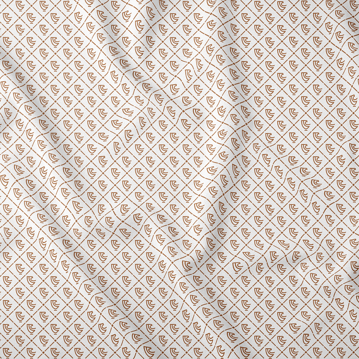
Conceito
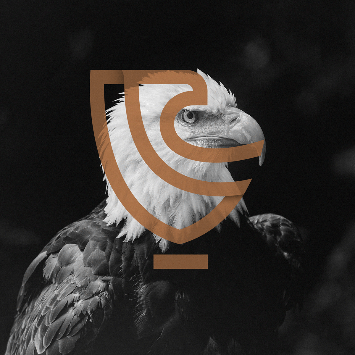
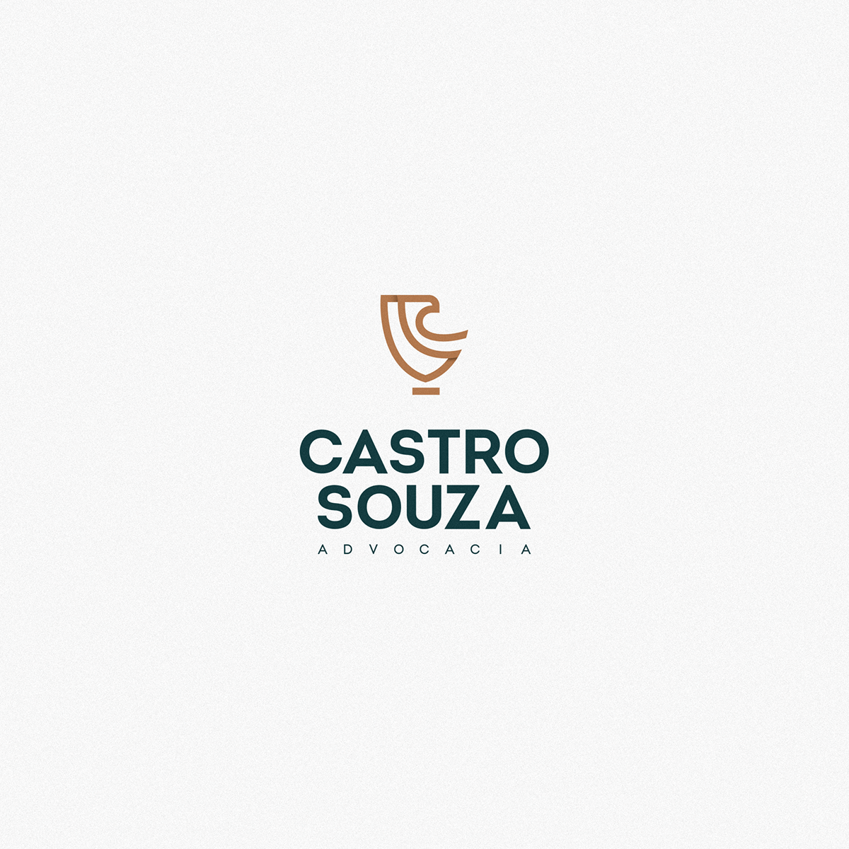
O símbolo da marca é a conexão de escudo e águia. O escudo representa a segurança e confiança. Já a águia tem um significado muito profundo, remetendo diretamente a liberdade, agilidade, sabedoria e imponência. Perfeito para ser o símbolo que guia todo e qualquer material de identidade visual do cliente.
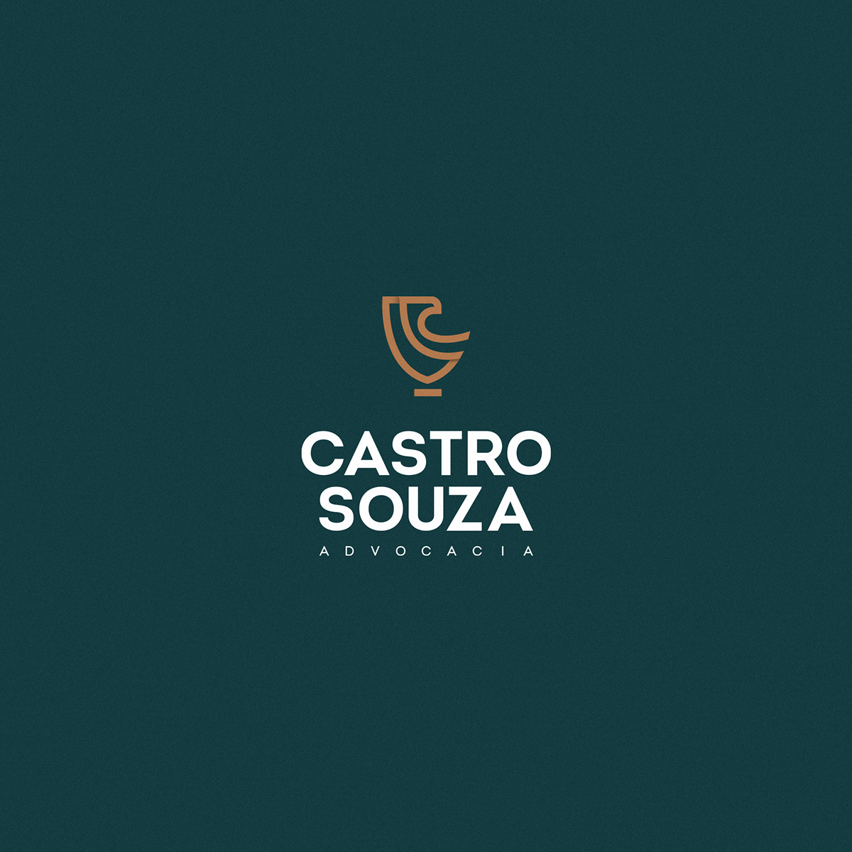
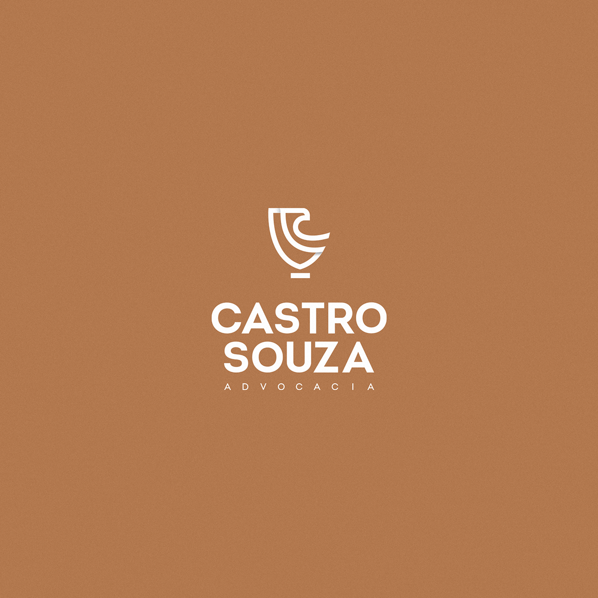
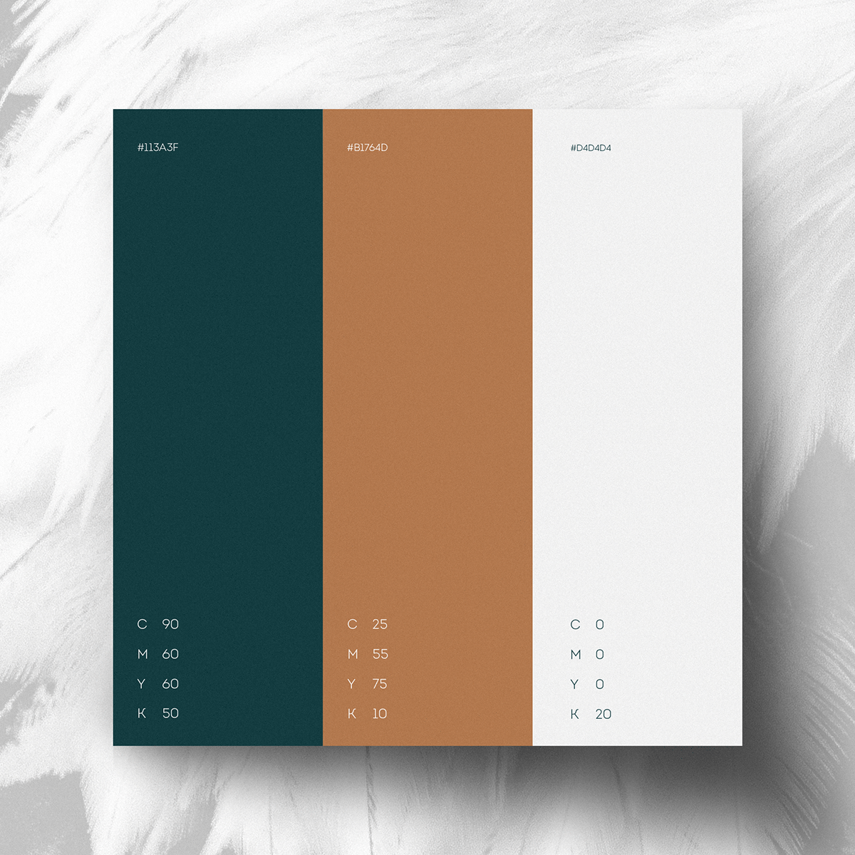
As cores fecham todo esse conceito, através do verde, cobre e cinza.
Simbolicamente, a composição das três cores indicam liberdade, paz, vida plena e harmonia. Significados que remetem diretamente aos atributos que o cliente (do cliente) precisa perceber, em cada ponto de contato.
Concept
The symbol of the brand is the shield and eagle connection. The shield represents security and trust. The eagle, on the other hand, has a very deep meaning, directly referring to freedom, agility, wisdom and grandeur. Perfect to be the symbol that guides all and any visual identity material of the client.Colors close this whole concept, through green, copper and gray.Symbolically, the composition of the three colors indicates freedom, peace, full life and harmony. Meanings that refer directly to the attributes that the client (client) needs to perceive, at each point of contact.

Gratidão.
Foi muito bom ter tido a oportunidade de criar algo nessa linha. Diferente da onda de tornar toda e qualquer marca uma startup, aqui prevalece a classe, o tom sóbrio e de respeito que o escritório faz questão de carregar e apresentar pro mundão.
Thankful
It was great to have had the opportunity to create something along these lines. Unlike the wave of making any and all brands a startup, here the class, the sober and respectful tone that the office makes sure to carry and present to the world prevails.