Trav App
A new way of booking travel
Project Duration: 2 months with weekly deadlines
Platforms: Cross-platform Mobile App
Tools: Whimsical, Miro, Figma, Lookback, Zeplin
Problem Overview
I like to travel often and I believe some things in life can only be leant when we travel. The idea of creating this app came from my own frustration when trying to book travel. I came to find that I shared these frustrations with other travelers I met, and so I decided to focus more on this issue. People get frustrated and discouraged by the amount of research that needs to be done before booking. Holiday travel is a massive industry. However, the vast majority of holiday apps are sorely lacking in good user experiences. I spent many years of my life working in the travel industry, and because I love traveling, I had previous knowledge of the market, but this time I was looking at those apps with fresh eyes. I didn’t want my app to be just another booking tool. I wanted to have a warm feeling.

Discovery: Research & Analysis
Based on my initial app idea, I came up with a list of interview and survey questions. The questions were simple and to the point. 47 people answered the survey in a 48 hour window. This was enough data to give me a good start. It gave me the direction I needed to dig deeper to find the answers I needed to solve the most common problems. I selected & interviewed 4 potential users who were interested in my research on their needs, pain points, and how they use digital products to book holidays.
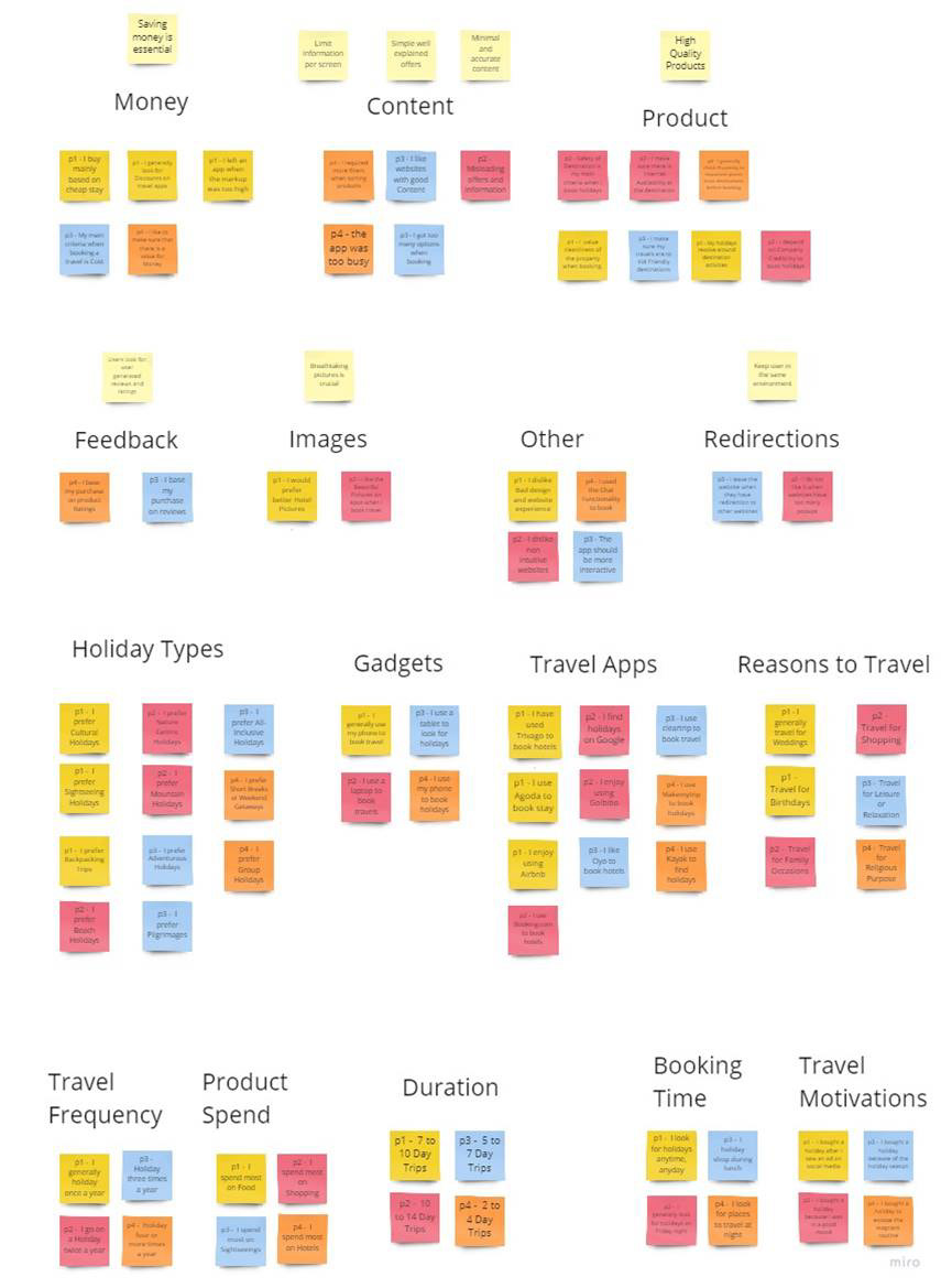
After conducting the interviews and surveys, I transferred all my notes and responses onto sticky notes on Miro. I recognized patterns, rearranged the sticky notes into clusters under different themes and possible opportunities, detailing particular pain points and user insights.

Competitive Analysis
As a way to gain insights into user flow and wire-framing, I looked into existing travel apps that offer similar features. For ideas on browsing information & itinerary planning, It was a great way to gain insights into user flow, layouts and interactions, and to see what was working or confusing from the perspective of a user.
Design: Concepts & Sketching
Research Synthesis
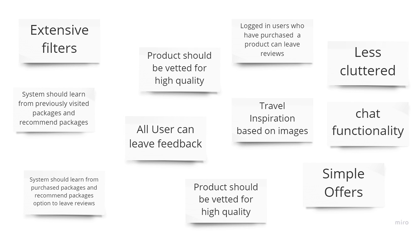
People primarily use their mobile apps to research holidays. However, travel apps have a lot of information and are poorly displayed and presented to the user. I identified the opportunity to build a product with a focus on filters, displaying breathtaking pictures and content with a simple, intuitive and functional mobile app interface. I identified a list of potential app features and prioritized them using the Value vs. Complexity Quadrants, MoSCoW Method, & Kano Analysis.
Sketches & User Flow
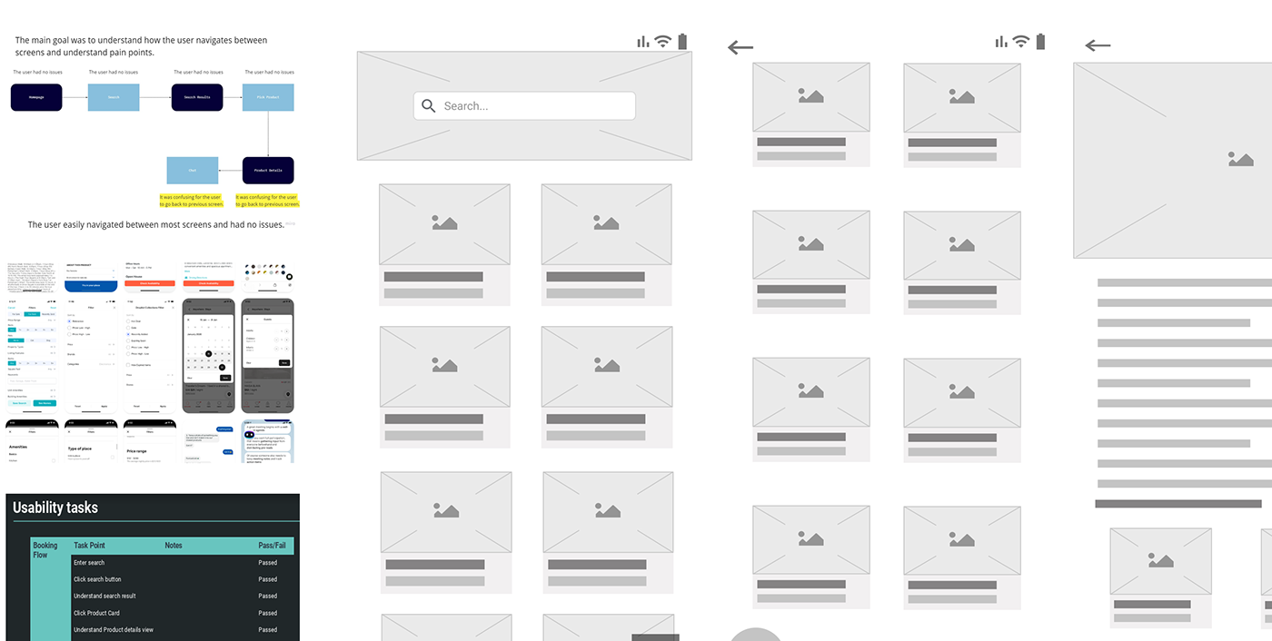
I built a user flow diagrams were created to illustrate the primary user flow through the mobile app booking processes. Based on the user flow diagrams - and bearing the main pain points in mind - sketches of the layouts were developed. These sketches included consideration of the primary user flow, positioning of main navigation and how interactions would work.

Develop: Prototyping
Based on the user flow, I started sketching ideas for my wireframes using pen and paper, trying different layouts, triggers and responses. After many iterations, the rough version for developing a medium fidelity prototype was achieved and a prototype was created using Figma. Before coming up with colors, typography and images. I wanted to define the information hierarchy of my design. I wanted to put this layout to test to see how my users would process this information without the distraction of visual design and branding.
Test: Validation, Usability, Feedback
I created a prototype using Figma with the wireframes and used the prototype for user testing. I decided to remote user testing sessions using Lookback so I can directly observe each user’s behaviors and also listen to users describing their expectation on every interaction. Based on my observations and the users’ feedbacks, I made revisions. The testing sessions were a very valuable way for me to identify the flaws in my designs and gain insights to what the users was expecting from each interaction. As a result, I was able to improve my designs with following updates to the wireframes
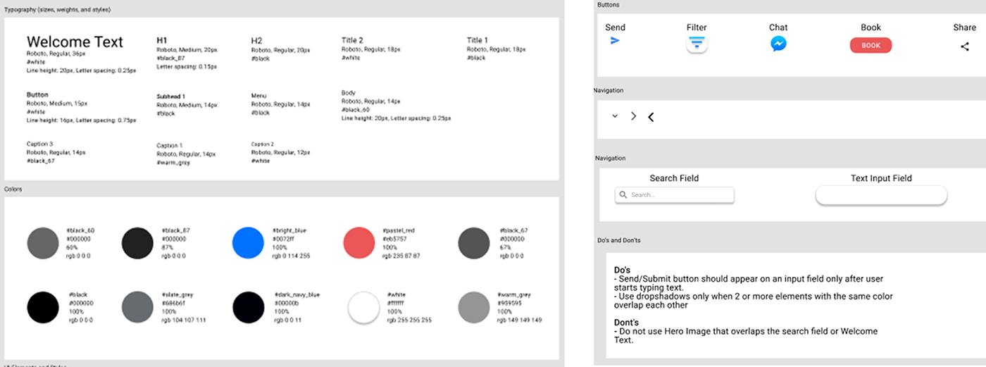
Design: Iteration
I improved accessibility and iterated on designs based on user research, data and KPI. I created style sheets and Component Sheet in Figma. After I was confident, I exported the designs to Zeplin for Engineering Handoff
Solution & Impact Overview
Although this project was created within two months as a deliverable for my UX course, this short period of time was an eye-opening experience for me. My role in this project is that of the lead and only UX Designer. I completed all activities in the UX project cycle in a solo capacity- from research to design to prototyping. This has resulted in the accumulation of a huge amount of knowledge and many new skills such as Procreate, Whimsical, Miro, Figma, Mobbin, WebAIM, Lookback & Zeplin. By the end of the project, I learned how to conduct user research and come up with insights and findings, turn it into theme and building features based on it. The key trade offs was that I had less users to test with, less time to research and that prototyping was fast. I feel like I have met the goals and needs of my user. However, ideally I would have liked to do more testing.
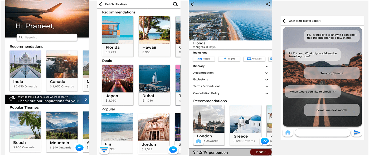
High Fidelity Clickable Prototype


