After a year of my previous website design, and 2 years of my previous logo, I decided the time was right for a new look and feel for the entire of my online brands, ps.design.
Logo and Branding
The first step for my overhaul was actually my logo, and considering I'm primarily a web and UI designer, I found that surprising. I used Dribbble, deviantART and Behance for sources of inspiration, especially my favourite designers such as Harry Ford, Ryan Ford and Von Glitchska.
I had initially went down the route of improving my old logo, rather than redesigning it, as I was happy with the form and what it stood for, but after many sketches, attempts in Illustrator and experimenting, I found that an entirely new angle was needed.
I had initially went down the route of improving my old logo, rather than redesigning it, as I was happy with the form and what it stood for, but after many sketches, attempts in Illustrator and experimenting, I found that an entirely new angle was needed.
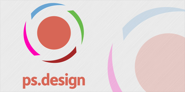
Early mock up of a new logo
Eventually, I settled on a unique shape for my logo, after my liking of badge-type logos seen across many designers' portfolios. I loved the hexagonal shape, but made it different by ever so slightly making it uneven for a more personal feel, and rounding the corners for it to stand out.
I initially had about 3 or 4 ideas for the badge icon, with friends on Twitter and Facebook suggesting that the badge with a banner across it was the way to go.
I initially had about 3 or 4 ideas for the badge icon, with friends on Twitter and Facebook suggesting that the badge with a banner across it was the way to go.

Early versions of the badge logo approach

Further concepts of the badge logo, focusing on the badge and banner idea.
After playing around with the badge idea, I finally settled on the badge with a folding banner, which makes more sense from a design perspective and gives the banner depth.
The next stage was to make sure that this logo was adaptable and could be resized down across all formats. This was achieved by dropping the banner for avatar-sized images, and then for even simpler formats, a plain text format. For favicons and even smaller images, a simple icon formed from the background hexagon is used.
The next stage was to make sure that this logo was adaptable and could be resized down across all formats. This was achieved by dropping the banner for avatar-sized images, and then for even simpler formats, a plain text format. For favicons and even smaller images, a simple icon formed from the background hexagon is used.


The next step after that, for me, was cementing that branding across all areas of my online profile and identity, with which came in a part of the web design then.
Website Design
Since I've started, I've wanted to establish myself as a web designer and UI designer, but was neglecting my local area and the possibility of finding a job in that area. I'm proud of where I come from, and since where I have moved to, and this is now reflected on my website and online profiles.
I have used iconic imagery from my surrounding area of Liverpool and from my hometown of Bidston on the Wirral (over the Mersey from Liverpool) with an industrial-type effect to reflect the industrial nature of Liverpool and the Wirral's history.
I have used iconic imagery from my surrounding area of Liverpool and from my hometown of Bidston on the Wirral (over the Mersey from Liverpool) with an industrial-type effect to reflect the industrial nature of Liverpool and the Wirral's history.


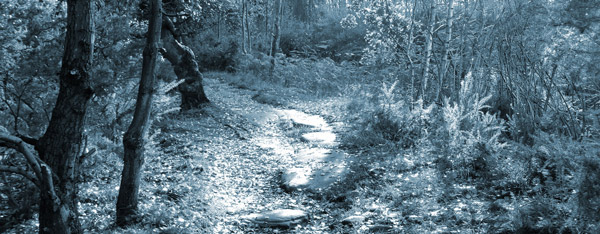
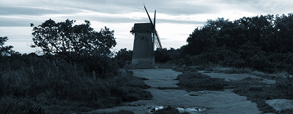
Images used in the background of ps.design v6
After sourcing initial imagery and photos for my new site, and taking some myself, I then went about the idea of implementing these in the coolest way possible to achieve maximum impact, and familiarity.
Around this time, eBay had announced their new logo design along with a new cool site which used parallax scrolling effects. I wasn't impressed by the new logo, but I loved the parallax scrolling, and so my idea was set and I searched for handy plugins to build my site upon. I came across an easy jQuery plugin for parallax scrolling, which made my job a whole lot easier and could concentrate on building the site via the ZURB Foundation framework. This meant the entire site is responsive, from HD desktops to smartphone leve, and everything in between.
Making the site compatible with smartphones, and especially iPhones and iPads, also gave me the chance to turn my new site into a web-app of sorts, with a unique homescreen icon and splash screen, perfect for quick bookmarking and visting of my site.


Along with presenting the site across all platforms in a concise and presentable manner, I also optimised images and icons to make use of Retina and HiDPI modes on phones, tablets and desktops by including double resolution versions called by media queries.
As well as making designing the site to suit a more mature, industrial look, I also redesigned some social icons to incorporate my new hexagonal icon look.
As well as making designing the site to suit a more mature, industrial look, I also redesigned some social icons to incorporate my new hexagonal icon look.


After launching the site on October 1st, the next step is to design and build a minimal blog which will be based on either a Ruby on Rails CMS or Anchor from Visual Idiot. I'm distancing myself away from WordPress for my own blog due to the heavyweight feel of it and the space it needs. My blog is now going to be a more personal platform for my rants, inspiration and musings, and I don't need a big install and theme to say these things.
Hopefully, I can design and build an Anchor theme (my preference) to host my rants, and this will again be built on the ZURB Foundation framework, and will be live after Christmas 2012.
Hopefully, I can design and build an Anchor theme (my preference) to host my rants, and this will again be built on the ZURB Foundation framework, and will be live after Christmas 2012.


