
A fictional redesign of the Washington Metro rapid transit map.

The basis of the new map was centered on the idea of stylizing district and county borders and the Beltway
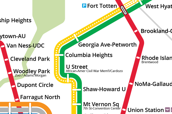
to form a square within a circle. Metro lines are designed to be more geographically accurate (where possible) while retaining fixed 15-degree angles.
to form a square within a circle. Metro lines are designed to be more geographically accurate (where possible) while retaining fixed 15-degree angles.
View a full size version here. (1500 x 1800 px)
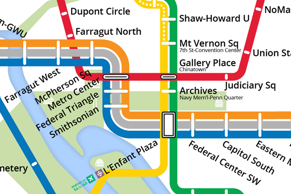
Detail of the downtown core. The square formed by the stations between the three major transfer points is in the exact center of the map and all lines radiate out from this point.
A proposal for displaying the unique service pattern of the Yellow line, which during peak hours serves fewer stations on its main line, but also runs an additional rush-only service option with unique termini. A description of this service adjustment can be found in the legend (seen above).
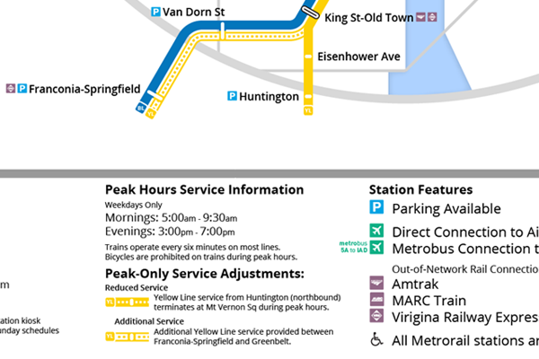
Some legend information, including color-coded station icons for intermodal connections and a description of the Yellow Line service information noted above.
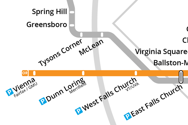
Detail of the Silver Line Phase 1 stations indicating the 'corner' through Tysons. All stations have accurate positions relative to city/county borders, as well as the beltway, parkland and other geographic features.
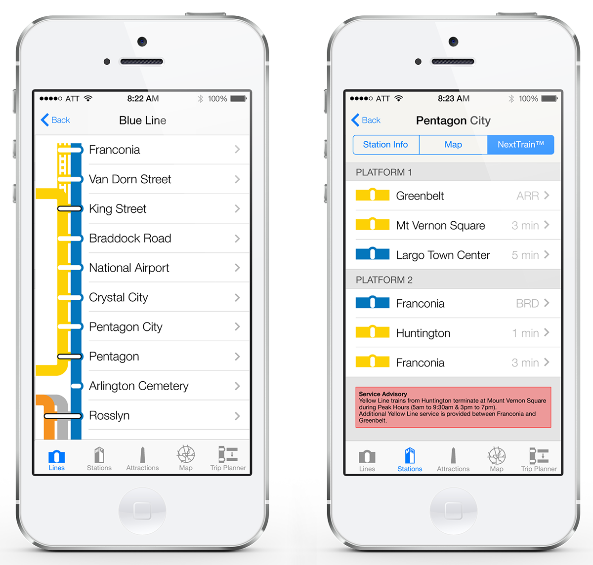
Additionally, an iOS7-style app mockup was created with the original version of the map design.


