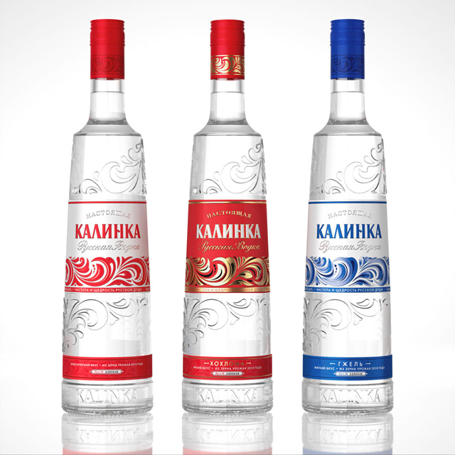
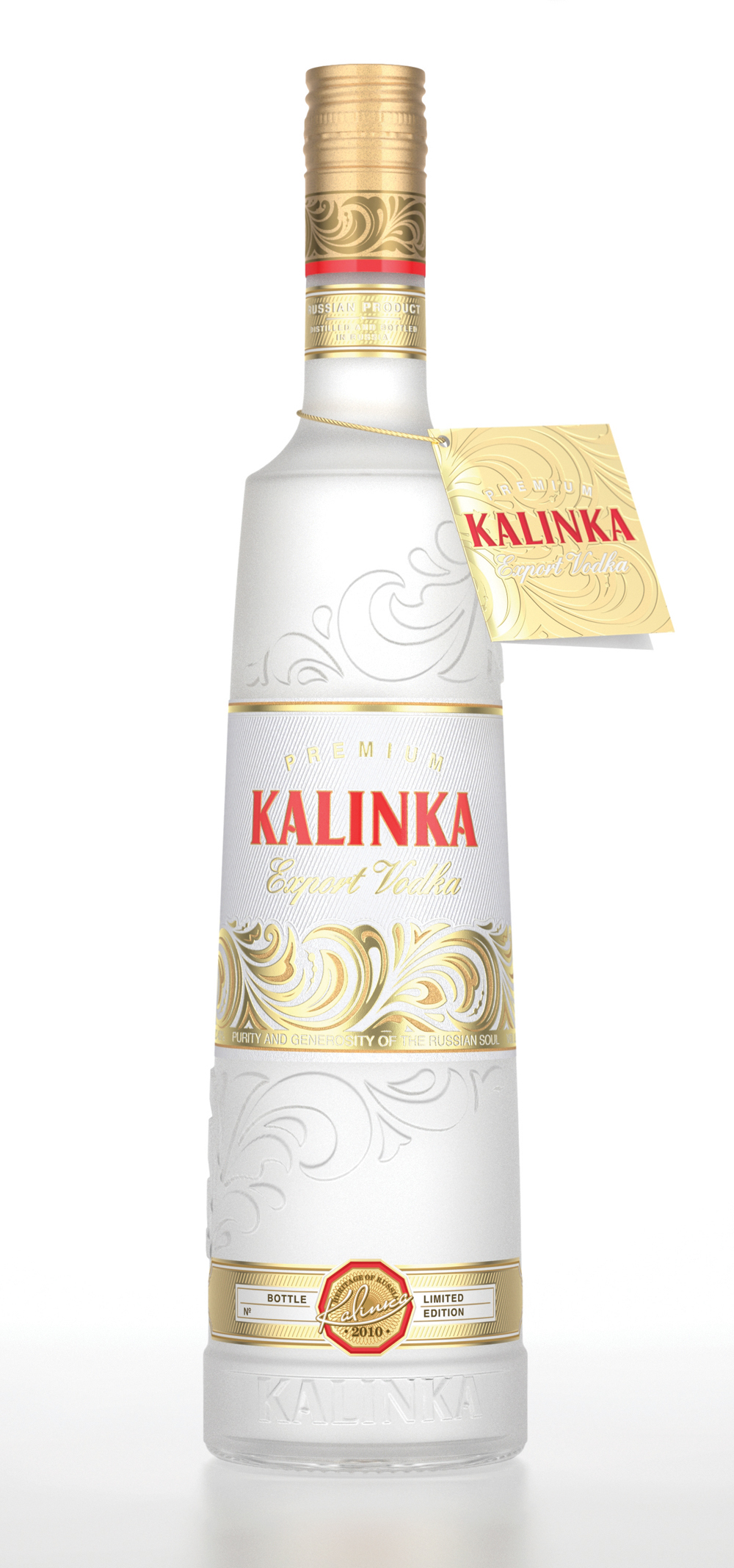
The KALINKA vodka
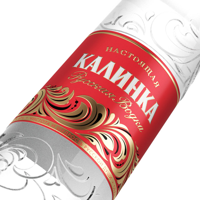
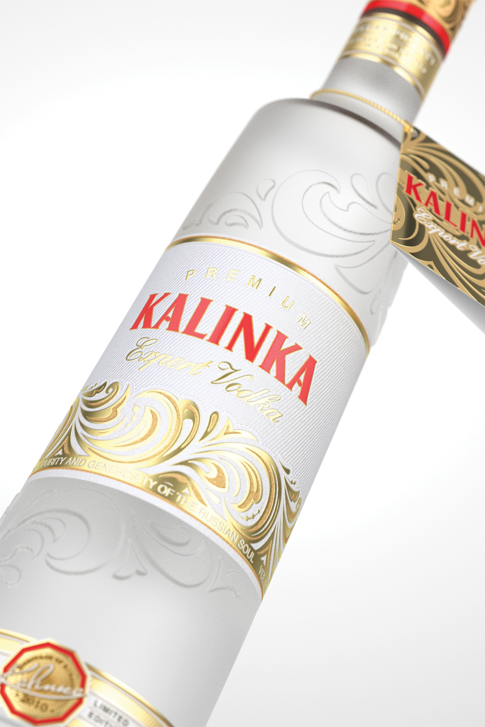
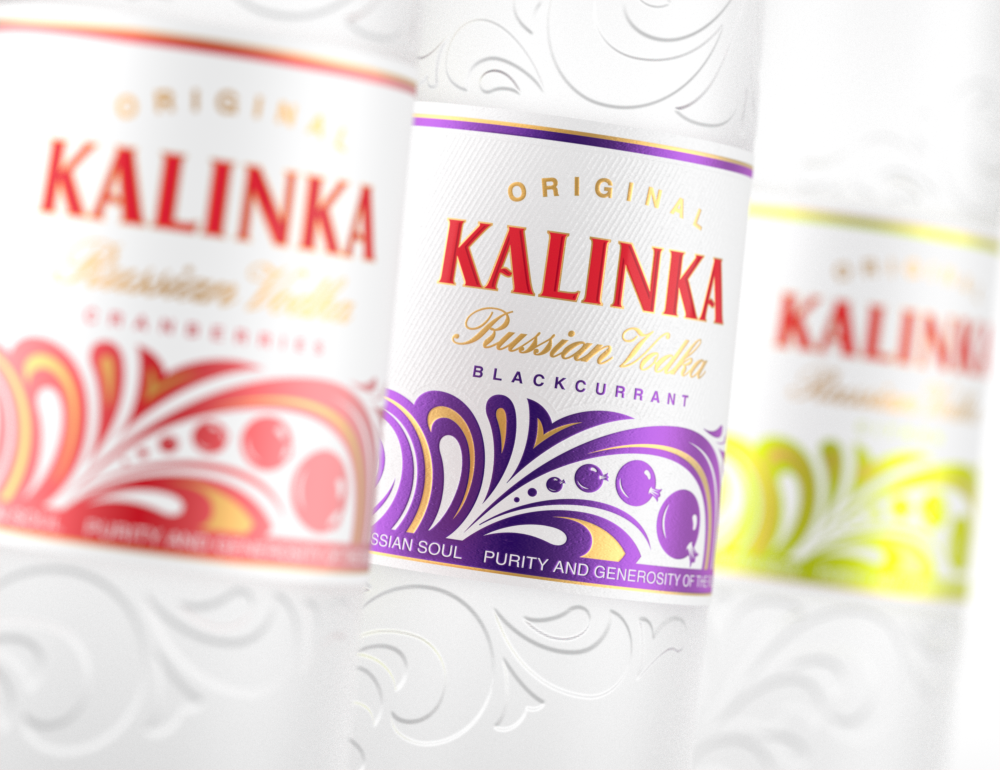
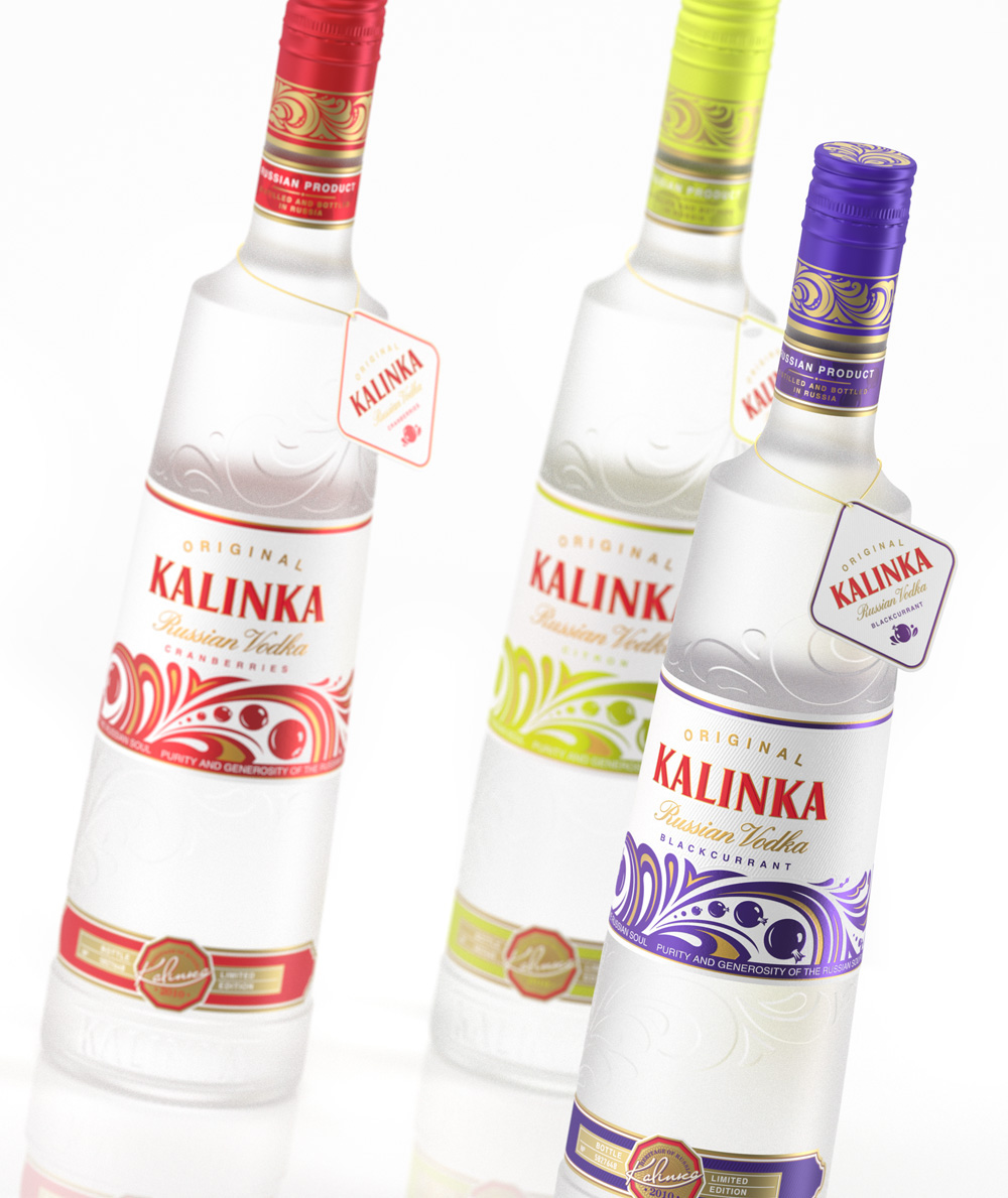
StudioIN came up in the competition for redesigning the appearance of the Kalinka vodka. The professionals of the studio suggested a fundamentally new solution for the product. They came up with an original shape for the bottle, its unique surface relief, logo and tracery. The bright elements of the company style and the clear-cut tastes differentiation form an effective identity.
The simple and laconic design of the packaging creates an organic image and an easy to recognize company style. That advantageously sets Kalinka apart from the competition, allows to correctly position the product on the market and brings the central idea of the brand home to customers.
The simple and laconic design of the packaging creates an organic image and an easy to recognize company style. That advantageously sets Kalinka apart from the competition, allows to correctly position the product on the market and brings the central idea of the brand home to customers.
Art Direction: Arthur Schreiber
Design: Arthur Schreiber, Maria Ponomareva
Visualisation: Anastasia Chamkina, Pavel Gubin
Design: Arthur Schreiber, Maria Ponomareva
Visualisation: Anastasia Chamkina, Pavel Gubin

