Vodafone NZ Icons
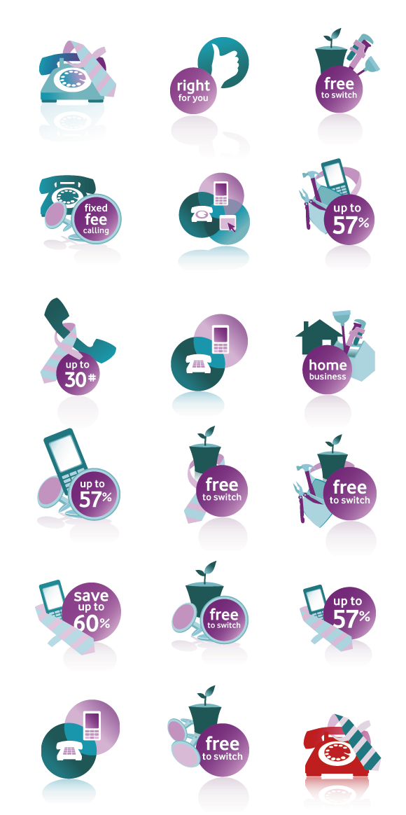
Collective icon design for Vodafone NZ
Collective icon design for Vodafone NZ
In year 2007, when Vodafone NZ decided it was time to relook and rework their website they wanted to give Vodafone NZ a new look and feel. They required some fresh ideas and really wanted their website to work for their audiences - to create a space where their audience can easily obtain necessary information, and a space where they can have great experience while browsing through it. In brief, they need something that will work for them in the online world.
A good website not only serves as a online face for the company such as Vodafone, but it can become a a good portal to deliver necessary information to the customerVodafone engaged Frontend to look at two key areas. The first project was to address the heavy product pages that contained too much information for the user to digest. Frontend took a fresh approach to create a clean-looking page that highlighted the key points through strong typography and simple, informative graphics. Our goal was to convey key messages in 5 –10 seconds. The second project we undertook was to restructure the landing pages for Mobile, Internet, Landline and Internet service.
A good website not only serves as a online face for the company such as Vodafone, but it can become a a good portal to deliver necessary information to the customerVodafone engaged Frontend to look at two key areas. The first project was to address the heavy product pages that contained too much information for the user to digest. Frontend took a fresh approach to create a clean-looking page that highlighted the key points through strong typography and simple, informative graphics. Our goal was to convey key messages in 5 –10 seconds. The second project we undertook was to restructure the landing pages for Mobile, Internet, Landline and Internet service.