Trip in Fashion is a brand realised for a turn of events whose theme is fashion and travel. We thought of the naming and we projected the logo, the event identity and the prints.
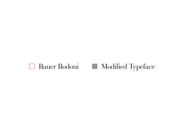
We designed the lettering of the logo founding our inspiration in Didone typefaces.
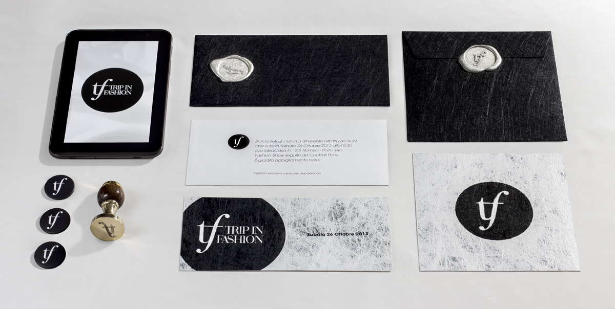
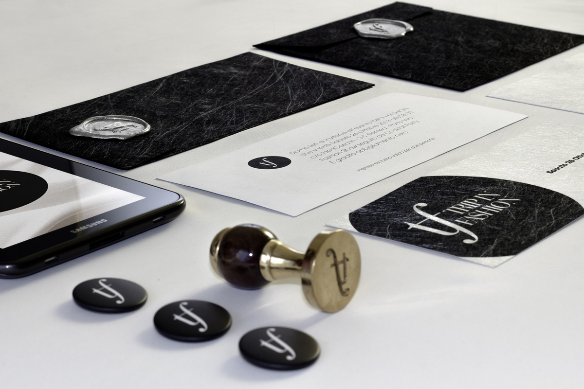
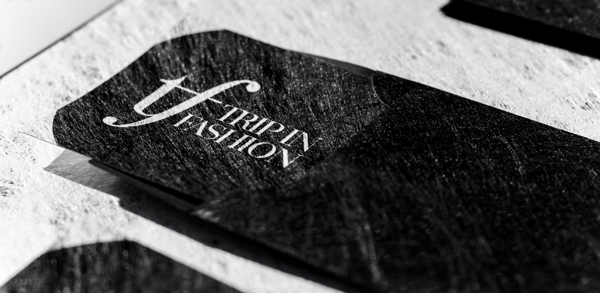
For all the prints on paper we chose the Favini Twist paper, which is characterized by a textile paired with opaque film and paper, in black and silver colours.
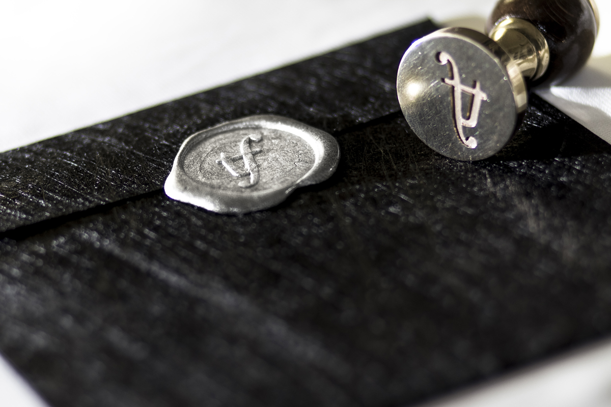
As for the printing techniques we used offset and silkscreen. We used also a stamp with silver sealing wax for the envelopes.
For the first event we realised a handmade poster too, with the black acrylic paint, a unique piece which combines together typography, calligraphy and graphic design.
We designed the lettering of the logo founding our inspiration in Didone typefaces.
For all the prints on paper we chose the Favini Twist paper, which is characterized by a textile paired with opaque film and paper, in black and silver colours.
As for the printing techniques we used offset and silkscreen. We used also a stamp with silver sealing wax for the envelopes.
For the first event we realised a handmade poster too, with the black acrylic paint, a unique piece which combines together typography, calligraphy and graphic design.
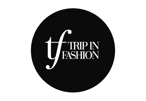
Main Logo
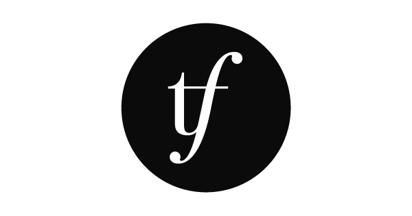
Secondary Logo / Monogram
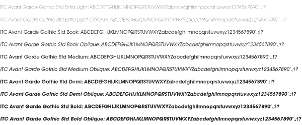
Typeface and Lettering
Main Logo Design

Secondary Logo Design (for small dimensions, as icons for social network and seals)

Font to be used
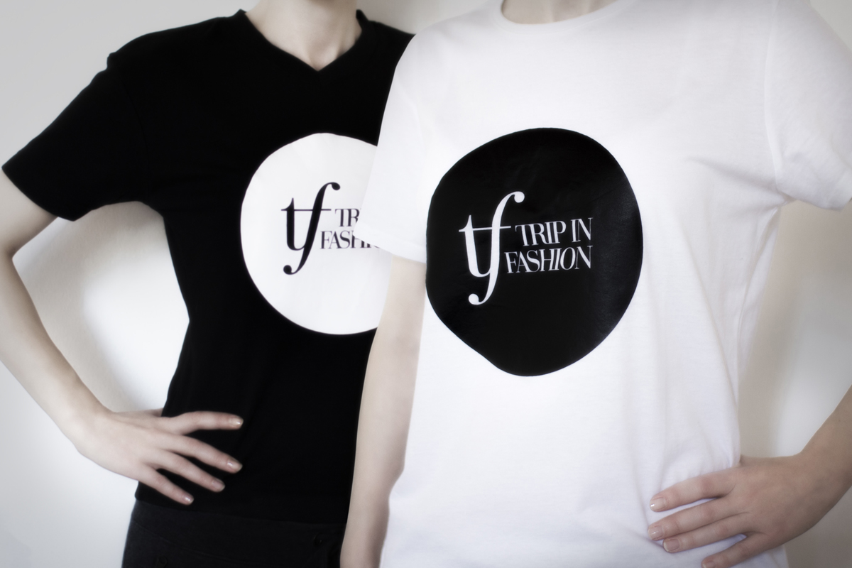
T-shirts
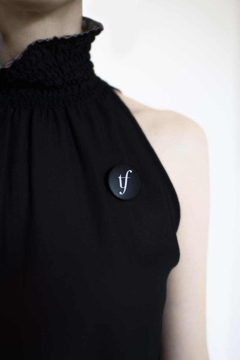
Pin