The Prague Post Redesign
Updating a weekly English-language newspaper
Updating a weekly English-language newspaper
Goal: Expand to 16 pages with more eye-catching visuals as well as extended content. Aimed for a “fresh” look, with increased white space and bigger photoplay. Story-wise the broadsheet content shifted focus to long-form analysis and informative features that better reflect the newspaper’s weekly nature. Shorter pieces aim to keep the reader up-to-date on important local and regional developments
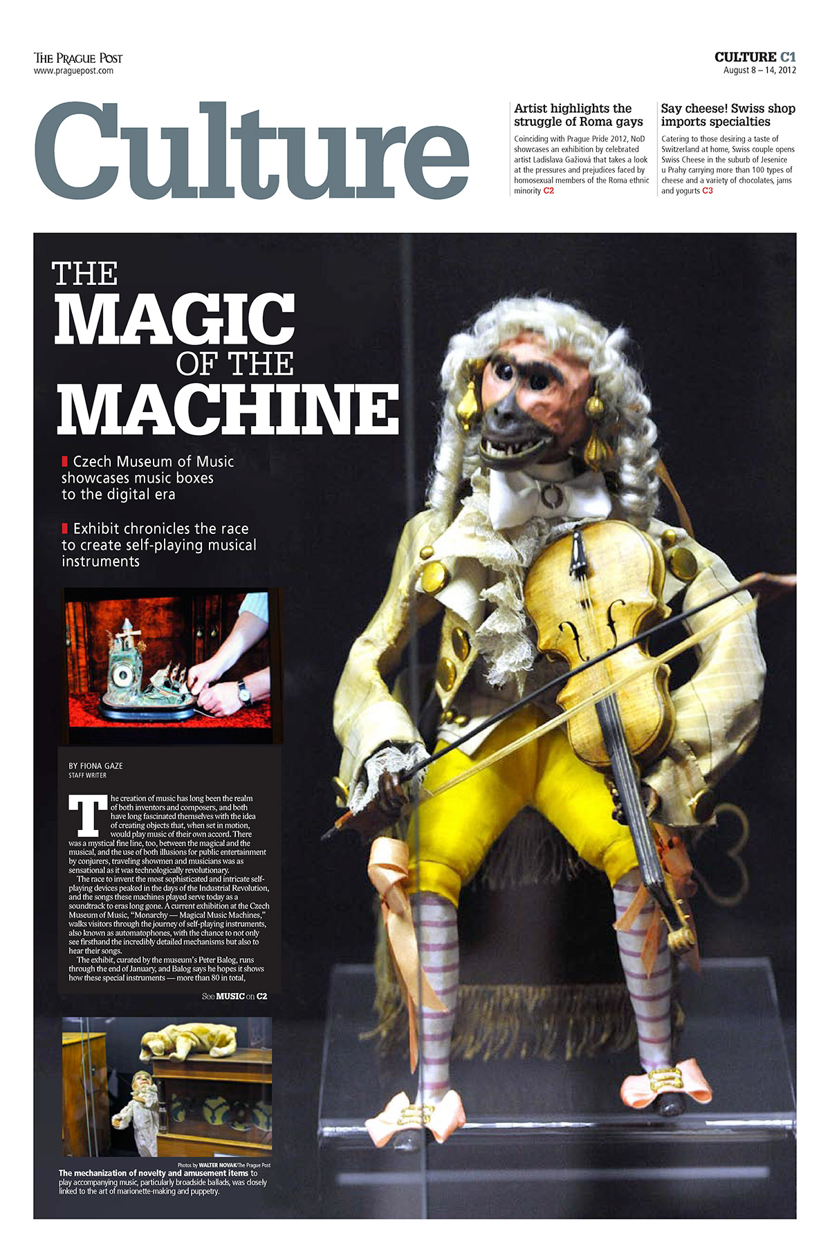
The front page: Move from a the daily-driven feel of the old format to a more magazine-style feel, a more accessible “info center” that can be used to navigate content, including higher promotion for the Night & Day weekly culture and entertainment guide in tabloid format
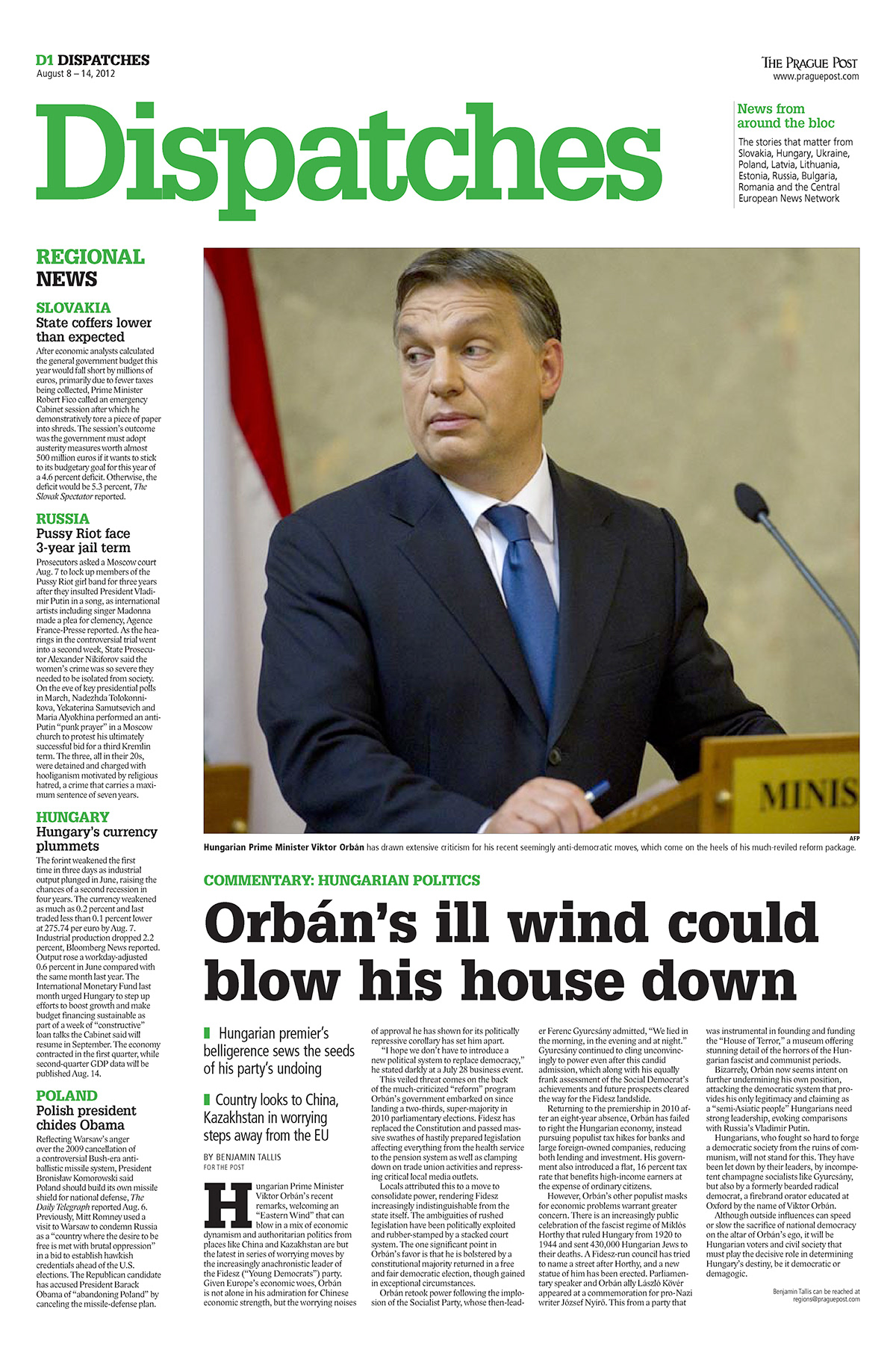
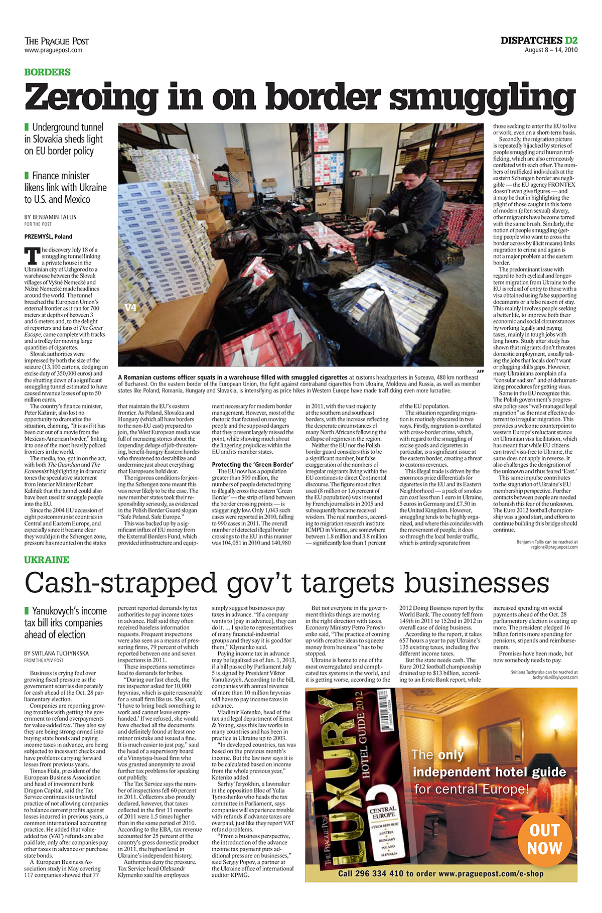
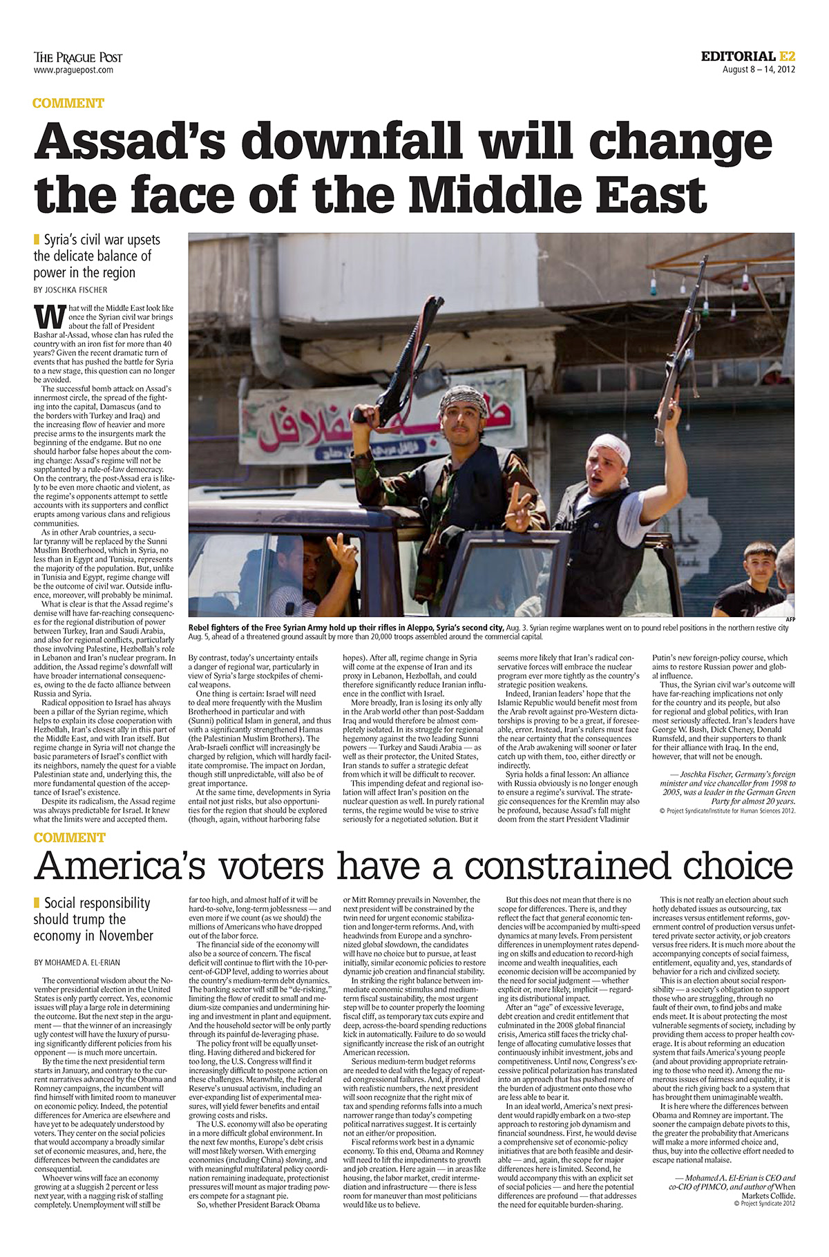
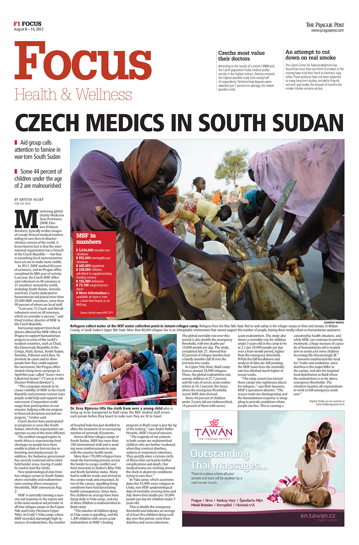
Navigation: The layout is designed for easier orientation with stronger use of colour. Sections follow Affairs and Business — the bread and butter of news reporting — into Culture features, Editorial pieces and a Dispatch section covering economic and political developments in the broader Central and East European region. Introduced a Focus section to rotate on diverse special interest topics such as health, education and technology
Fonts: Moved from Caslon to Gylpha; Franklin to Frutiger; and Times-Latin to Lido for the body
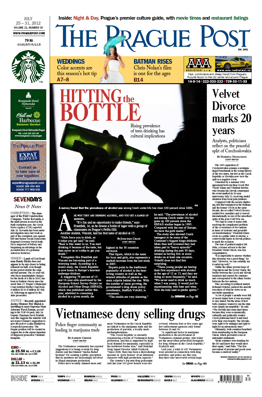
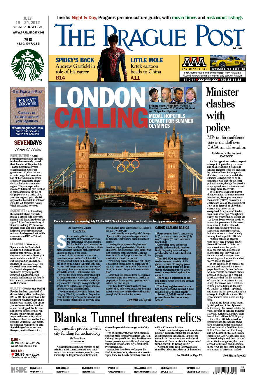
Examples of the old front page are at the bottom
The front page: Move from a the daily-driven feel of the old format to a more magazine-style feel, a more accessible “info center” that can be used to navigate content, including higher promotion for the Night & Day weekly culture and entertainment guide in tabloid format
Navigation: The layout is designed for easier orientation with stronger use of colour. Sections follow Affairs and Business — the bread and butter of news reporting — into Culture features, Editorial pieces and a Dispatch section covering economic and political developments in the broader Central and East European region. Introduced a Focus section to rotate on diverse special interest topics such as health, education and technology
Fonts: Moved from Caslon to Gylpha; Franklin to Frutiger; and Times-Latin to Lido for the body
Examples of the old front page are at the bottom