

TAMPAX INVISIBLE
I had one week to find a piece of packaging I didn't like and re-design it. I choose Tampax Tampons.
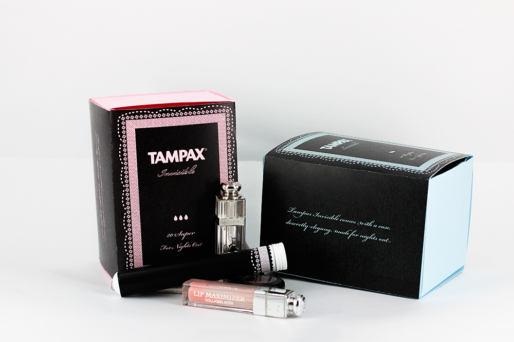
From my research I found that tampons always come in a tacky packaging, and that many women found it embarrassing to actually go and buy tampons. Therefore I set my self a goal to try and make a tampon package that was both elegant and discrete.

I made a laced pattern to make the product look feminine. As tampons can be bought with different absorbencies, I made 2 different colours, a light blue and pink. Further I added drops in order to show the absorbency.
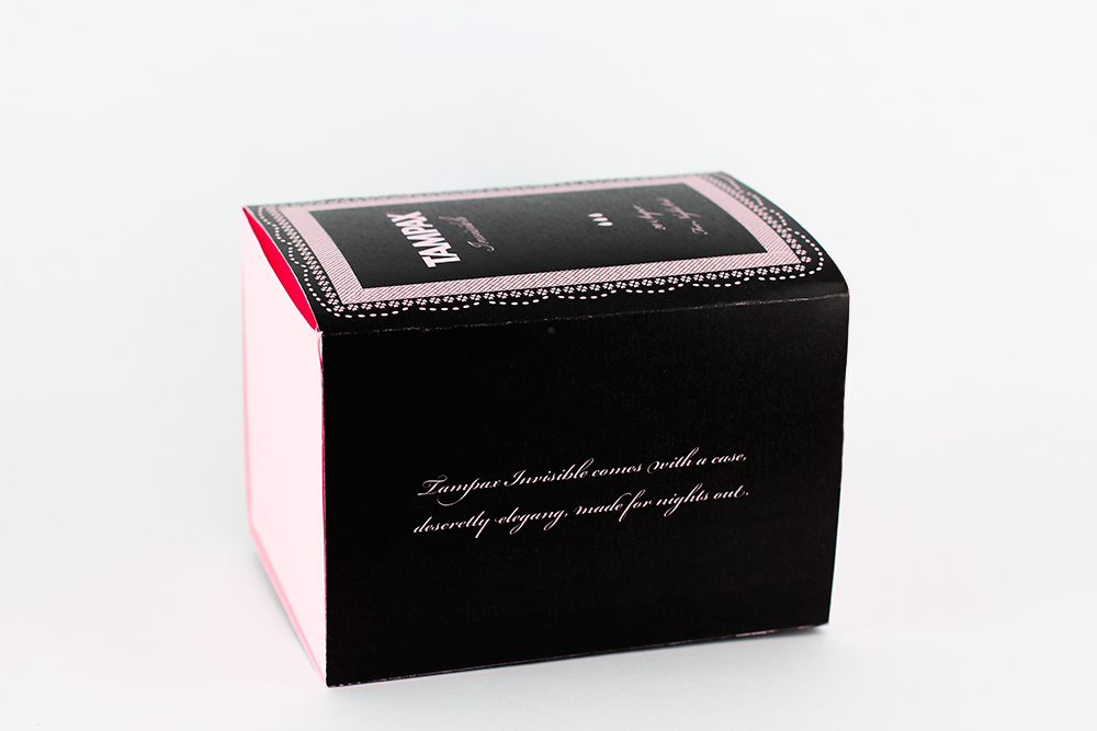
What I realised from looking at the original Tampax packaging was a chaos of text printed everywhere on the packaging, this just added to the tacky look I wanted to avoid, therefore I choose to only add a very limited range of information on the packaging and instead include a leaflet, that could contain the rest of the needed information.
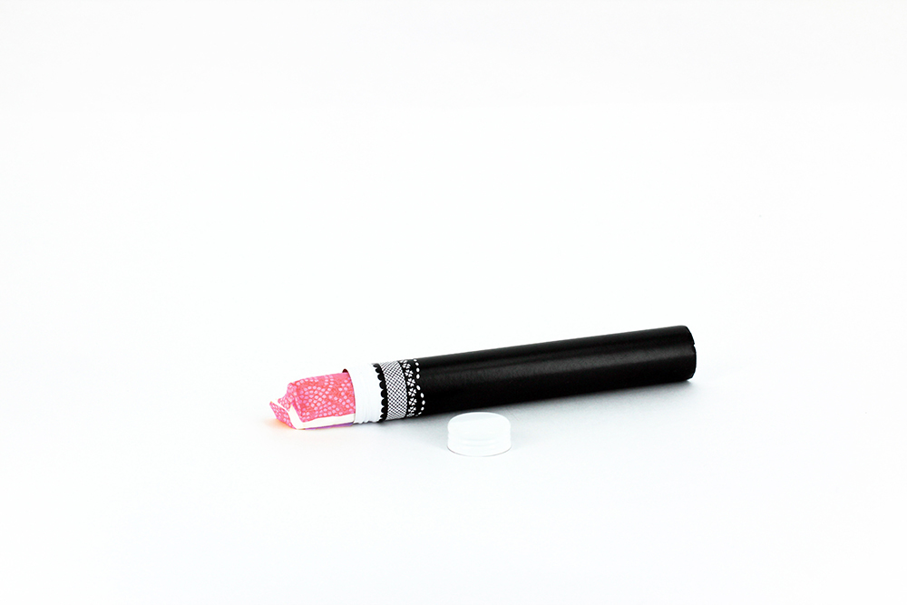
Further I decided to produce a case able to contain a tampon, I got this idea from my research, as many women found it awkward carrying around tampons in their purse, as everyone would know that they were on their period just from a glance in their purse.
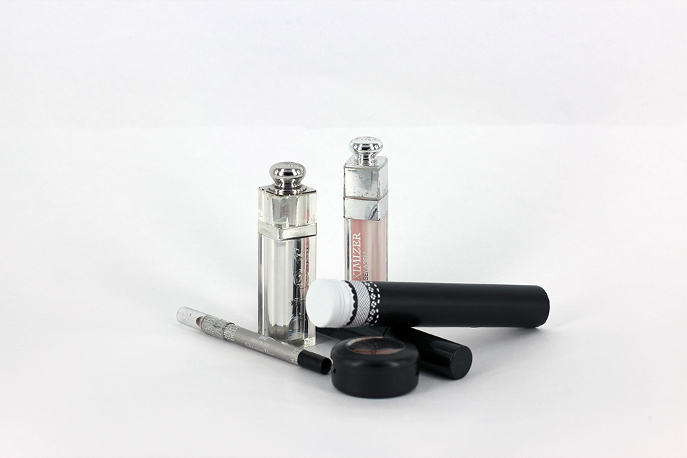
When designing the case I found inspiration from beauty products.

I would love to get feedback.


