Brief: Create a brand name, identity & packaging for a range of wild bird seed. The brand needs to ooze natural and be strong enough to hold its own along side branded competitors.
Concept: The main theme of my response is that of being informative but conversational, adding a playful element and highlighting the idea that the brand would be something the birds themselves would choose.
Solution: Using a colour palette taken from a range of wild birds I wanted my brand to be natural but eye catching and something that the purchaser would feel is good enough for them and in a sense 'good enough for their pet'
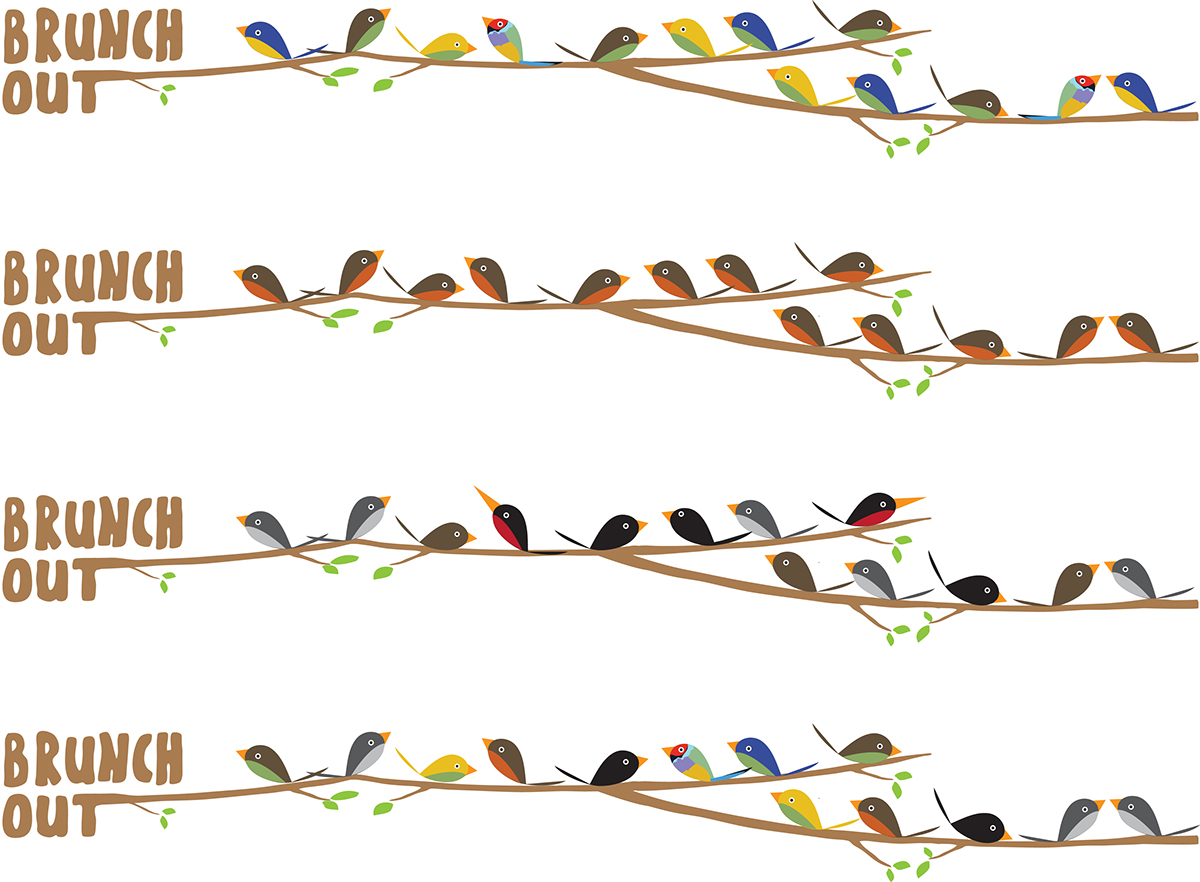
The brand name plays on the idea of ‘brunching out’, with the ‘T’ character elongated to portray a branch, reinforcing the play on words. I wanted the concept to feel more human and to reference the seeds as food. In this way the purchaser associates the product with buying food for themselves and, as such, is subject to the same decision making regarding quality and assurance.


The strapline Meet, eat and tweet uses wit and humour to suggest the birds are all talking about the new product, and reinforces the humanised angle by using bird themed phrases we often hear.

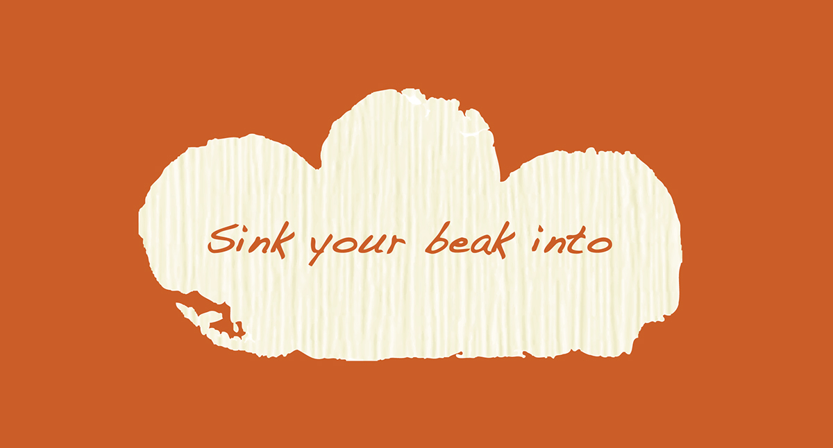
The packaging is purposely house shaped to stand out on the shelf. The house theme further reinforces the link between shopper, home and birds. To some purchasers the wild garden birds can become almost seen as pets. Again I have used phrases often associated with food and eating out to link with the brand name Brunch out to make the seeds be seen as ‘food for birds’ such as sink your beak into and for the ingredients on the back ‘today will be served…’.

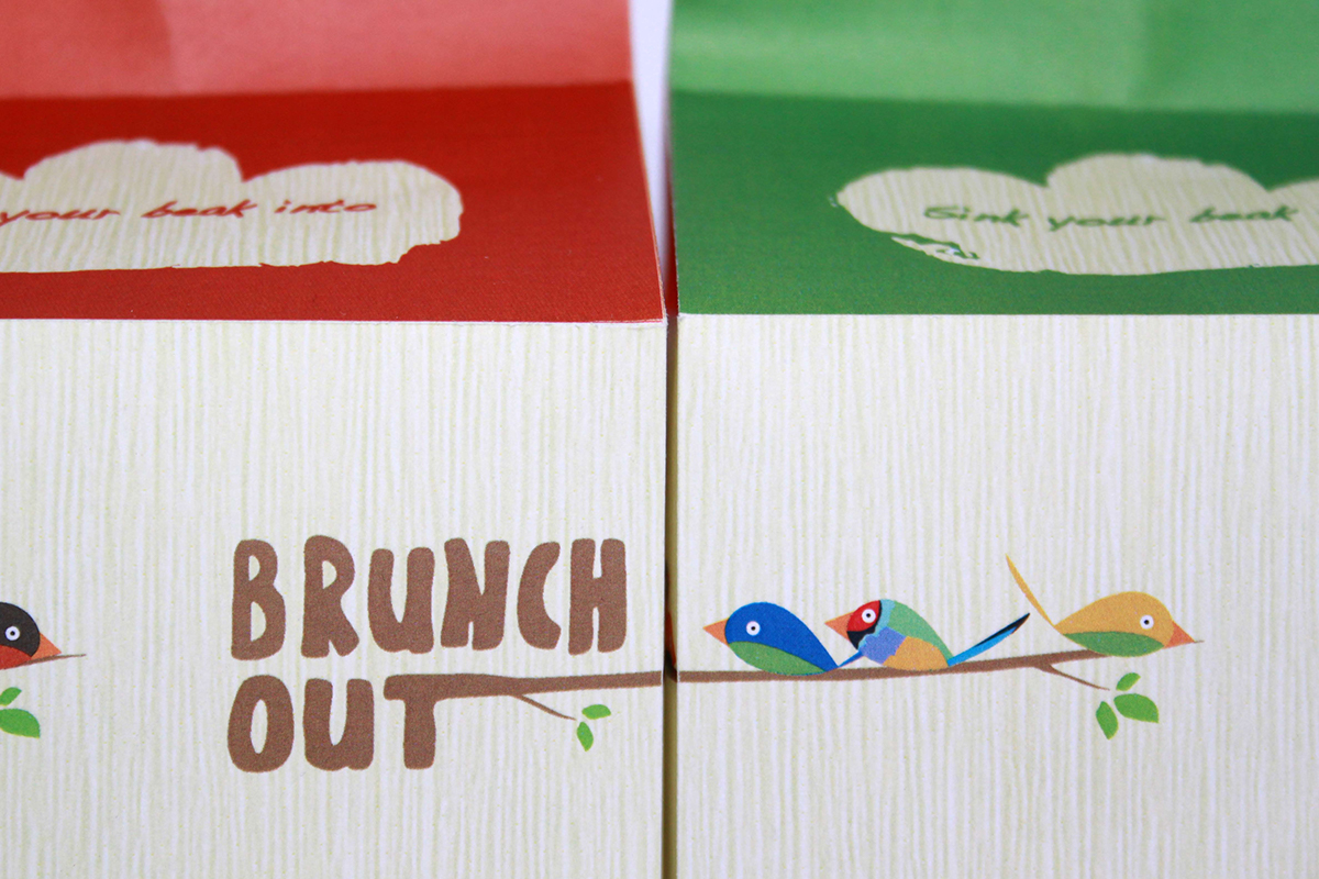

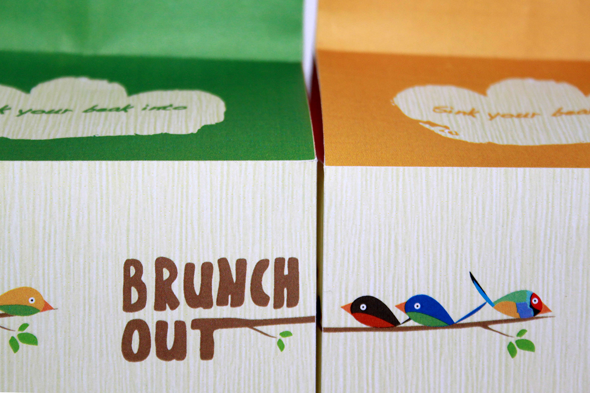

When stacked on the shelf the logo would look as if the branch is continuing on the next piece of packaging with the birds changing to highlight the strapline ‘meet, eat and tweet’ and to show all the wild birds together. Which ever way the packaging is stacked the branches would meet together.
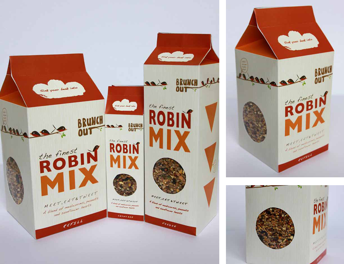
In the range available would be the feeder, refills and a chewy bar

The main idea for the packaging is how the seeds would be poured out. For the refill packaging the seeds would pour out from a triangular shape that would be perforated and slot in and out. The concept for this was for the shape to represent the beak of a bird. The seeds would be poured straight on a bird table or if the bird feeder was purchased too then would be poured into the top of the feeder.
The concept for the feeder would be the same as the refill packaging in that the triangular shape would be representative of a beak. These would be present on both sides of the product for the birds to feed from. Visible also would be speech bubbles with bird themed phrases such as ‘What’s everyone tweetin about’ and ‘What’s everyone’s feathers ruffled about’ to highlight the birds ‘talking’ about the new product and for it to seem as if the birds are actually saying it from the positioning of the speech bubbles to where the birds would feed from.


