Brand Identity and Packaging
Design Brief: With the (theoretical) legilization of marijuana in the United States, an American marijuana manufacturer is looking to launch a “toke shop” in Brooklyn where it will sell various strains of marijuana and related accessories. In addition to the retail area, the venue will house a cafe offering ready-to-smoke joints, snacks, coffee, tea, and other beverages.
Approach: Stash is based in the Brooklyn neighborhood of Williamsburg, where it caters to the hipster locals, known for their disposable income and extensive free time. The brand identity not only aims to capture the essence of Williamsburg but to also portray marijuana as a viable product in the legal marketplace.
The brand signature incorporates a mustache as a play on the dual colloquial uses of the word stash. The black and white palate keeps the look consistent, modern, and clean. Playful typography is used as the primary supporting element throughout the packaging and identity system.
The brand signature incorporates a mustache as a play on the dual colloquial uses of the word stash. The black and white palate keeps the look consistent, modern, and clean. Playful typography is used as the primary supporting element throughout the packaging and identity system.
Photographs of Comps/Concepts:

A business card that also triples as an envelope for samples, and a nifty disguise.
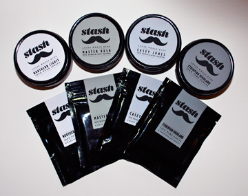
Packaging system for loose buds and rolled joints.
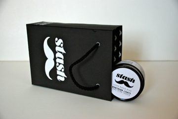
Shopping bag and product package.


Storefront Signage (Night).

Storefront Signage (Night).


