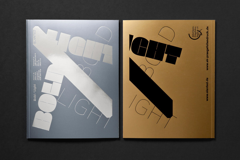
Slanted #16 – Bold/Light
Slanted #16 – Bold/Light is contrast. The new issue deals with the loud and the silent, the eye-catching and the inconspicuous.
BOLD is the opposite of despondent. In typography it is a popular method of accentuation. LIGHT is the opposite of noisy and bigmouthed. For this theme of contrasts we initially had more loud and bold fonts, works and pictures in mind than quiet, restrained ones. We are impressed of a time – striking and epic in its occurrences – which rushes past and carries us off. The soft overtones only get little attention at this rapid speed.
So, how can we pause, set the LIGHT against the BOLD? The fluid, cinematic moment of presentation has an exceptional meaning for us also in this issue. We are bothered about a linear concept of narration. The rhythmic comparison encourages to stay and immerse. Creative decisions and the use of typography for this compilation were stretched far to specific borders, to underline the topic and to work out the character of the two extremes. This precipitates also in the production: By the use of different, metallic Chromolux papers and a two-colored finishing, issue #16 appears with six different covers. Furthermore a haptic surprise awaits the reader in the inner part.
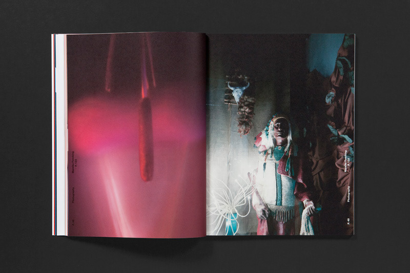
We are glad having the chance to present two photo series, which interpret the terms BOLD and LIGHT on a special, distinctive way: The historical photography of the propably most significant heavyweight champion of all times, Muhammad Ali (UPI/Bettmann/Corbis), as well as a critical photographical counterdraft to the “soft-washed” and alleged airy aesthetics of David Hamilton, created by Mareike Foecking (Düsseldorf).
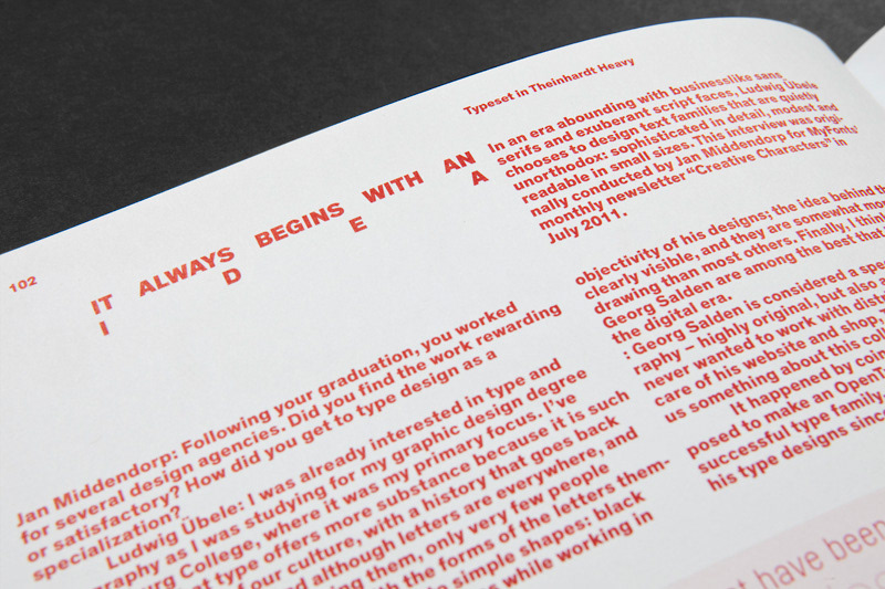
We feature type essays by Jean François Porchez (Clarmart), Horst Wöhrle (Esslingen), Reinhard Albers (Constanz) and Nanna Funke (Münster), furthermore interviews with Ian Party (Lausanne), Ludwig Übele (Berlin), Eric Gill, Michael Horsham (London), Doug Wilson (Springfield), Raffinerie AG für Gestaltung (Zurich), Jost Hochuli (St. Gall), Thomas Lupo (Weissach) and Mareike Foecking (Düsseldorf), as well as reports by Michael Schmidt (Munich), Ian Lynam (Tokyo) and a musical travel report by Frank Wiedemann (Berlin).
Slanted Magazine #16
Bold/Light
Design: MAGMA Brand Design
Editor: MAGMA Brand Design
Release: 24.11.2011
Language: English, German
148 pages
21 × 27 cm
BOLD is the opposite of despondent. In typography it is a popular method of accentuation. LIGHT is the opposite of noisy and bigmouthed. For this theme of contrasts we initially had more loud and bold fonts, works and pictures in mind than quiet, restrained ones. We are impressed of a time – striking and epic in its occurrences – which rushes past and carries us off. The soft overtones only get little attention at this rapid speed.
So, how can we pause, set the LIGHT against the BOLD? The fluid, cinematic moment of presentation has an exceptional meaning for us also in this issue. We are bothered about a linear concept of narration. The rhythmic comparison encourages to stay and immerse. Creative decisions and the use of typography for this compilation were stretched far to specific borders, to underline the topic and to work out the character of the two extremes. This precipitates also in the production: By the use of different, metallic Chromolux papers and a two-colored finishing, issue #16 appears with six different covers. Furthermore a haptic surprise awaits the reader in the inner part.
We are glad having the chance to present two photo series, which interpret the terms BOLD and LIGHT on a special, distinctive way: The historical photography of the propably most significant heavyweight champion of all times, Muhammad Ali (UPI/Bettmann/Corbis), as well as a critical photographical counterdraft to the “soft-washed” and alleged airy aesthetics of David Hamilton, created by Mareike Foecking (Düsseldorf).
We feature type essays by Jean François Porchez (Clarmart), Horst Wöhrle (Esslingen), Reinhard Albers (Constanz) and Nanna Funke (Münster), furthermore interviews with Ian Party (Lausanne), Ludwig Übele (Berlin), Eric Gill, Michael Horsham (London), Doug Wilson (Springfield), Raffinerie AG für Gestaltung (Zurich), Jost Hochuli (St. Gall), Thomas Lupo (Weissach) and Mareike Foecking (Düsseldorf), as well as reports by Michael Schmidt (Munich), Ian Lynam (Tokyo) and a musical travel report by Frank Wiedemann (Berlin).
Slanted Magazine #16
Bold/Light
Design: MAGMA Brand Design
Editor: MAGMA Brand Design
Release: 24.11.2011
Language: English, German
148 pages
21 × 27 cm
Buy at slanted.de
Subscribe to Slanted Magazine and never miss an issue. Receive 4 issues per annual via mail and save money and time. Be in tune with the Zeitgeist of typography and design.
If you want to buy the issue via Slanted Shop you get free access to Slanted portfolio area. There you can present your fresh (typographic) projects or new fonts.