


São Paulo Zoo - Identity redesign and wayfinding
An academic group project done in 2011.
An academic group project done in 2011.
Group members: Amanda Souza, Ayako Matsuda, Danielle Quast Tostes, Gabriela Weischtordt, Luis Eduardo Consolo
The purpose of this project was to come up with a fun and more comprehensive identity and wayfinding system for the São Paulo Zoo. We identified many problems in the actual system, mostly of maintenance and inconsistency. It also didn't seem to catch the users' attention or actually work for wayfinding (signs would only work one way, people still couldn't - even with a map - figure out where they were or where they had to go, etc). There was also a surprising lack of map signs.
We decided to start from scratch, then, by mixing a bit of an Art Nouveau influence with some playfulness.
The zoo as it currently is
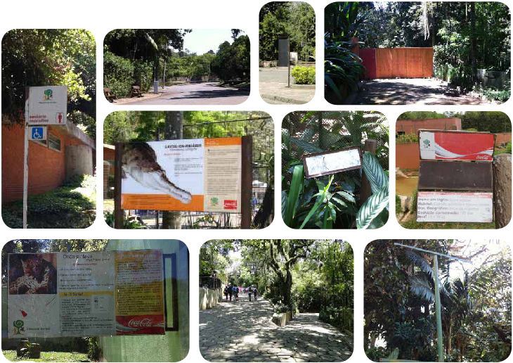
You can notice missing signs, bad maintenance and a general lack of consistency.
Proposed Identity

My initial conception for the zoo brand. The wolf represented is the maned wolf, one of the main native attractions of the zoo. The group later decided that the wolf was too chubby and the palette was too gloomy.

Sketches for the signs. Still very rough.


Despite my personal distaste for yellow, these ended up becoming the final logo and its alternates. The color choice was mainly because of the contrast necessary for it to draw people's attention inside the zoo.
Besides the wolf and the color, the P also suffered some changes. An area of 'non-interference' for the brand was determined and represented by the bounding boxes above. The box itself is not a part of the logo, though.
Besides the wolf and the color, the P also suffered some changes. An area of 'non-interference' for the brand was determined and represented by the bounding boxes above. The box itself is not a part of the logo, though.
The System
The map was divided into 4 color coded sectors to facilitate user recognition, we also used the avenues animals' icons and numbering to keep things organized.
The system itself is composed of:
~ Large animal information signs
~ Smaller animal information signs (for areas with little space or lots of animals cramped together, such as the bird area)
~ Location signs (These have the avenue name and the icon of a popular animal present in it)
~ Orientation signs (Lists nearby avenues, toilets, restaurants, etc)
~ 4 map signs
~ Animal and Zoo SP totems
~ Animal paw prints (on the floor)
~ Prohibitive signs
~ Service signs
All signs were color coded according to their location in the map.
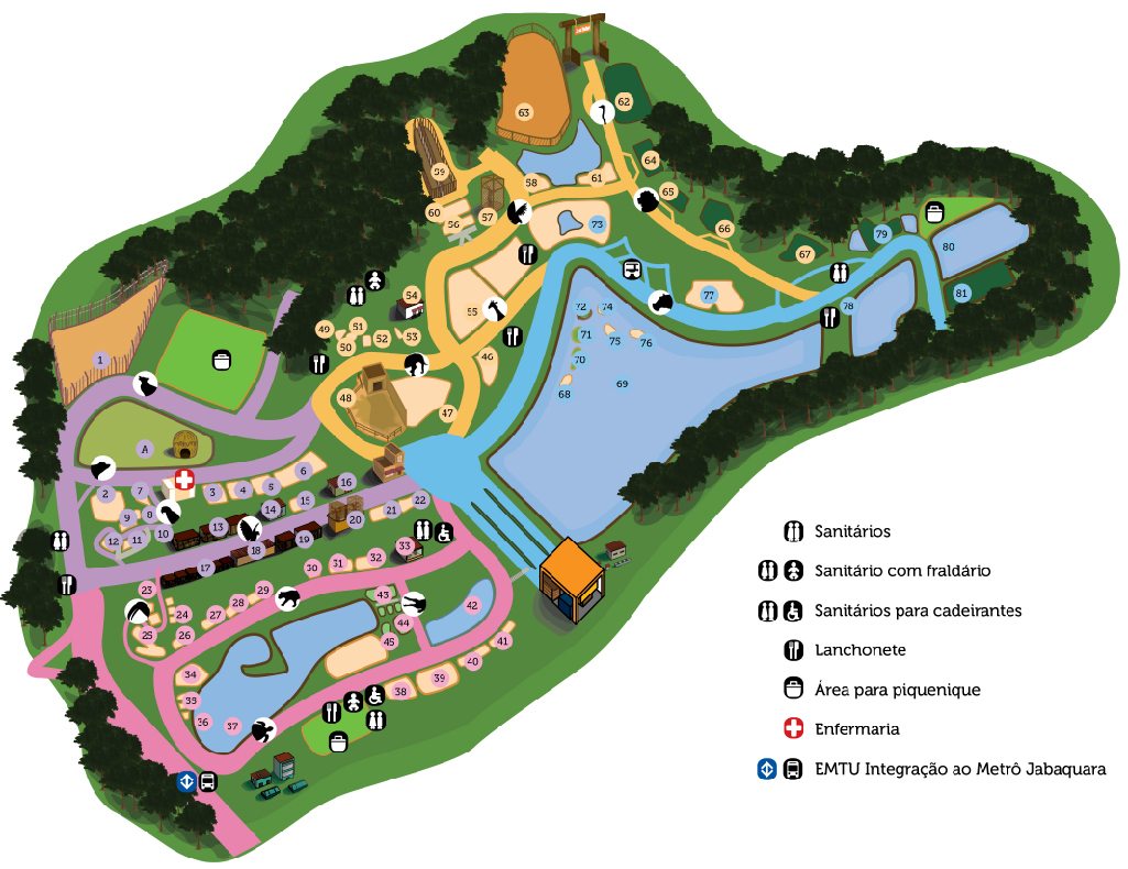


Simplified map with sign positioning, this wasn't the map visitors would see, but our own mapping of the park so we knew what we were working with to make that much neater map you guys saw before this one.


Signs and their size relations when compared to a 1,7m high person.

Exploded view of the workings of the small sign. It was made this way to accomodate the fact that the animals some times needed to be moved. This way the sign could also be moved with it, without the need to produce new signs or 'breaking' the system.
Design Elements

System's typography.

Orientation sign's arrows.

Animal pictograms used for the location and orientation signs, maps and totems.
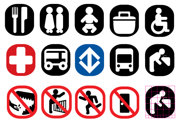
Pictograms. The "do not feed the animals" one is personally my favourite.

Animal prints were place on the floor to help locate certain animals, this is an example of a few.
Simulation

Zoo SP totem.

Animal totem.

Map sign.

Orientation sign.

Big animal information sign.

Small animal information sign (double)

Upclose view.


The big animation signs have, along with all the basic information, a little map illustrating the origin of the animal and trivia/curiosities about it.


Location sign.


Prohibitive sign


Service signs (toilets)

Simulation of the animal paw prints on the floor, these are guiding the user to the maned wolf, which people seemed to have trouble finding.


