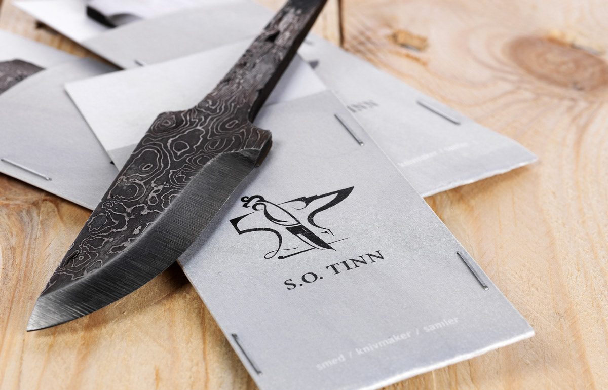
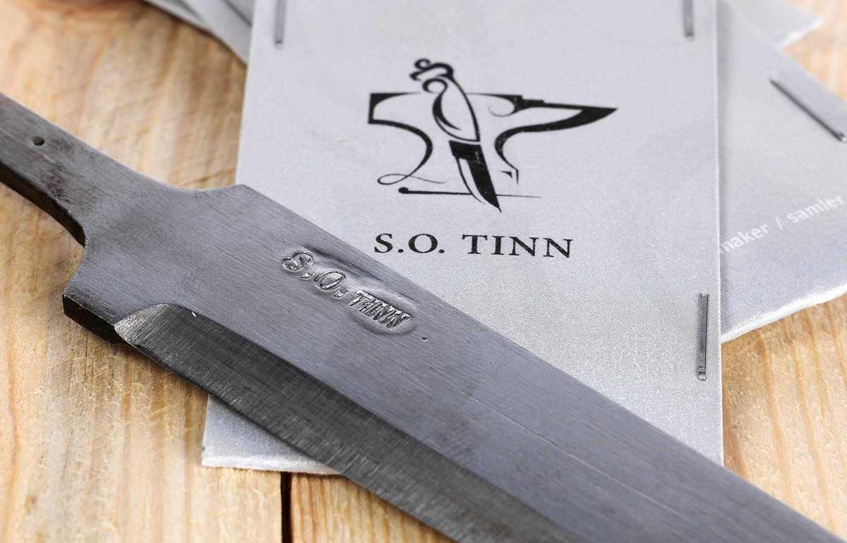
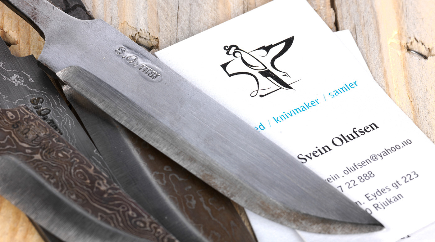
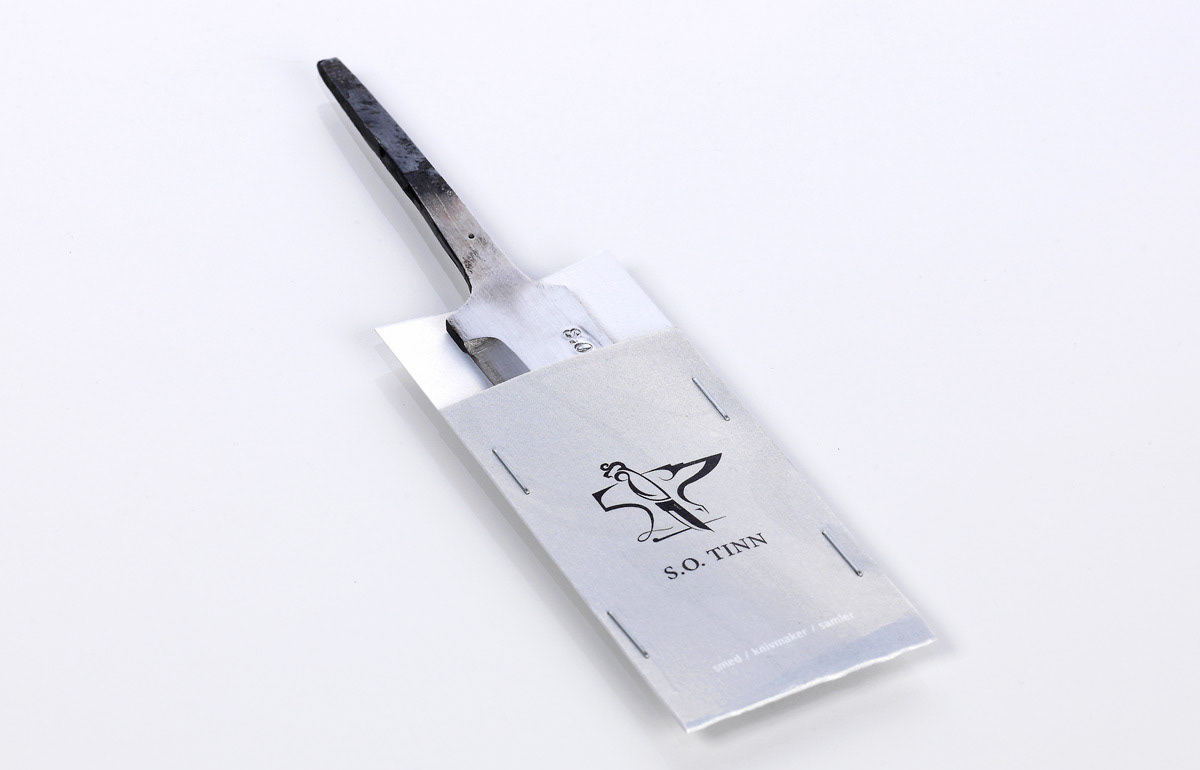
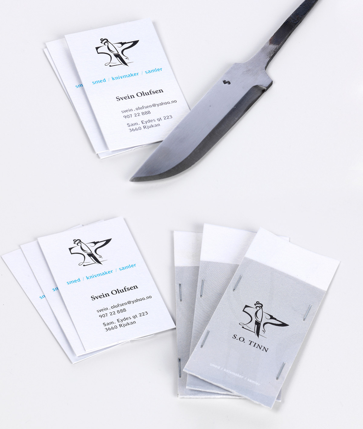
S.O Tinn
- S.O Tinn
Bussiness cards and blade packaging 
- A simple branding project made for my dad, Svein, who is a fond knife maker. He is involved down the entire ”line of production”; He is forging the blades, carves out handles of wood and creates the knife sheaths before putting it all together, or sell the blades individually. He is also a dedicated collector of knives.
The brief was to design a logo and a set of business cards for branding purposes, and also design a set of simple “envelope” packaging for his blades. He wanted the logo to represent his three unified hobbies; Blacksmithing, knife making and knife collecting.
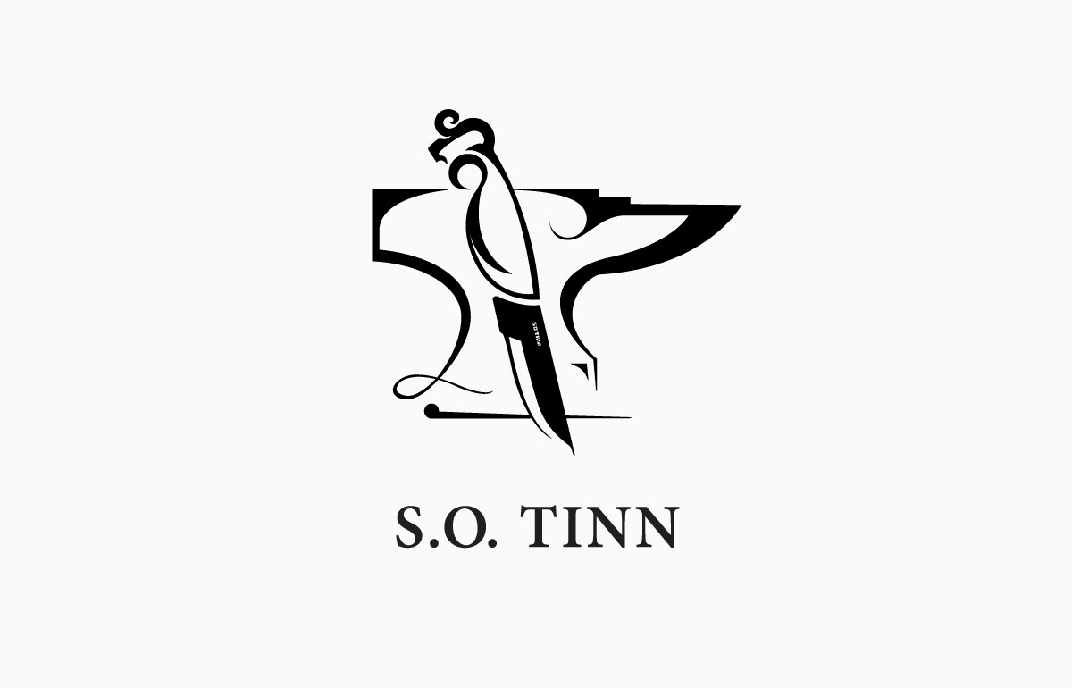
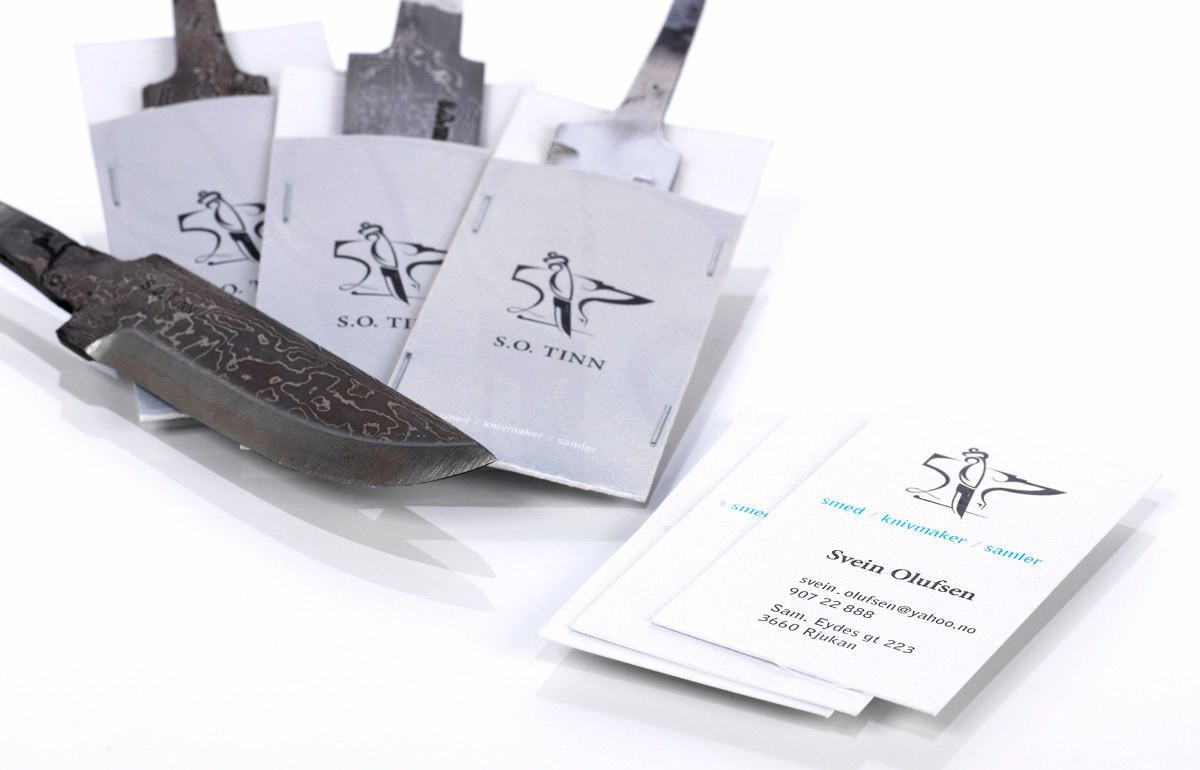
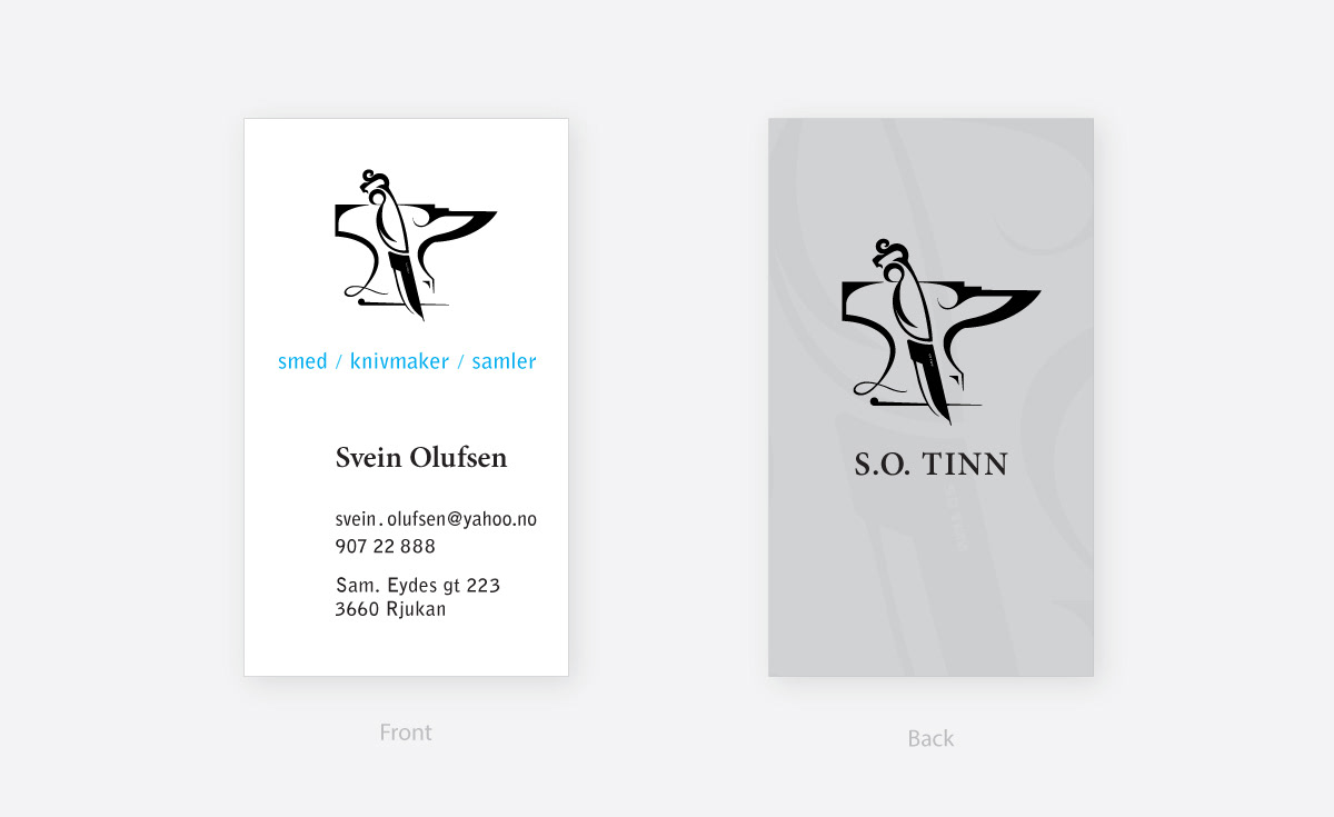
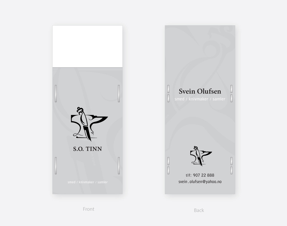
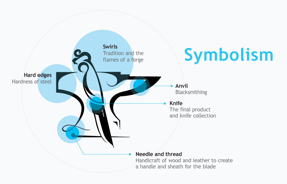
The logo was made to symbolically unite all of his three hobbies and give a feel of tradition, while also mixing the organic and non-organic processes involved in making a knife.
The S.O Tinn underneath the logo is his initials, Svein Olufsen, and his home county Tinn – which is the known way for blacksmiths to mark and brand their products. ( I also "camouflaged" his initials within the symbol, just for the fun of it )
Both the business cards and knife-envelopes were printed on 300g “Curious Metallic Metal, Ice Gold” paper, which gives the grey colour a subtle but life like metallic shine when viewed underneath light.


Discuss This Project: ( Comments)