SAS rebranding
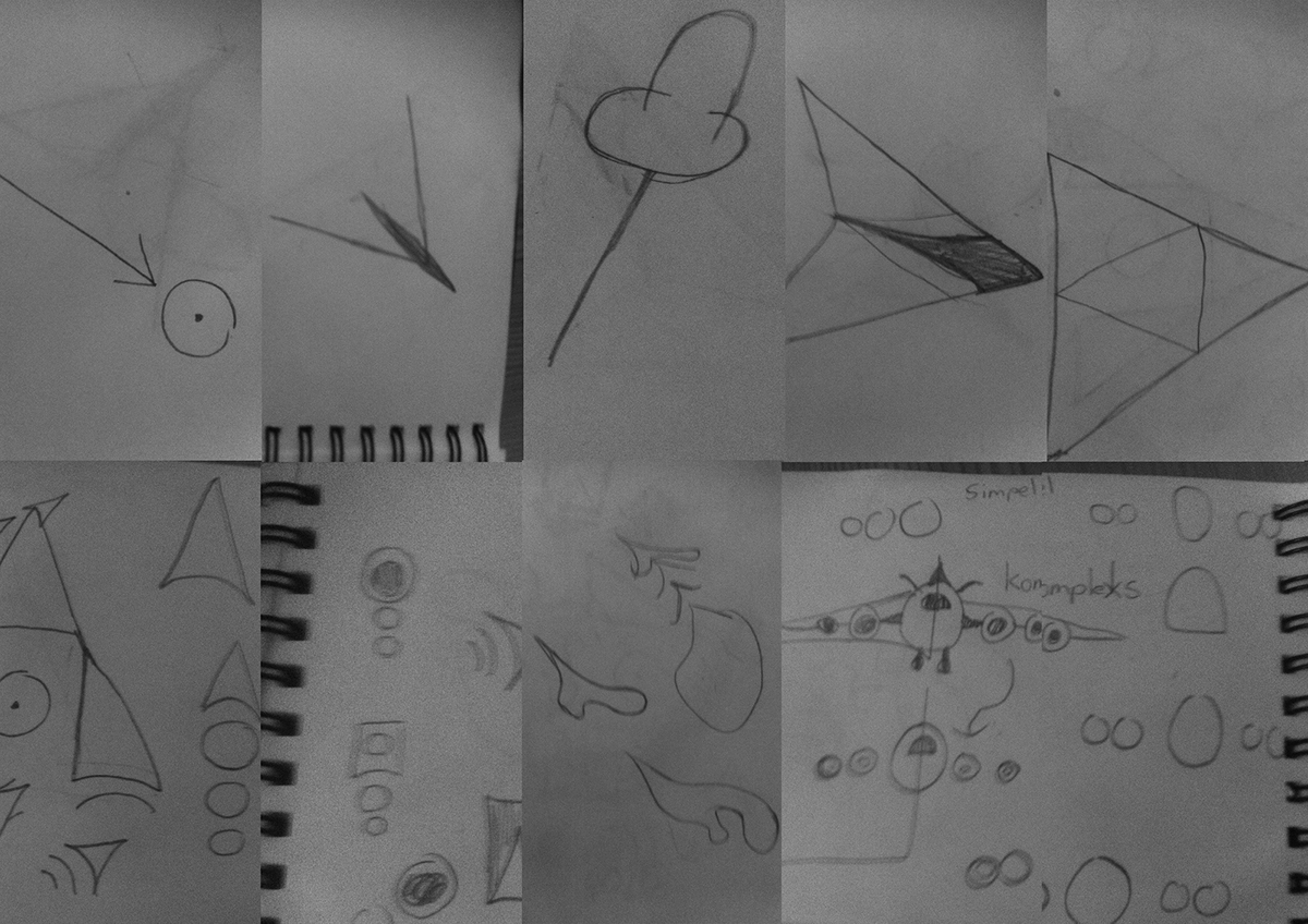
I have chosen to preserve the foundation of SAS's branding of themselves by maintaining the blue and white colors, as I only want the shape of the logo to be the positioning/explanatory factor. In order to shape the logo form, I have immersed myself in the 'dream' of respectively 'freedom' and 'vacations',and hence the bright thought bubbles.
I have made a sharp edge on the last bubble to make sure that SAS can fill in the rest of the dream, SAS can then make the dream of freedom and vacations real.
- As a final finish, the form of the bubbles also show a silhouette, of the left side of a passenger plane (seen from the front).
I have made a sharp edge on the last bubble to make sure that SAS can fill in the rest of the dream, SAS can then make the dream of freedom and vacations real.
- As a final finish, the form of the bubbles also show a silhouette, of the left side of a passenger plane (seen from the front).