
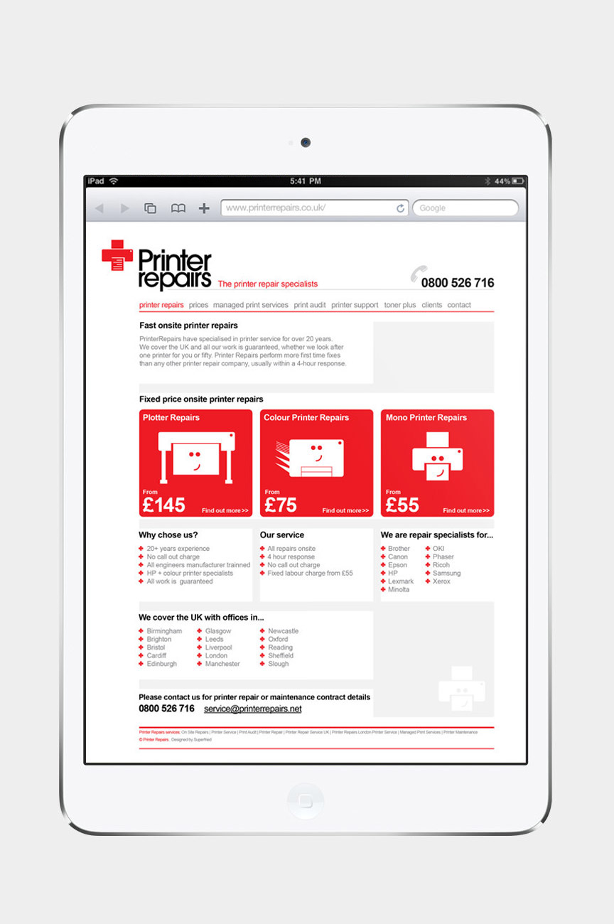
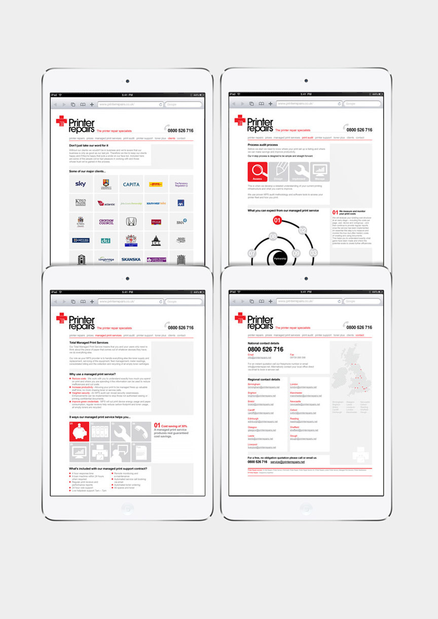

Printer Repairs are a long established firm providing maintenance and repairs to office equipment.
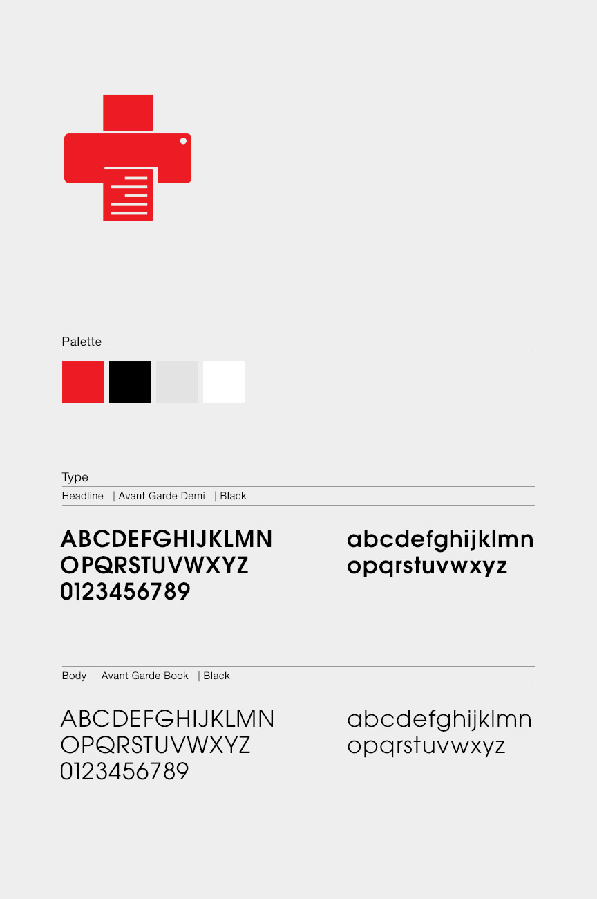
Superfried were briefed to completely re-develop their identity from scratch. It was important that the new brand looked clean, professional and approachable.
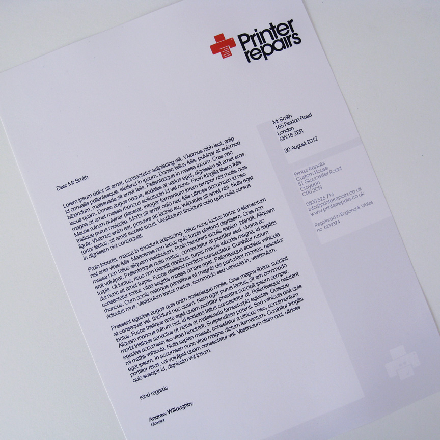
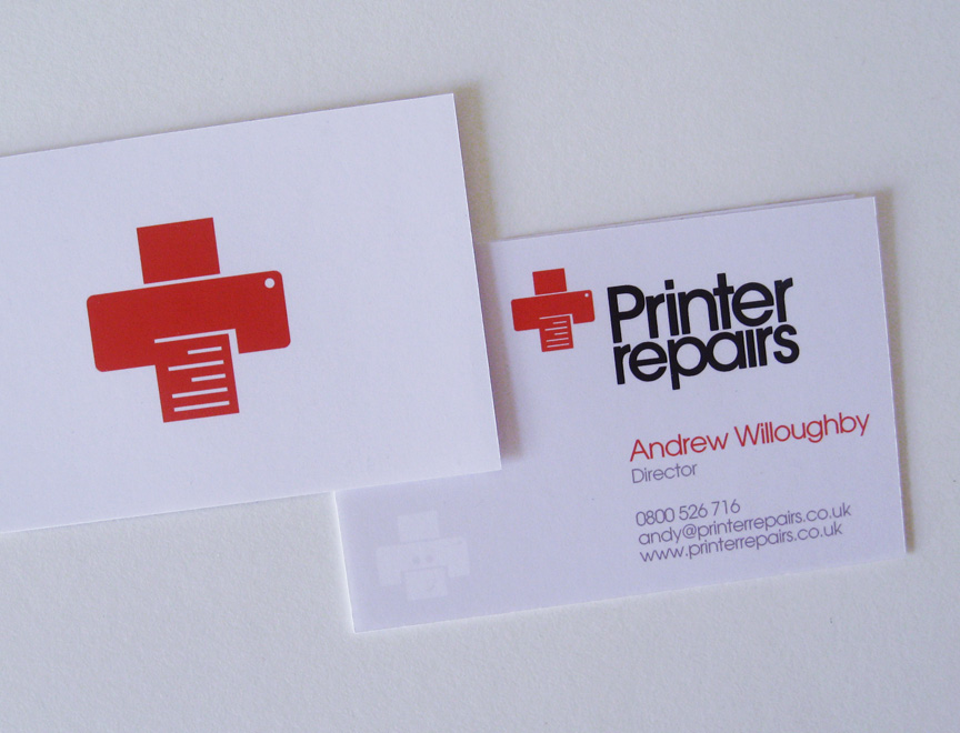
They trade within a very competitive industry sector so a strong identity was required. It was felt a distinct icon would be required in addition to a different approach to the competition. Printer Repairs would be positioned as the emergency service for office machines. With this in mind whilst looking at symbols for printers their resemblance to a cross in shape became apparent. As one of the most widely recognised symbols, the red cross provided both recognition and the required medical connotations.
Superfried were briefed to completely re-develop their identity from scratch. It was important that the new brand looked clean, professional and approachable.
They trade within a very competitive industry sector so a strong identity was required. It was felt a distinct icon would be required in addition to a different approach to the competition. Printer Repairs would be positioned as the emergency service for office machines. With this in mind whilst looking at symbols for printers their resemblance to a cross in shape became apparent. As one of the most widely recognised symbols, the red cross provided both recognition and the required medical connotations.
With such a strong icon a very simple style was adopted for the typography. For the website, for continuity, a clean and clinical style was implemented.

