Paul Smith Fragrance Brief - "RIVAL"
SECOND YEAR WORK - I was shortlisted for this project by Paul Smith, 2012
BRIEF:
CONCEPT:
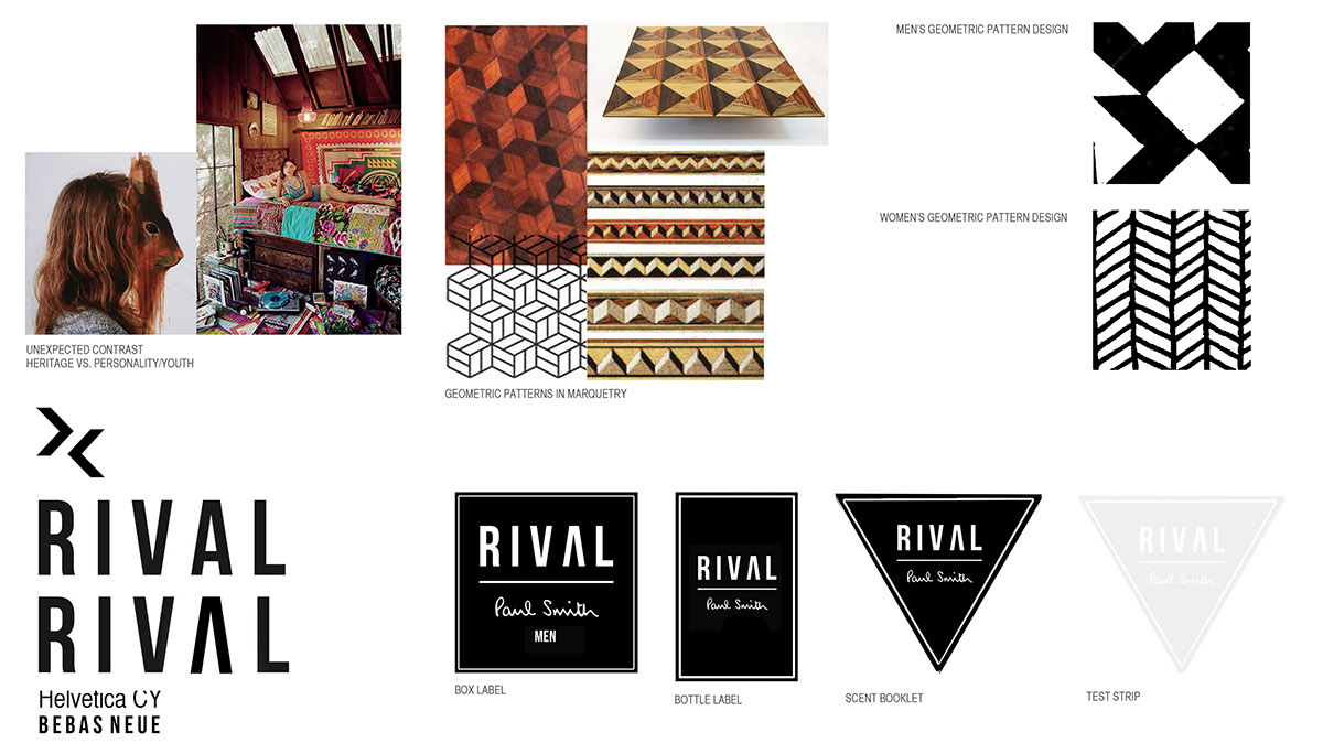
Unexpected Contrast - heritage vs. personality/youth
Geometric Patterns in marquetry
Geometric Patterns in marquetry
SOLUTION:
Formation of the marque based on opposing chevrons found in marquetry.
Formation of the marque based on opposing chevrons found in marquetry.
RIVAL - The letters "V" and "A" mimic chevron shapes in opposition when places next to one another. I removed the horizontal bar from the letter "A" to further enhance this effect.
This also suggests the juxtaposition of heritage and fun/youth - two elements which are working to offset one another yet seek the same outcome (like rivals).
This also suggests the juxtaposition of heritage and fun/youth - two elements which are working to offset one another yet seek the same outcome (like rivals).
Unexpected Contrast - heritage vs. personality/youth
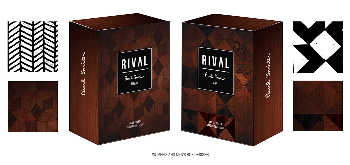
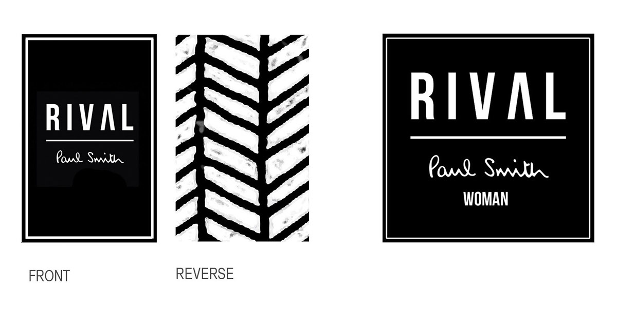
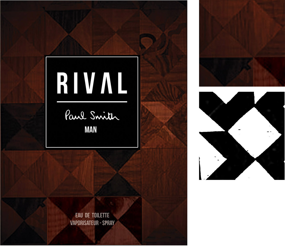
Geometric Patterns in marquetry - different variants for both genders (women's is more intricate and features curves whereas the men's is more robust and uniform in appearance, echoing strength and masculinity), yet at a glance the two boxes look similar; reflecting the androgeny present in Paul's Mainline fashion collection. This is also true of the interior box pattern designs for both genders.
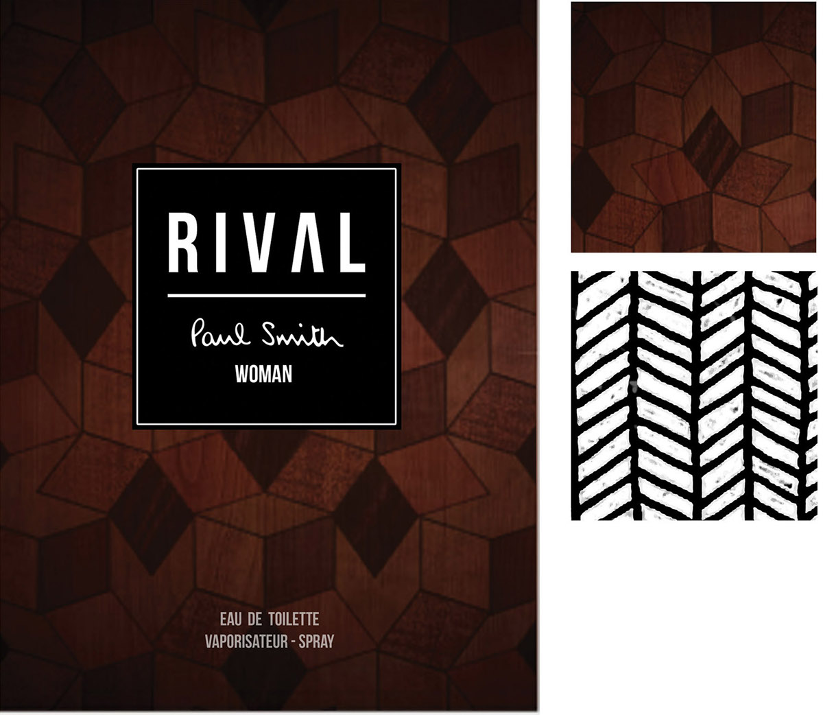
WOMEN'S BOX DESIGN & INTERIOR/EXTERIOR PATTERN SWATCH

The bottle design takes inspiration from the aesthetic of vintage whiskey bottles and the glass is etched to form a chevron patterns down the centre.
In the centre is space for either a label or another etched, rectangular section of glass, which instead of being angled is contrastingly straight/flat and protrudes inwards slightly.
The lid of the bottle is made from a rich-coloured wood and features a subtle chevron inlay on its top, symbolising Paul's attention to detail and love of the eclectic. When the lift is removed the pattern is removed (unexpected contrast - with continuity to the pattern within the box interior), to give an unexpected and playful indication of gender - suitable for the young demographic. The interactive nature of the product continues the fun, youthful feel.
The pattern is carried throughout the different elements of the packaging - box interior, underside of bottle lid, reverse of bottle label (visible through glass when bottle is turned around - tactile) and within the scent booklet.
MOCK-UP OF BOTTLE, INDICATING LABEL FUNCTION

(LEFT TO RIGHT) PROPOSED BOTTLE LABEL & BOX LABEL
MOCK-UP OF BOTTLE LID

MEN'S BOX DESIGN & INTERIOR/EXTERIOR PATTERN SWATCH

MOCK-UP OF BOTTLE, INDICATING LABEL FUNCTION
(LEFT TO RIGHT) PROPOSED BOTTLE LABEL & BOX LABEL

MOCK-UP OF BOTTLE LID

The exterior of the packaging is fairly minimal and classic, focusing on luxury materials. The patterns are inspired by the geometric forms found in marquetry, which relate to Paul's love of heritage.
Box box interiors feature bold patterns which inject a burst of spontaneity and youthful energy into the design and reflect the brand's personality.
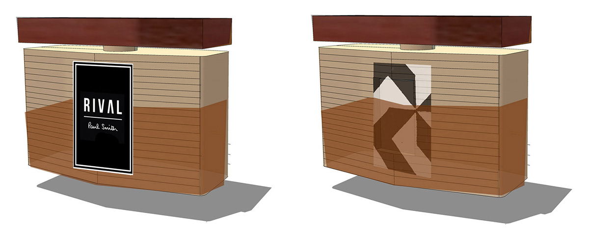
ADDITIONAL PACKAGING CONTENT & POINT OF SALE (BOTH GENDERS)


