
Neige Ice Cider
Brand Identity & Packagings
Brand Identity & Packagings
—
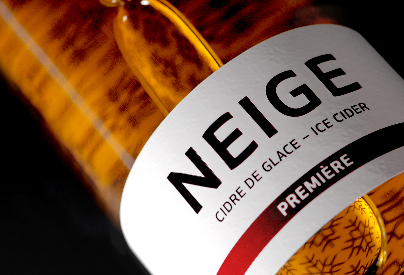
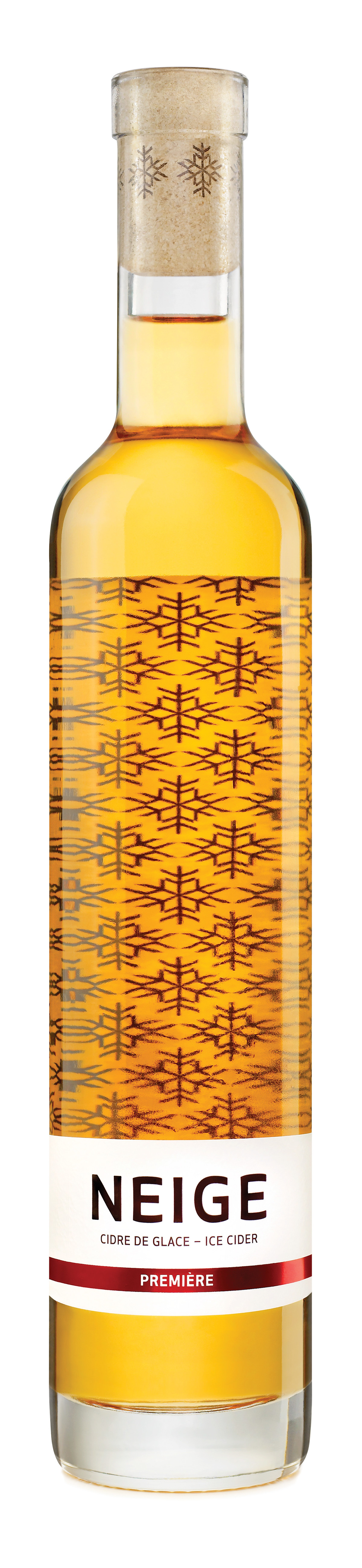
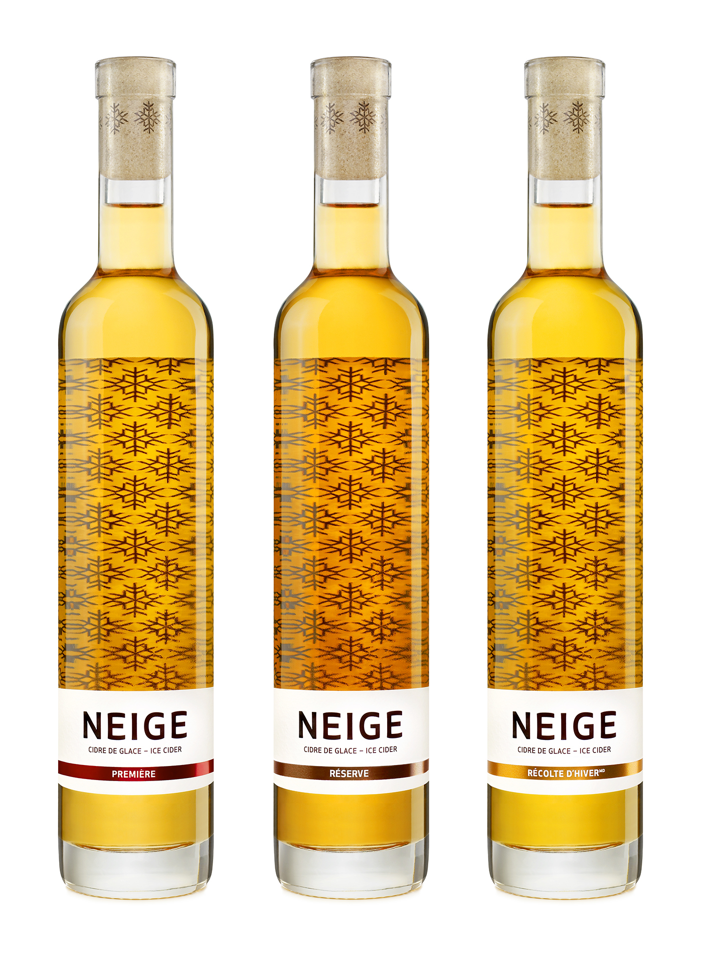
Inspired by the technique used to make ice wine and by Québec’s very particular climate, Neige (meaning snow in English) ice cider was born out of this Canadian province’s terroir, which has the extreme cold winter temperatures needed to produce the concentration of sugars for its creation.
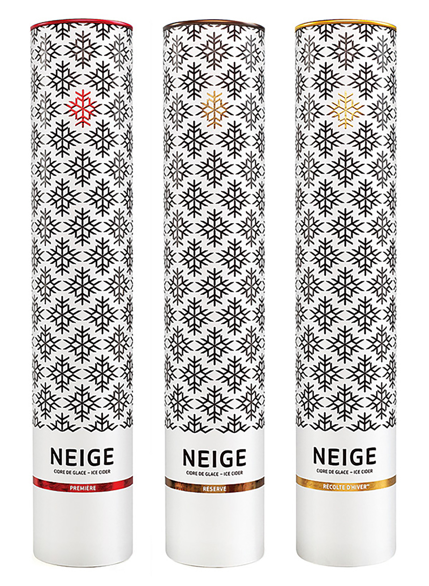
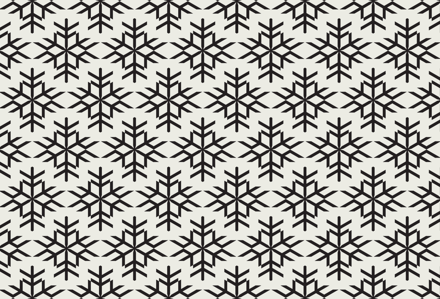
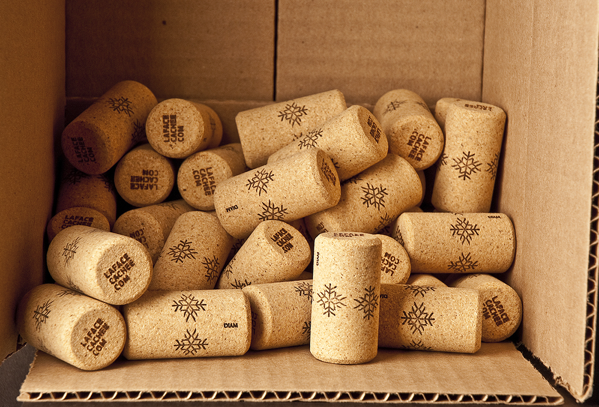
The cidery La Face Cachée de la Pomme approached Chez Valois to redesign the brand identity and packaging of the product line. The goal was to reafirm the leader and trendsetter position of this premium brand in the ice cider category as well as reinforce its recognition on the international market. To achieve this, a clean and minimalist design was created based around a pattern of snowflakes that can be found throughout the product line.
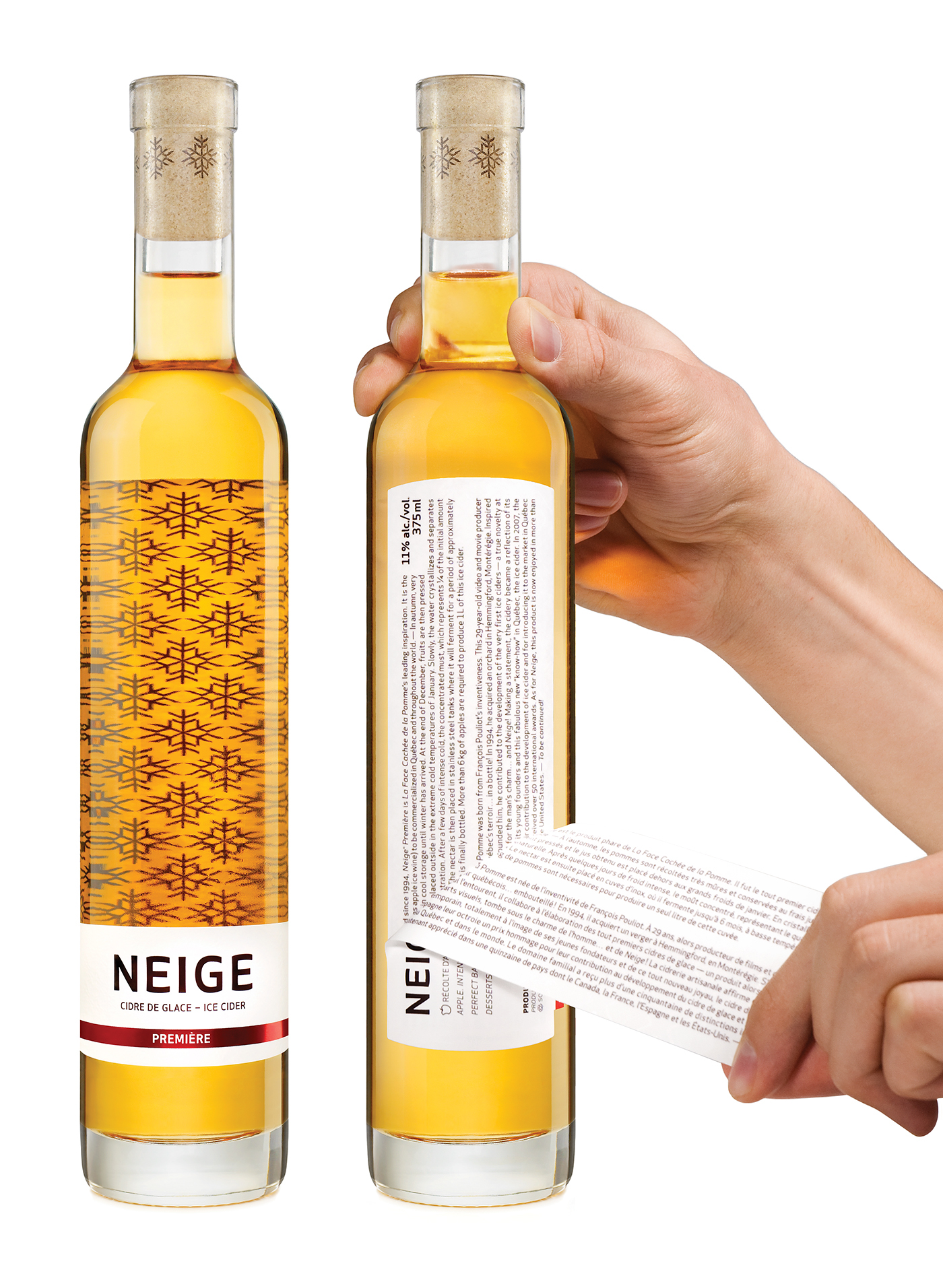
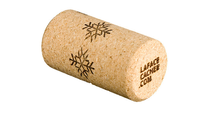
A lot of subtle elements were also included in the design of the packaging, such as a peel-off label on the back of the bottle that allows to include more information on the history of the cidery and on the fabrication process of ice cider. Custom packing tape was also created to help identify which of the three versions of the product can be found in the shipping boxes.
The cidery La Face Cachée de la Pomme approached Chez Valois to redesign the brand identity and packaging of the product line. The goal was to reafirm the leader and trendsetter position of this premium brand in the ice cider category as well as reinforce its recognition on the international market. To achieve this, a clean and minimalist design was created based around a pattern of snowflakes that can be found throughout the product line.
A lot of subtle elements were also included in the design of the packaging, such as a peel-off label on the back of the bottle that allows to include more information on the history of the cidery and on the fabrication process of ice cider. Custom packing tape was also created to help identify which of the three versions of the product can be found in the shipping boxes.
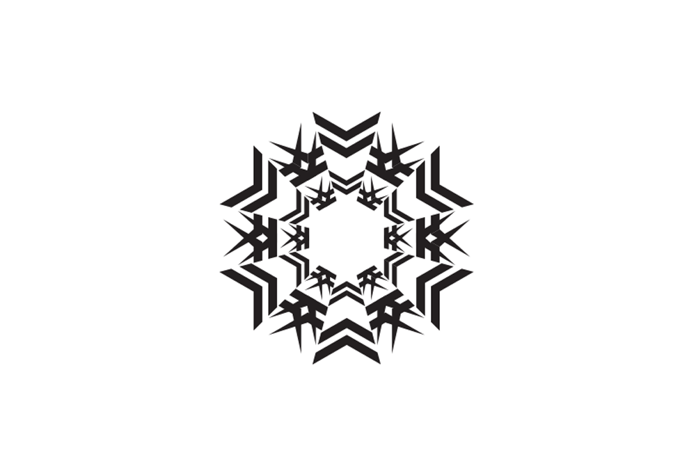
Preliminary exploration for the flake symbol


Advertising campaign

Design studio: Chez Valois
Brand identity & packaging
Brand strategy: Patrick Gauthier | Creative direction & design: Michel Valois | Symbol design: Catherine Petter
Brand strategy: Patrick Gauthier | Creative direction & design: Michel Valois | Symbol design: Catherine Petter
Advertising campaign: Louis Beaudoin & Michel Valois
Thank you for liking


