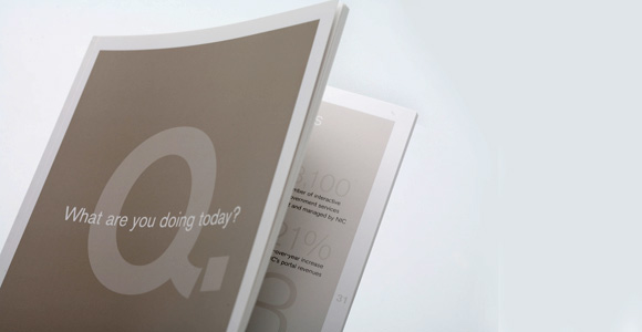
NIC, the world’s largest provider of Web-enabled government services, has concluded a comprehensive branding overhaul. Working through our Perception Branding Process, NIC clarified
their position and incorporated it into the brand identity both visually and verbally.
their position and incorporated it into the brand identity both visually and verbally.

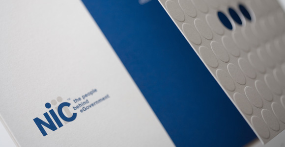
The dotted “i” design of the finished logo was a logical representation of the “people behind” concept. Once the logo design was established, we created and published corporate identity guidelines for use of the logo, such as color specifications, proper presentation space and typography. Also included are examples of correct and incorrect uses for the logo.
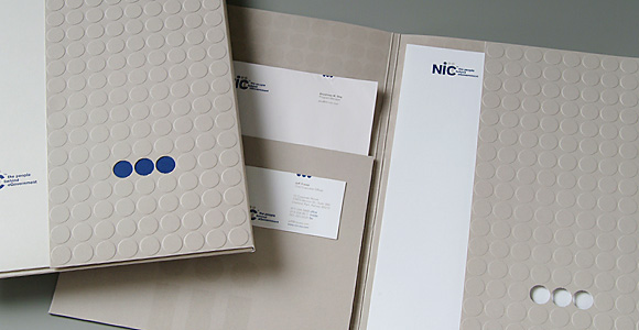
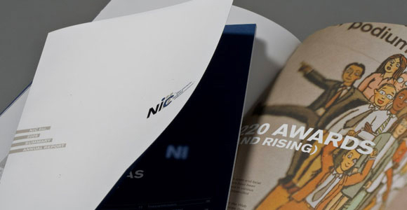
Following the standards established, we designed stationery, business cards, a PowerPoint template, and a corporate pocket folder. All the projects we continue to create for NIC from their annual report to trade advertising reflect the brand attributes, the Brand Promise, and the target audience.