


Music Performer Identity
In 2010, the client, a student of music looking to become a concert pianist, asked me to create a visual identity so that he might promote himself. The client wanted an identity which captured some of the classical distinction of the music he plays, without appearing outdated and sombre.

As the majority of the client’s retinue included classical compositions, I felt a serif font was appropriate. The font Georgia provided the right balance between old and new with it's beautiful, yet relatively subtle serifs and thick/thin relationships. It worked well as both a display font and a body font and could be used in all situations required for future promotions. Being an identity focusing on the man, the performer, I wanted the logo to be simple and clean, free of unnecessary elements. The colour, a slightly warmer shade of cyan, was chosen to evoke a sense of energy and bring the identity into modern times.

For the business card, I used a piece of the fantastic photography by Ocello Photography depicting the hands of the artist playing the piano. To contrast this this classic looking scene, I applied a modern type treatment to the logotype and information which forms a near solid block, strongly pulling it out of the card toward the viewer. For the back of the card, a variation of the logotype displays the web address amongst some playfully placed filagree. The end result is a card that playfully balances classical style with a modern layout.

To promote his upcoming concert, the client asked for a poster design that would attract attention from the bulletin boards around the university campus. To that end, I combined the established identity with an attention grabbing, tiled layout, with bright colours and a healthy amount of white space. The result is a poster somewhat reminiscent of wood block posters of old that proved complicated enough to grab the eyes of passers-by, while still being easy to read. The show quickly sold out.

Rather than using generic tickets, the client ordered custom tickets which mirrored the look of the poster.
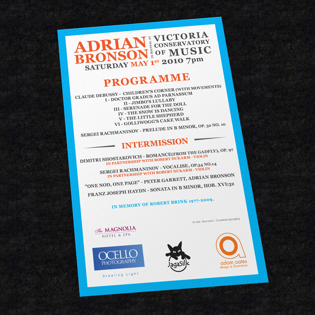
The client needed a programme to match the poster and ticket.

After the concert, which the client had professionally recorded, he wished to release a DVD of the performance. The brand was applied to the case and disk design, with a heavy focus on photography.

The same design was then extended to the design of the DVD menu.
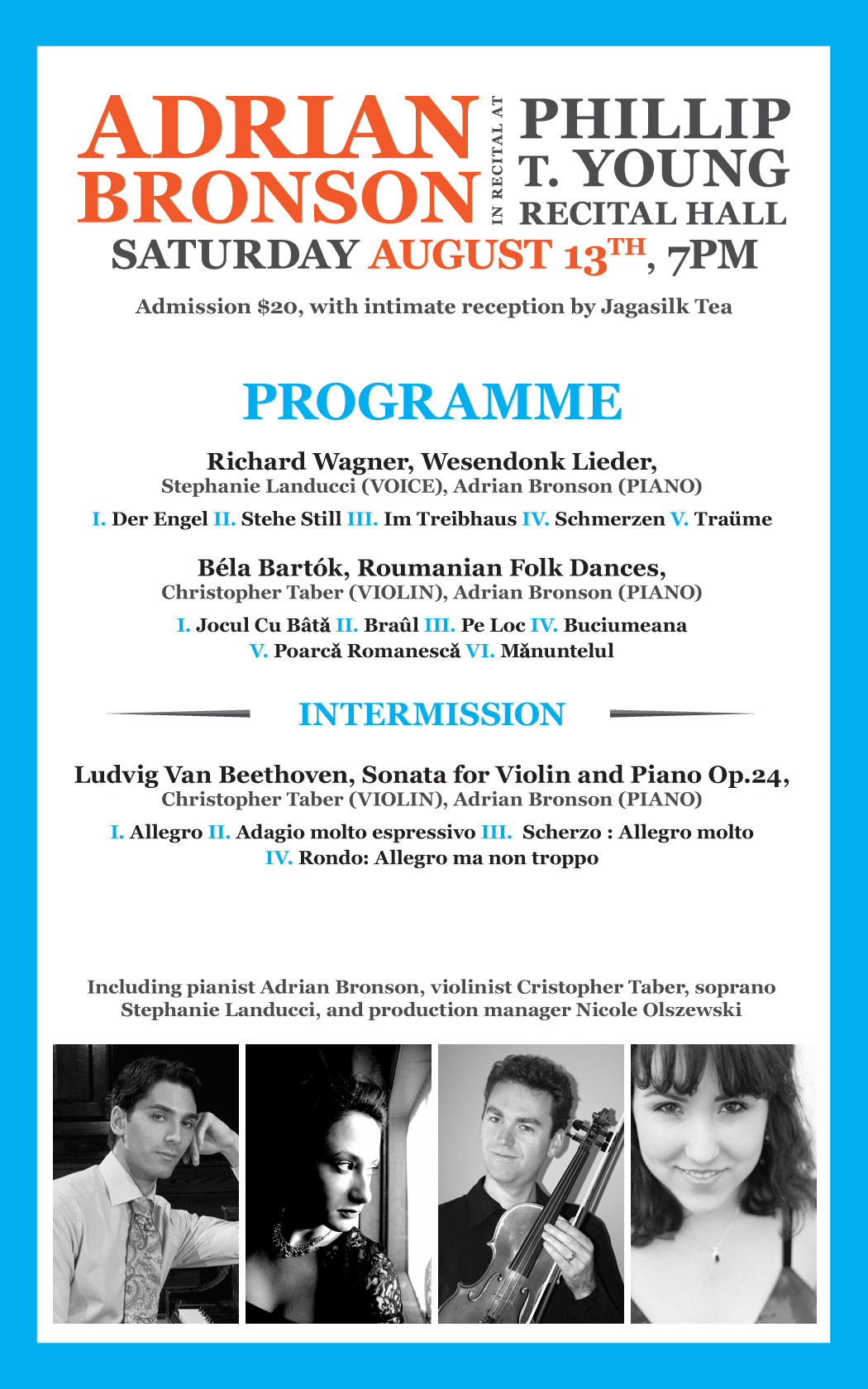
In 2011, the client needed a poster to market his latest perfomance, but a smaller budget forced him to limited the amount of printed materials. To save on costs, the poster and the programme were combined into a single, smaller design.


