Here is a project for Manjiela - a company selling luxurious Chinese medicine, known as cordyceps. Manjiela is a branch of
同仁堂 (TongRenTang), the largest producer of Chinese medicine, that was founded in 1669.
Cordyceps is a very expensive type of fungi which, according to Tibetan medicine powerful enough to fight cancer. It looks similar to this:

The task was to create a logo for a company’s shop in Tibet and to think about overall visual identity.
A huge amount of work was done, tons of information on Tibetan culture and symbolism has been studied, lots of ancient Tangkas reviewed. Let’s look closer at Manjiela (the Medicine Buddha):
A huge amount of work was done, tons of information on Tibetan culture and symbolism has been studied, lots of ancient Tangkas reviewed. Let’s look closer at Manjiela (the Medicine Buddha):

Usually the Medicine Buddha was depicted seated, holding a jar with medicine nectar in his left hand and resting his right arm on a right knee. In the sutra, he is also surrounded by lapis lazuli-colored aura.
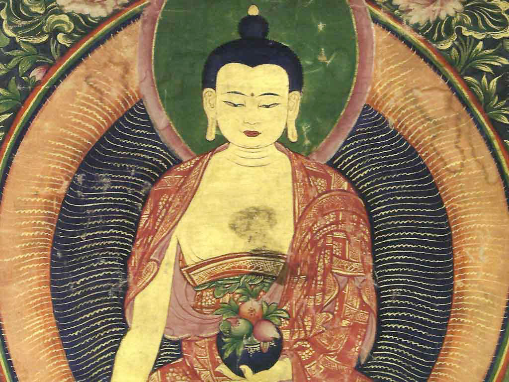

The practice of Medicine Buddha, the Supreme Healer (or Sangye Menla in Tibetan) is not only a very powerful method for healing and increasing healing powers both for oneself and others, but also for overcoming the inner sickness of attachment, hatred, and ignorance, thus to meditate on the Medicine Buddha can help decrease physical and mental illness and suffering.
-Wiki
-Wiki
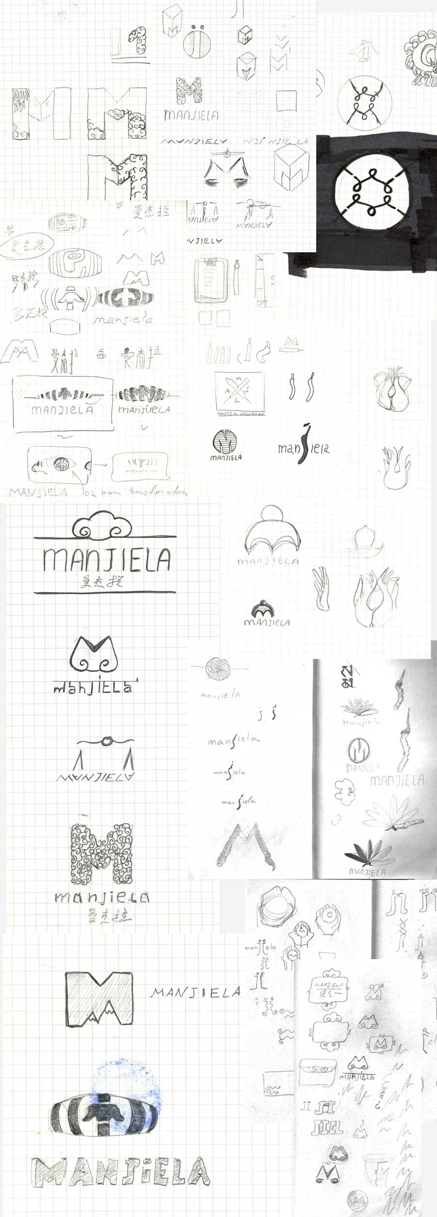
Below are several concept logos, that we created together with Ekaterina Vernigorova.
LOGO 1

The concept and inspiration came from the Buddha’s crown decoration and traditional Tibetan textile patterns:


A couple of color suggestions, I really happy how it turned out in lapis lazuli color, which is the main color of the Medicine Buddha as you might remember. (see above)


The logo looks gorgeous in gold color as well.
LOGO 2

Here is a second concept, let’s quickly tear it apart to see the symbolism behind it.

First there is the letter “m”.

Than there are cordyceps.

Traditional ornaments.

And traditional colors, where yellow is a color of compassion in Buddhism, and brown represents warmth, support and, in our case, stands for the cordyceps color as well.
LOGO 3 (2 variations)

The next logo also carries a couple of symbols inside. First of all the outer shape of logo comes from the outline of the “Endless knot”:
…without beginning or end; are a universal symbol for eternal life, the eternal cycle of nature, and eternal love.


The second symbol is a divine aura, surrounding the Medicine Buddha.

In the inner circle of the logo, letter “M” represents mystic Tibetan mountains in the clouds.


Gold emboss.

LOGO 4

Inspiration for this logo came from the traditional Tibetan cloud thrones and cloud elements.


Looks great in lapis-lazuli.
SKETCHES
You made it till the end! :)


