M- logo & business card
contest entry
contest entry
This was my entry to the sationery design contest. Contest requirements was:
Looking for a logo and business card design that will represent the meaning of our company name:
Maxiria stands for MAXImized Returns Innovative Advertising
We stand for innovation, breakthrough methods and technologicaladvances as applied to marketing and bringing business/clients/ordersto our client companies. We are the company that can be trusted todeliver.
When we are networking with other Sillicon Valley entrepreneurs andangel investors and would like to be able to make an impression withour business cards. There should be an element of "Coolness" to ourcards. We like Avant-garde, modern innovative designs.
The typeface should be clear, simple and bold. Want something that stands out.
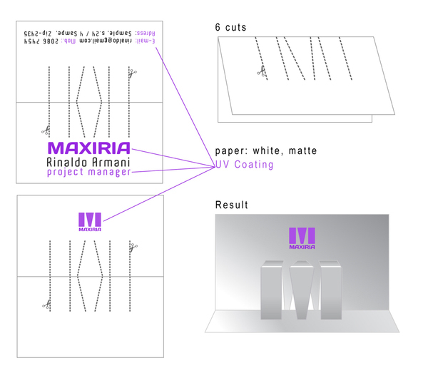
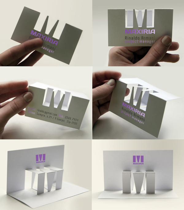
Please feel free to experiment with bold colors, shapes, dimensions, textures and material for the business cards.
Cards can be frosted, clear, white, platinum.
Options: UV Coating
produced. With onlyaccents. Folded M letter looks good from all angles. Businees card placed on table looks like a sculpture, suvenire or art.
Looking for a logo and business card design that will represent the meaning of our company name:
Maxiria stands for MAXImized Returns Innovative Advertising
We stand for innovation, breakthrough methods and technologicaladvances as applied to marketing and bringing business/clients/ordersto our client companies. We are the company that can be trusted todeliver.
When we are networking with other Sillicon Valley entrepreneurs andangel investors and would like to be able to make an impression withour business cards. There should be an element of "Coolness" to ourcards. We like Avant-garde, modern innovative designs.
The typeface should be clear, simple and bold. Want something that stands out.
Please feel free to experiment with bold colors, shapes, dimensions, textures and material for the business cards.
Cards can be frosted, clear, white, platinum.
Options: UV Coating
produced. With onlyaccents. Folded M letter looks good from all angles. Businees card placed on table looks like a sculpture, suvenire or art.