Entasis is an architectural firm specializing in classical structures and renovations. The script capital is a completely original letterform designed to compliment the structure, elegance, and motion of it's Bodoni counterparts.
Noir is a French press coffee maker and is part of a largerpackaging/branding project. The logo was developed from the Swiss originsof the product and the geometry of the package itself.

Intare is a Japanese media portal for Tokyo's urban youth to keep updated and informed about concerts and celebrities.
FR2 is an electronic music recording label that produces House, and Drum & Bass artists. The abstracted, minimal type treatment is used to appeal to a more esoteric audience.
Emily Bader is a mainstream fashion designer. Emily wanted something simple and original that would still be relevant to a wide range of clothing lines.

Soir Cusso serves French cuisine in an elegant environment along the coast of Laguna Beach.
City Kid is an urban-youth lifestyle network and resource that functions as an insider guide to major cities across the US.

Meuse wanted a completely original type treament for their high-end hair salon and spa in Wilkes-Barre, PA.

Trinian's Cafe is a quirky cafe and deli in Grenwich Village, NYC. The branding pays homage to English cartoonist Ronald Searle.

Shneckengarten is an organic farm that specializes in the cultivation of a rare type of snail.
Terra is a vegan cafe and restaurant. Their branding is inspired by the work of Henry Moore.
Meso is a Meso-American restaurant located along the beach in Southern CA. The mark draws inspiration from Mayan heiroglyphs and ocean waves.

Familia Lactima produces a range of margarin and butter products. The completely original type treatment capitalizes on the stirring effect of a rotational ambigram.

Pero is a Bulgarian publisher that focuses on introducing translated non-fiction that has never before been available in Bulgaria.
Climb specializes in search engine optimization. They wanted something clever and simple that would create a strong web presence with a 2.0 feel.
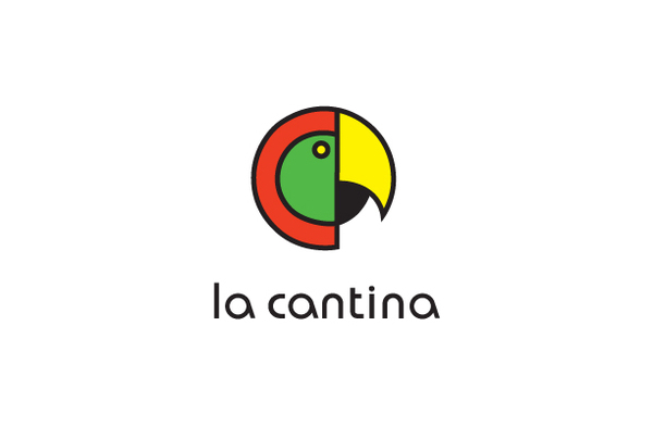
La Cantina is a chain of Mexican family restaurants that started in San Pedro, CA. The owners wanted to use a parrot as their corporate image.

Leaf Source is a vitamin and energy supplement made from ingredients extracted from rare leaves.

Living Brands is a brand focused, marketing and research agency in London.

Analog is my own personal branding as an online freelancer.
Special Thanks: John Langdon & Jack Cligget


