

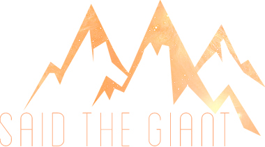
Said the Giant is my blog/project. It's a site were I write reviews of music and literature.
I decided to design a website and a logo and two tumblr themes for this project and this was the resolt, as far as the logo goes.
The Process
At the begining all I had was the name of the site and the main color (a bright perfecly balanced orange #ff9900). I knew I wanted something a little vintage, a little modern, a little feminine and a little minimalist with some fun colors and very organized, with a strong message and sharp edges.
My mother gave me the idea of adding moutains to the logo saying that every time she heard "giant" she tought of mountains. So I made a vector inspired on some pictures of mountains I found.

Added the orange, I had nothing still. So I tried a couple of patterns and shapes and, as always, the simpelst one was the one that caught my eye. With a simple universe pattern on the mountain itself, I found a very sleek and minimalist font and added the name of the site.
So this was the first logo. But there was something missing. I knew I needed a "ground" for the mountains to stand upon. I decided to add the vintage touch I wanted and added a vintage label type of vector around it:
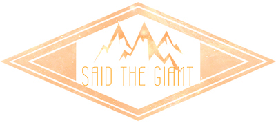
Better, huh? But not quite there yet. So I decided to take it all back and turn it into B&W solid colors to try and find another way out. The "shape" of it was great, it was a matter of finishing it right. With the solid colors I had a much better vision of the logo, and I created a simple warm fiery yet feminine and delicate pallete for the logo! :)

Now I'm happy! :D


