Let's Burger is one of the earlier burger joints to exist in the Lebanese market after Roadster and Crepaway. Visually, it resembled a lot the typical American diner: black-and-white photographs and license plates on the walls, dark red leather dine-style chairs and the script logo that is found on the signage of diner facades in America. The blue stripes and stars also alluded to American-ness. After several successful burger joints opened in Beirut, Let's Burger approached Kite Creative seeking a concept and identity uplift.
The brand strategy made for the project positioned Let's Burger as a burger joint that offered its customers endless options to customize their own burgers. It also suggested that Let's Burger depart from the American diner look.
Agency: Kite Creative
Creative Director: Maya Saikali
Strategist: Monica Karam
Designer: Nayla Yehia

To the left is the original Let's Burger logo and some of the visual elements, along with the strapline. To the right are some diner signs in America, the style of which we sought to steer clear of.

We wanted to create a feel that was really about the burger itself. We thought of charcoal and the mouthwatering smell of chargrilled patty, which inspired the treatment of the logo.

The client wanted the post-uplift logo to remain familiar to the customers who were acquainted with the burger joint, so the script feel and composition had to be maintained. I first sketched out the logo using a calligraphic pen. Annotated are the visual decisions made during the sketching process.

Logo before and after. The new logo is reminscent of the old logo, although very different in the details.

Logo and strapline lockup. A new strapline was created that was relevant to the new strategic positioning.
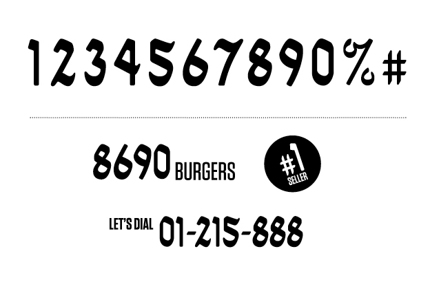
As the identity was headed in the way of choices and options and combinations, numbers would prove to be important to the identity. Using the calligraphic pen and same feel as the logo, I designed the digits and a few other characters.

The typographic palette.

The imagery- a combination of individual ingredients, pictograms and isolated burgers.

A summary of the concept showing how the logo, digits, ingredients and burgers come together.

The order sheet, making use of the digits, typographic palette and ingredients. While Let's Burger allows the customer to customize burgers, it also markets its own burger recipes.

The brand identity was supplemented with infographics that engage and entertain the customers and talk all about the burger!

Infographics intended for display on the window or walls.

Infographics on the placemats.

Two menu spreads showing the photographic style, typography and playful infographics that show the composition of each burger or the portion of the menu occupied by a particular menu section.

A menu spread showing a map made of little burger icons and that shows the country that inspired the choice of burger ingredients.

Waiter uniform that is accessorized with pin badges.

Bill holder made of a magnet flaunting the strapline and a metallic tray.

