Kitchmate
Branding & Identity
Branding & Identity
I was engaged to develop an identity for a new brand of kitchen appliances. The flagship product of theirs are the induction cookers - I'm also supposed to draft a minimalistic design for the user interface of their induction cooker panel.
We decided to use the name Kitchmate - and used round circles to symbolize their main product - the induction cooker. The logo is meant to symbolize their initial K with an arrow pointing right - symbolizing forwardness.
--
Client: Kitchmate Industries
Art Direction: Andrew Tay
We decided to use the name Kitchmate - and used round circles to symbolize their main product - the induction cooker. The logo is meant to symbolize their initial K with an arrow pointing right - symbolizing forwardness.
--
Client: Kitchmate Industries
Art Direction: Andrew Tay


Product UI Design


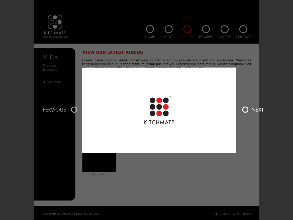
Proposed Web Design for Kitchmate