If a project has an outstanding and easy-to-remember name, drawing a logo for it is bliss. We got very lucky here! We have been approached by developers from Internet resource Kanobu for a logo as bright as the name of the website.
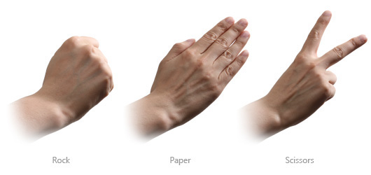
The name Kanobu is an acronym derived from the Russian name of the world popular two-person hand game Rock-Paper-Scissors. This tells us that the project is devoted to various games and all other things related to the gaming industry.
The name Kanobu is an acronym derived from the Russian name of the world popular two-person hand game Rock-Paper-Scissors. This tells us that the project is devoted to various games and all other things related to the gaming industry.

We decided to start working on the logo from sketches. The first group illustrates the game’s cycle that adds to the dynamics of the symbol.

The first sketch of the second group points out at the equality of opportunities selecting one of the three natures. And the second and the third hint at fairy-tale characters: the trasher, the elf and the dragon.

We also thought a bit about coats of arms and fashionable glass spheres but made up our mind really quick considering it a dead-end scenario.

After having discussed the sketches with the client, we picked the prioritized directions of logo development and drew new sketches.

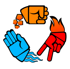
The round logo with human-like hands was picked as the most suitable since it is highly dynamic and conveys the essence of the game. Further we had to color the logo into the corporate colors of Kanobu project: red, blue and orange. Surprisingly we have spotted the color association with three elements: earth, fire and water.

We added details and made the logo more “graphicy”. The result was remarkable!

What is that this logo missing to become a full-fledged logo? Of course we are talking about a corporate typeface! We came up with two concepts.

After continuous deliberation we decided to stick to the neutral “chopped” font. The deco handwriting typeface was also cool but it seemed to be too eye-catchy for our logo.