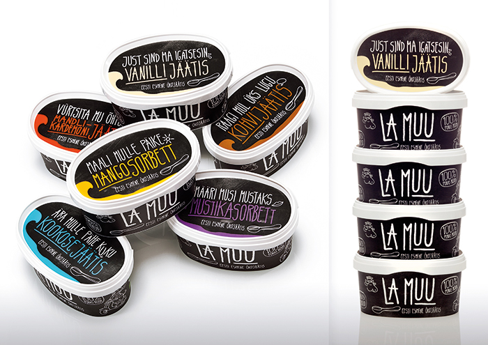
La Muu is Estonia's first eco-friendly ice cream. The creative idea was to differentiate from everything else on the shelves through design and color. It was important to sell the product strictly through packaging aesthetic alone since advertising was not an option for the brand at initial rollout.
The packaging, features a chalkboard-like finish with witty hand-written copy. The "chalkboard look" is growing in popularity for packaging design because it has a
farmstand-like feel that gives products a handcrafted, small-batch aesthetic.
Some translations from the packaging copy: "Don't fall on my head, coconut ice cream.", "Tell me a story, coffee ice cream.", "Spice up my evenings, cardamon ice cream." "
Squeeze me gently, lemon sorbet."
Advantage of using the chalkboard look on a frozen dessert - the container will naturally frost over when removed from the freezer, enhancing the black chalkboard surface with a dull, chalky/dusty finish.
Awards won:
Awards won:
Golden egg 2013 silver, Estonia
ADCE 2013 gold, Estonia
Designed by KOOR, www.koor.eu
Designed by KOOR, www.koor.eu