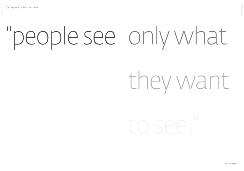
‘Tales to change the word’ is a brief that allows the boundaries of traditional book printing to be pushed, exploring the endless possibilities of magazine layouts. Inclusions of the double page spread, the ability to change typography into imagery and the facility to pull out important quotes or references are a few of the approaches used in my overall design and aesthetic of my interpretation of ‘The Waitress’ by Jack Zipes.
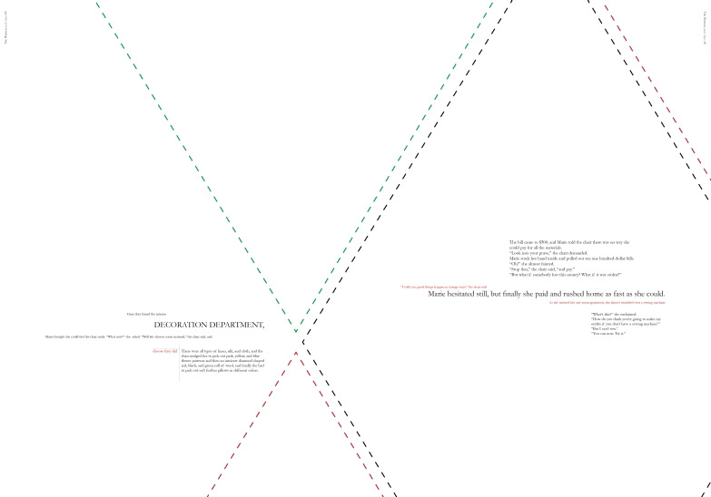
While a Parisian theme might seem the more obvious route to go down my spreads have a more literal and illustrative approach, by taking direct references from the story. I have taken descriptions of materials and translated them into patterns within spreads. Locational references of running through the streets are translated into a street map of Paris; and I have also adopted the colour palette of French street signage.
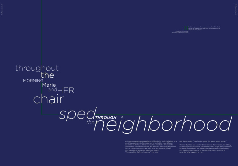
A selection of different serif and san serif fonts balance the clarity and aesthetic look of the typography on the page. Although on occasion certain combinations of fonts are used for decorative purposes, all body copy however has been kept consistent with either one chosen serif or san serif running throughout. The fonts used are: Birch STD, Fedra Sans Display, Garamond, Gotham, ICT Franklin Gothic and Univers.
While a Parisian theme might seem the more obvious route to go down my spreads have a more literal and illustrative approach, by taking direct references from the story. I have taken descriptions of materials and translated them into patterns within spreads. Locational references of running through the streets are translated into a street map of Paris; and I have also adopted the colour palette of French street signage.
A selection of different serif and san serif fonts balance the clarity and aesthetic look of the typography on the page. Although on occasion certain combinations of fonts are used for decorative purposes, all body copy however has been kept consistent with either one chosen serif or san serif running throughout. The fonts used are: Birch STD, Fedra Sans Display, Garamond, Gotham, ICT Franklin Gothic and Univers.