
"HungryShark.ru is the first website for enterprising young people containing the most interesting and most useful information." This was the company introduction made by Anton who contacted me to develop a logo.
Anton: "Our logo should be a contrast to a usual logo for business media. As I see it, it should be a grinning shark."
As usual, I do some sketches first.
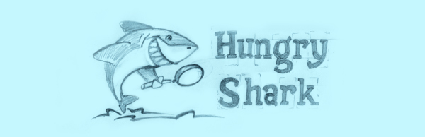
The first logo concept portrays a shark looking for some information.
The shark jumping out of water seeks for some food using a magnifier as well as a reader finds some wanted information at Hungry Shark site.
The lettering is stylized antique printing press font.
The second logo concept is a hungry shark with a toothpick.
The lettering is stylized graffiti.

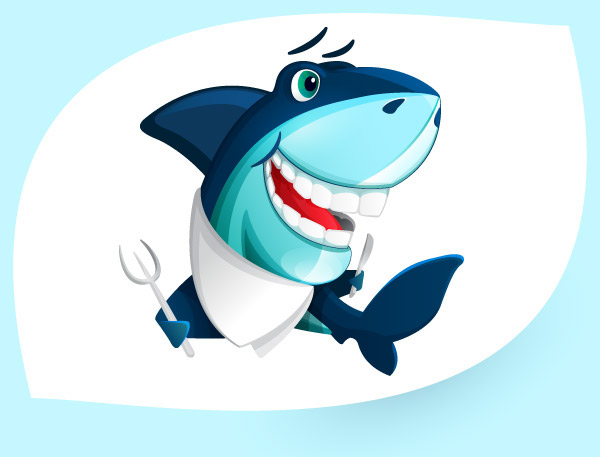
And finally, the last logo concept is a hungry shark holding a knife and a fork in its fin, a napkin round its neck, waiting for dinner to be served.
The lettering is classical calligraphy.
After all, I arrived at a youth audacious character, at the same time classical lettering should radiate competence and quality.

Anton: "The shark turned out to be too good-natured and light-hearted. It should be more concentrated. The lettering is good."
I start doing more sketches.
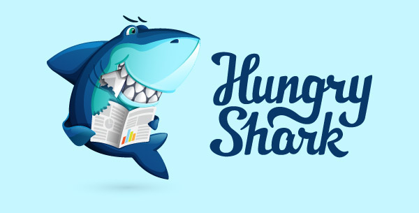
A shark with a newspaper on a plate.

May be, this shark is so much hungry that it's biting its tail?

A more concentrated shark with a magnifier.

A shark is a hungry reader.

Anton: "I like the last concept very much, you should develop this one."
I drew the character and lettering on vector editor:
Anton: "It's perfect!"


Some time later Anton asked me to draw a logo for a video section of the website.


