


Hammerson
Corporate identity
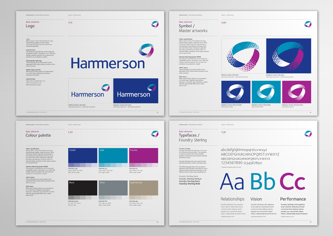
Corporate identity


Scope of work
Corporate identity
Creative direction
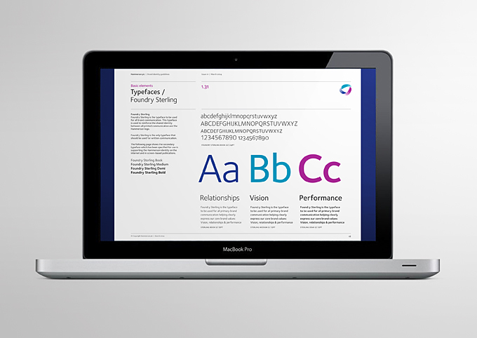
Custom type design
Corporate identity
Creative direction
Custom type design
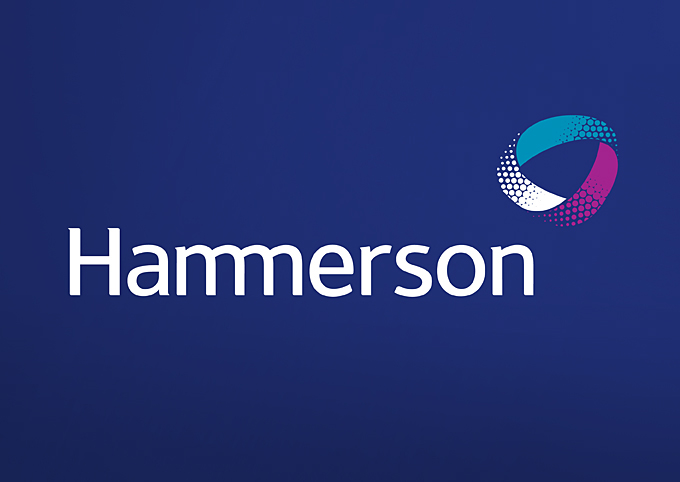
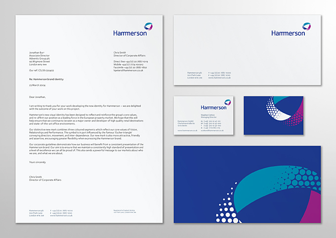
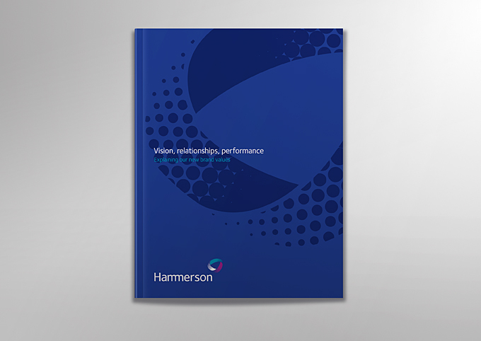
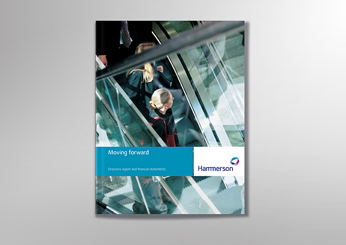
A specially drawn wordmark and symbol are a central feature of the updated
corporate identity for leading European-based property developer, Hammerson.
The new custom designed wordmark is both confident and professional,
making subtle references to the previous old-style logo set in Times New Roman,
while the accompanying symbol expresses the three central company values:
vision, relationships and performance.
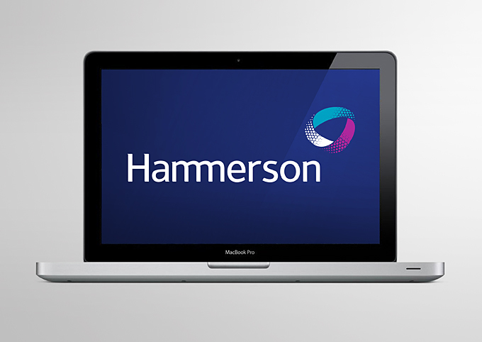
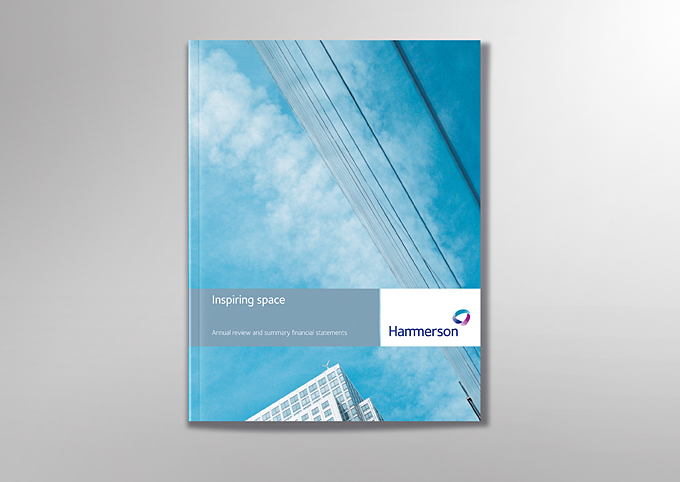
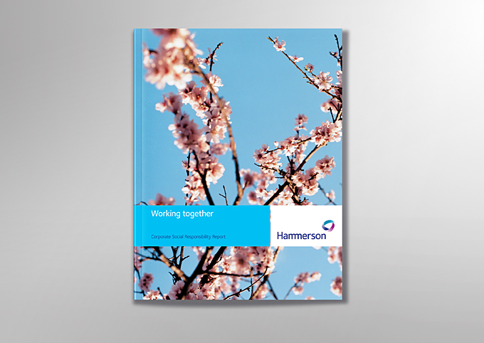
The new identity has been successfully applied to all aspects of corporate
communication helping deliver a more confident and contemporary visual expression.
The new custom designed wordmark is both confident and professional,
making subtle references to the previous old-style logo set in Times New Roman,
while the accompanying symbol expresses the three central company values:
vision, relationships and performance.
communication helping deliver a more confident and contemporary visual expression.


