Harley Ellis Devereaux Collateral
From Corporate Identity to Centennial Celebration
From Corporate Identity to Centennial Celebration
A small collection of corporate identity work and related materials from my days at HED.

The icon portion of the Harley Ellis Devereaux logo, created for the merger of HarleyEllis and Fields Devereaux. The two colors symbolize east- and west regions uniting.

Poster / postcard design announcing a seminar on sustainable design in architecture.

A mini-poster of "decades panels" commemorating the 100 year anniversary of the firm. Designed in sections, this design was conceived as a series of large wall panels (below) that were sequentially unveiled one month at a time leading up to the anniversary date. The poster was a leave-behind commemorative piece for employees and clients.


The centennial "Decades Panels," mentioned above.


Centennial announcement card for the firm's 100th anniversary. In addition to embossing, foil stamping and die cutting, this piece uses a wonderful paper stock for the card itself - "Curious Touch" by ArjoWiggins. It feels like suede, almost wet. A nice surprise touch to a simple piece.

Poster graphics supporting the firm's tag line, "Advancing Your World...by Design."

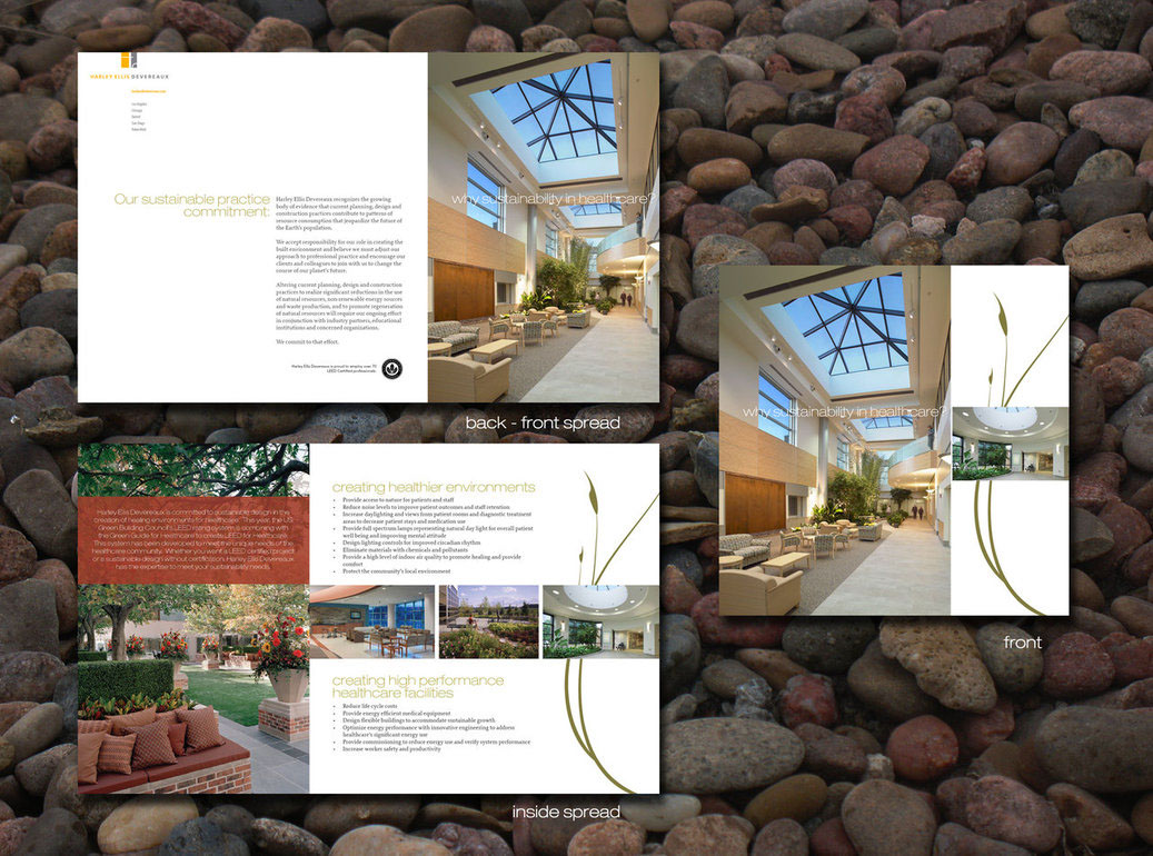
Brochure highlighting the firm's commitment to sustainability in healthcare design.

Board highlighting a landscape architecture project.


Mini-brochure for GreenWorks Studio, a specialty service offering sustainable consulting services.


Design for the firm's holiday card. Traditionally the company sends out a card before Thanksgiving to clients, hence the theme of "giving thanks." A small die-cut opening was made in the front panel to reveal portions of the letters beyond, creating the firm's logo.

An architectural project display board for a national conference. Rather than take a standard approach of filling a board with project images, this concept called for a unique image that would draw observers from across the room for a closer look. Board size: 40"x40"


